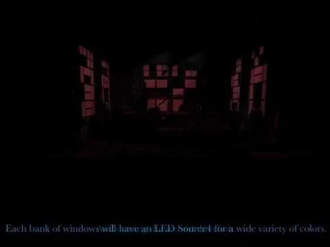
new design approaches
Without being too much of a geek, I've been using a program (VectorWorks) that allows what I draft to be "turned on" in a virtual environment. The short story is, that done the right way, it allows me to render what the theatrical environment will look like. It's far from perfect, but I can now storyboard ideas for directors and choreographers and give them a better idea of the design. Here's what I've done along the way...
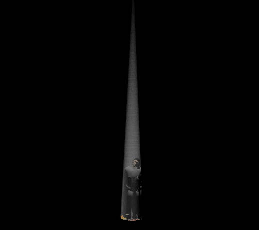
This is one of the first renderings I did. I made a simple 3D model of the set and added scans of the set designer's (Dan Boylen) paint elevations. I wanted to see if a design idea would work, and if I could then show what I meant.
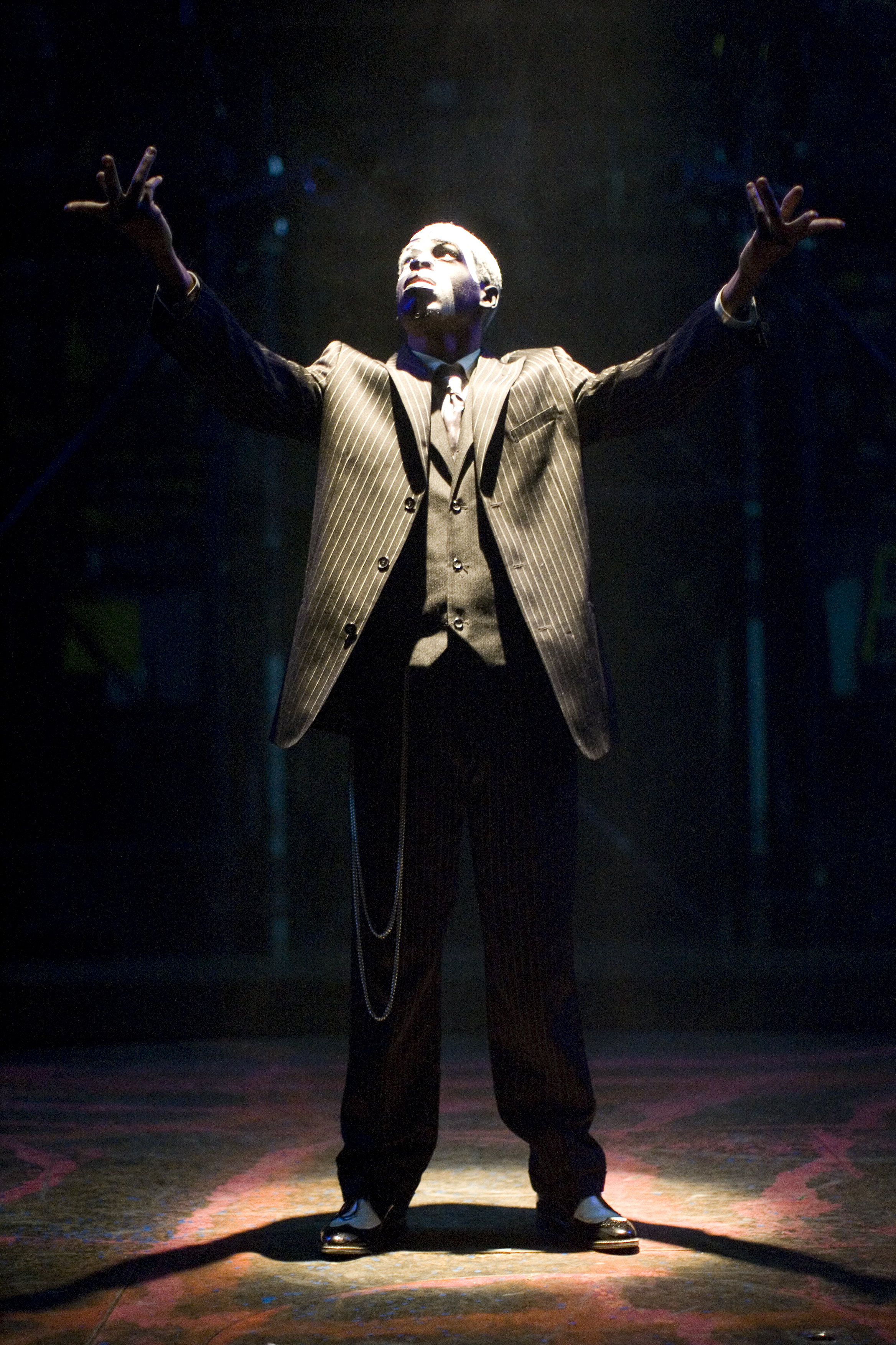
The opening invocation with the same kind of light.
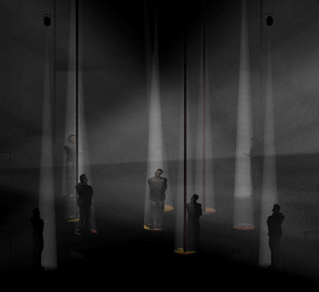
The Idea was that the lights would enhance the verticality of the set and the metal pipes creating a "forest" of light that could change colors. This base idea could define the space through combinations of shape and also color.
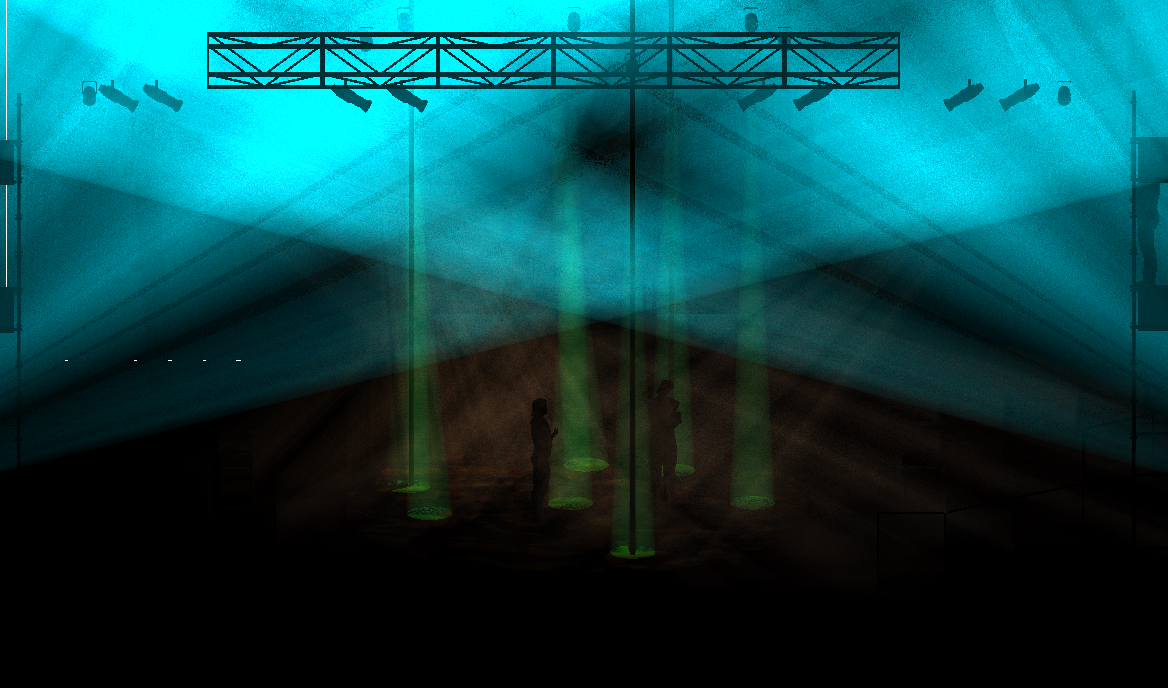
The "forest" of light would change color, like in this forest scene. I would typically never ask anyone to breathe this much haze, it's there to help emphasize some of the design ideas (like the balance of the shafts of light to the negative space of the "ceilings" of colored air).
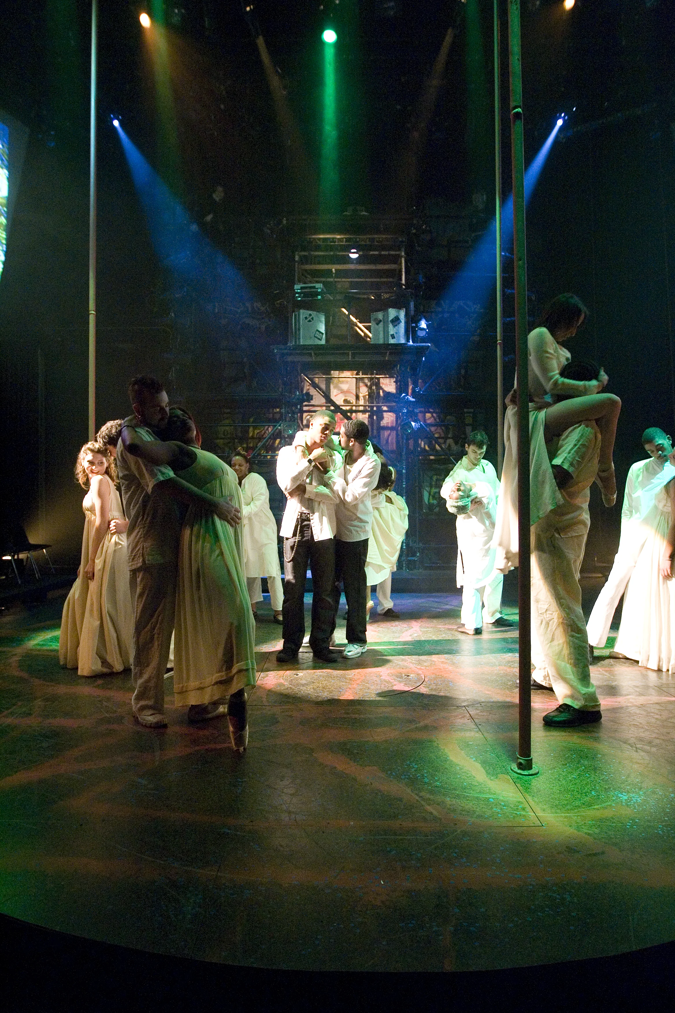
The Forest. The down pools of light created a rhythmically changing and pulsing landscape that lit the floor, random body parts and the air.
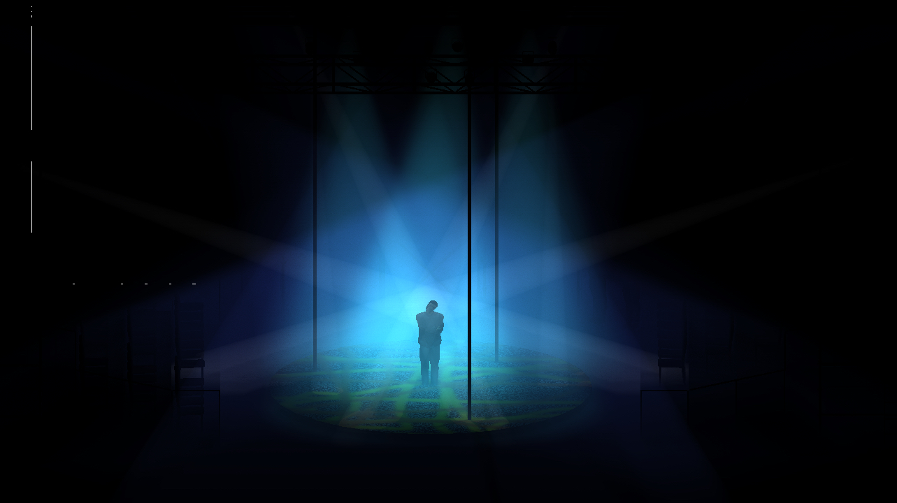
If nothing else, I could sit with the director (Lee Richardson) and say "Oh, you meant that blue!!" Lee liked this blue. I made sure for this scene I had this blue ready for him.
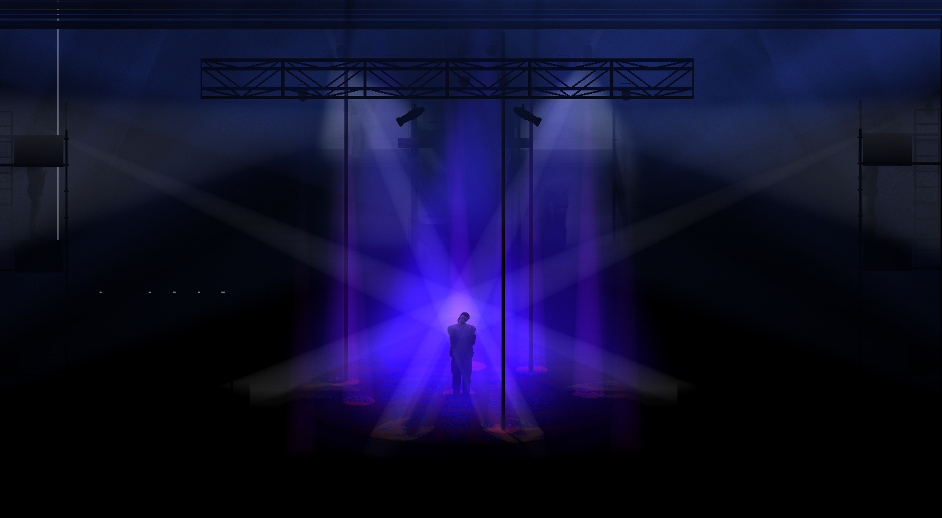
We also used four follow spots that were rendered for certain moments. (You can see the spot-ops lurking in the haze.) I could sit in rehearsal with the director and render different ideas in a couple seconds for us to consider.
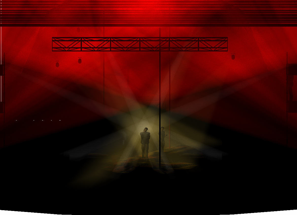
We also played with shaping the height of the space with different levels of "ceilings." We created a storyboard for the entire show based on the renderings and conversations. And then were able to tech the entire 300+ cue musical in less than 8 hours.
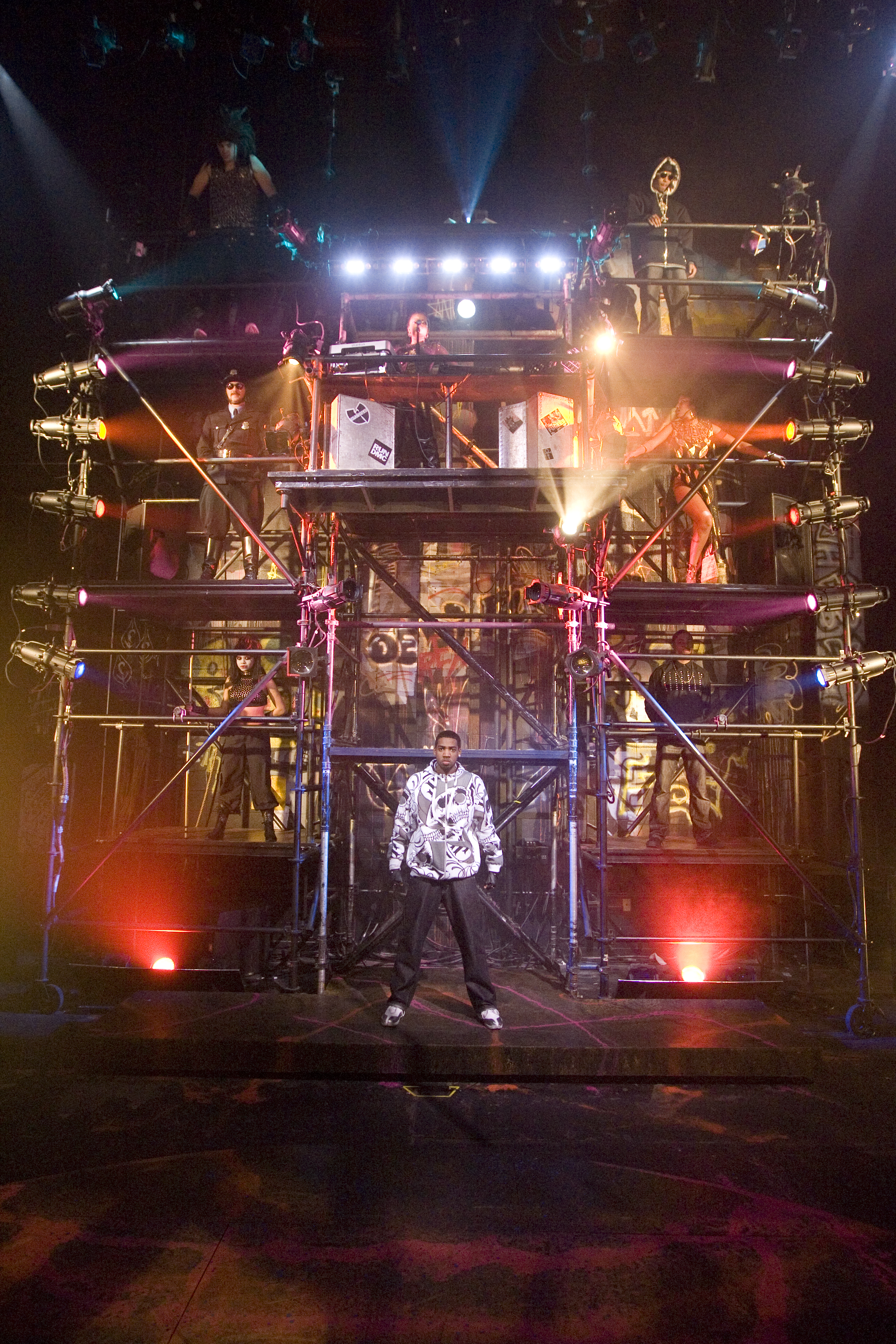
The 7 approach Thebes. The layers of "ceilings" have been building and filling the negative space as we head to battle.
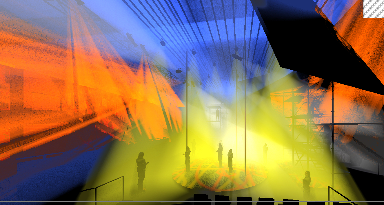
Sometimes things got out of control...
(I have no idea what I was doing on this one)
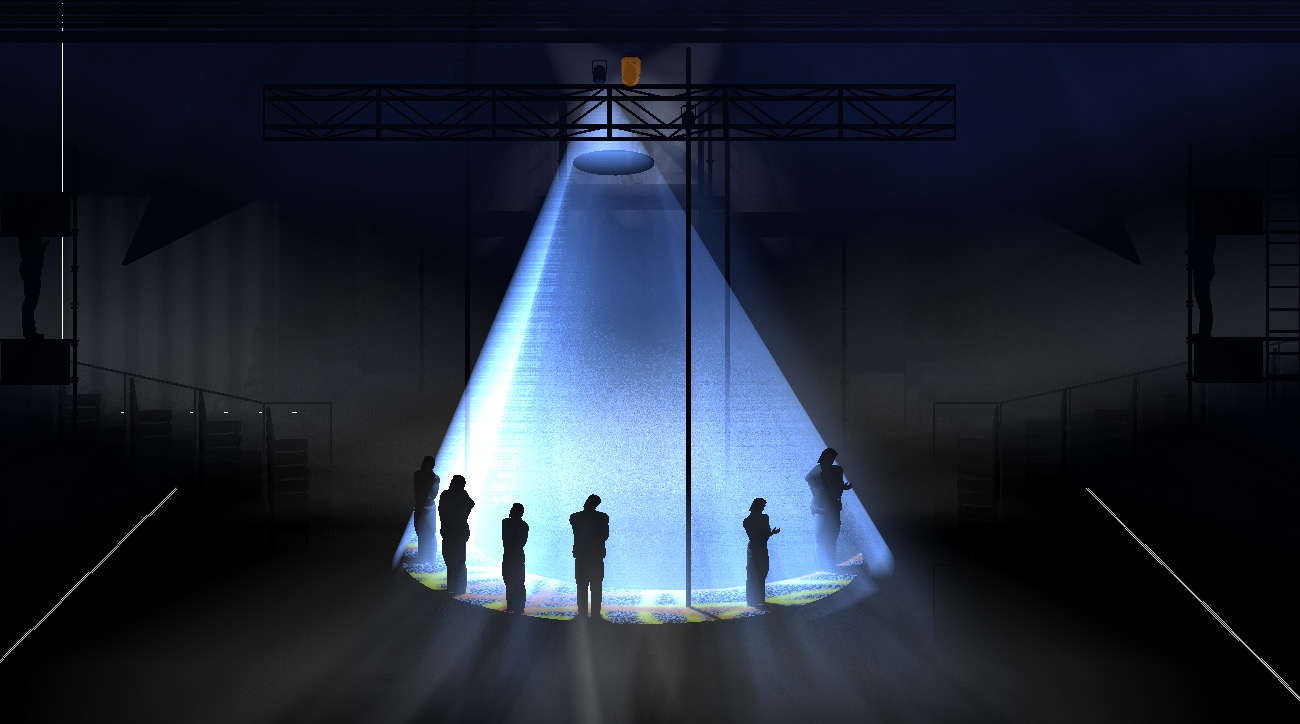
I wanted something unique for the end where the cast stood around the edge of the stage and sang out to audience. There were no templates in Vectorworks yet, so I made a giant frisbee and put it near the light to cut out the center of the cone of light.
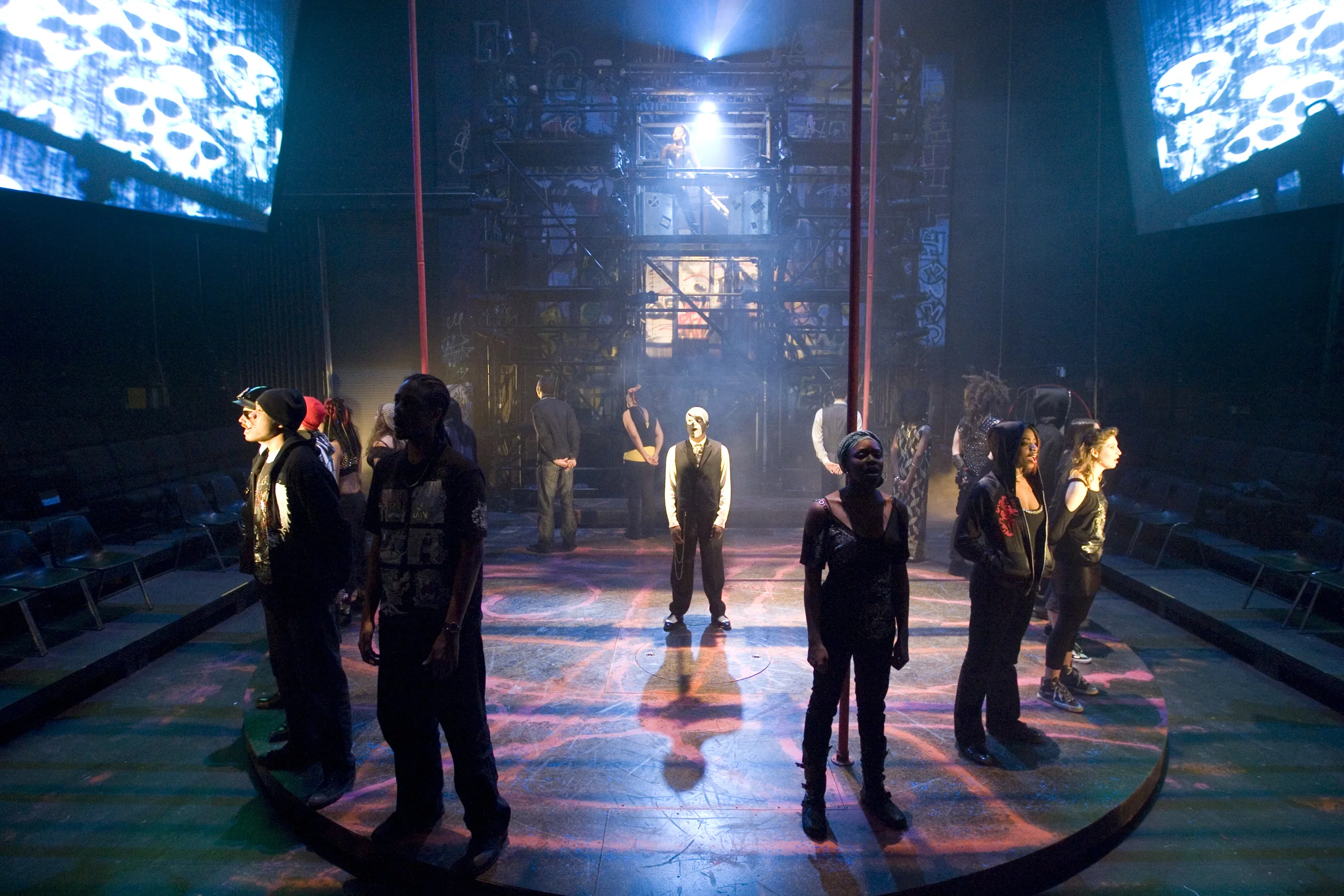
The final admonition.


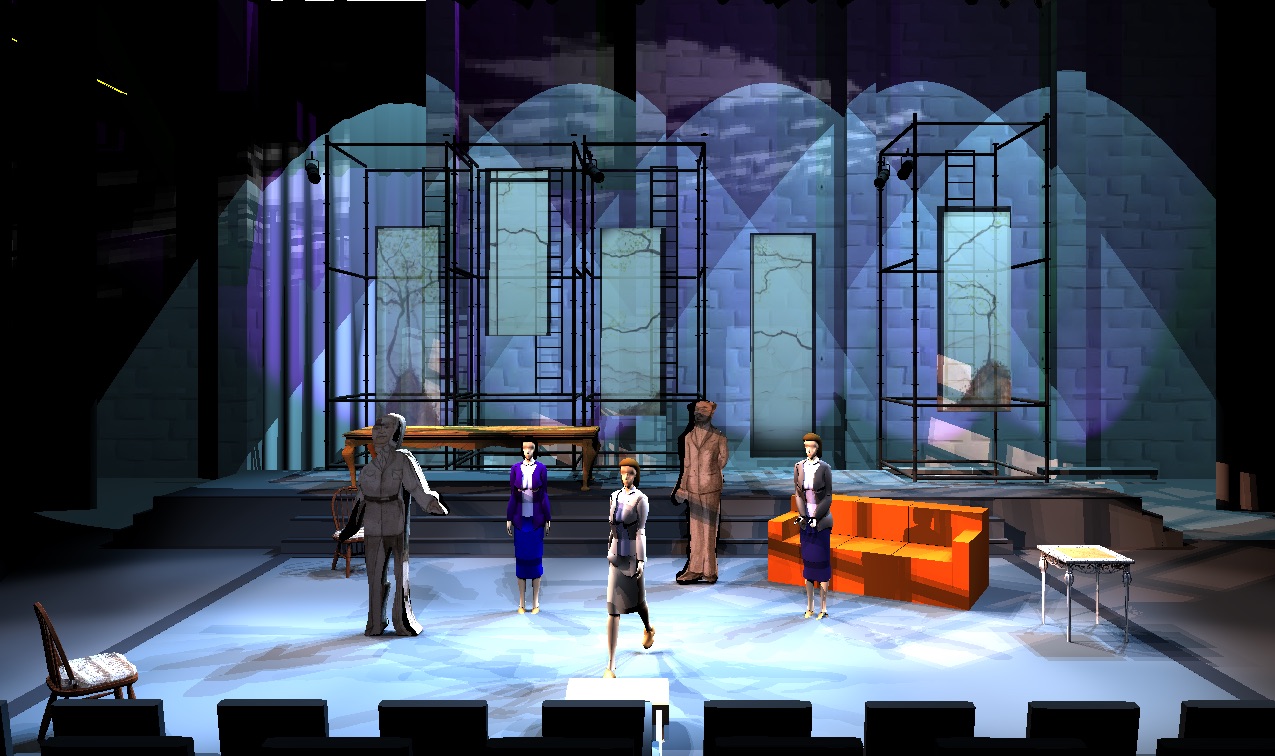
This was two productions in rep (Three Sisters and Measure for Measure). We needed to play with the language of the playing space, which was common to both productions, and the back scenic panels and white back wall of the theater. Previously I'd used the human figures found in Vectorworks. But they're very memory heavy, complicated, and their heads tend to fall off. I began playing with "cookie-cutout" people (shapes made to follow the costume rendering, extruded, and then the rendering applied as a texture).
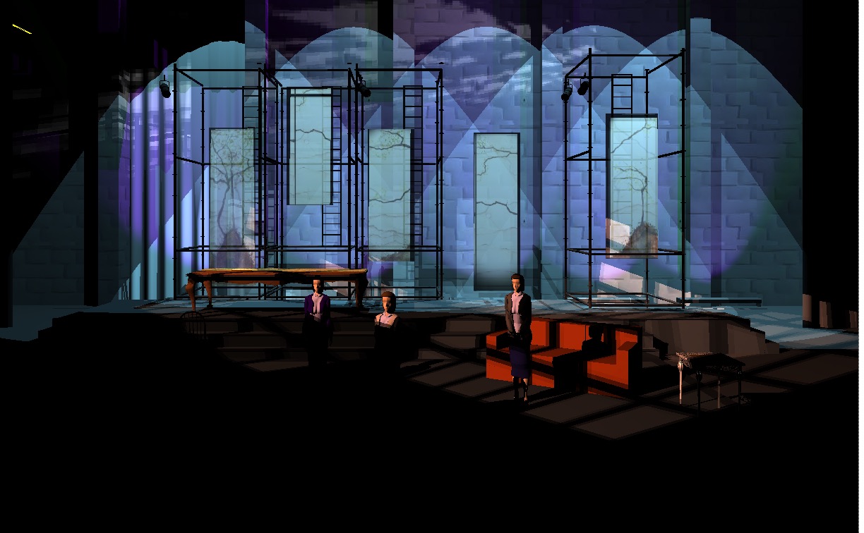
Top of the show we wanted a suspended image of the sisters framed by the rest of the world. The colors on the back were from research images that we felt captured the right feel.
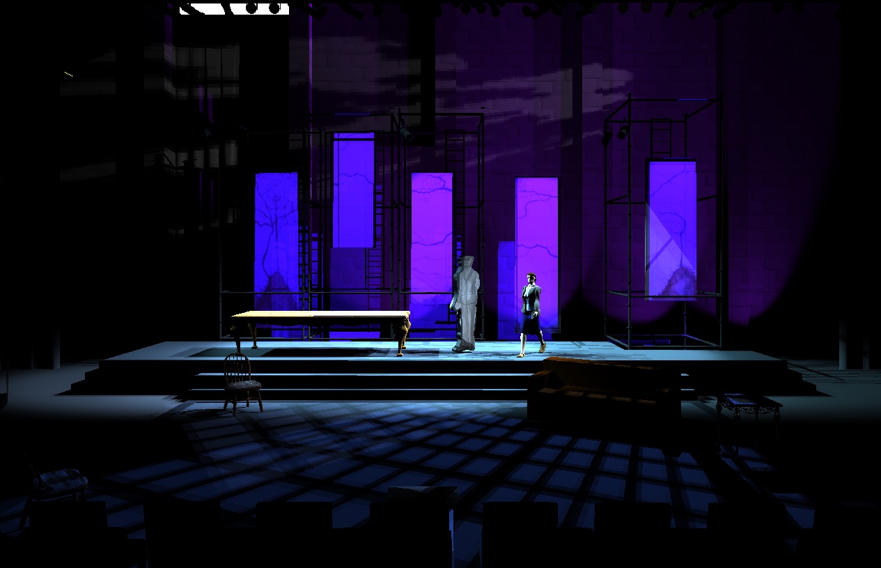
I took the set designer's (Dirk Durosette) paint elevations for the scrim panels and made virtual translucent panels meant to imitate the effects of a scrim. Here, as night falls, we wanted the panels to feel architectural while the back wall receded.
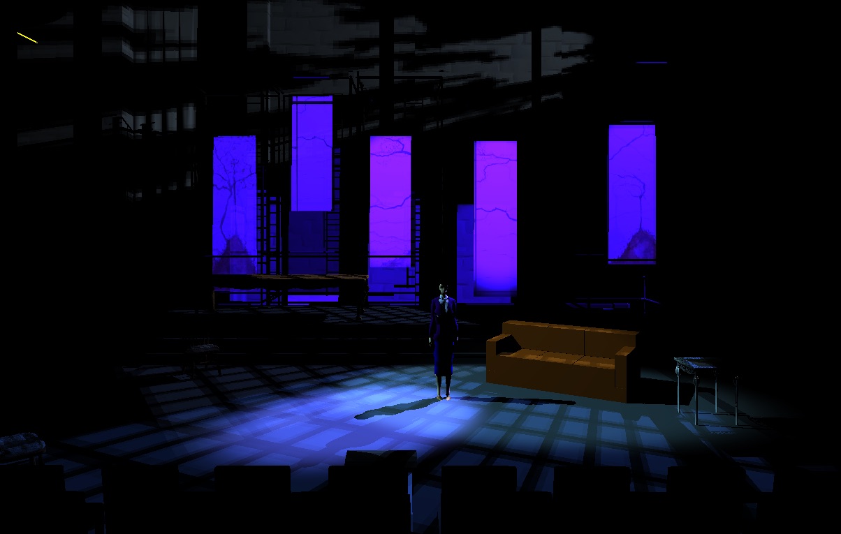
I wanted to be able to show the director (Dan Kern) how at the end of Act 2 we would shape the light directionally from upstage left with templates and a little "moonlight" fill, take the panels to something cool and "nightish," and have a dim back wall with some groovy little clouds on it.
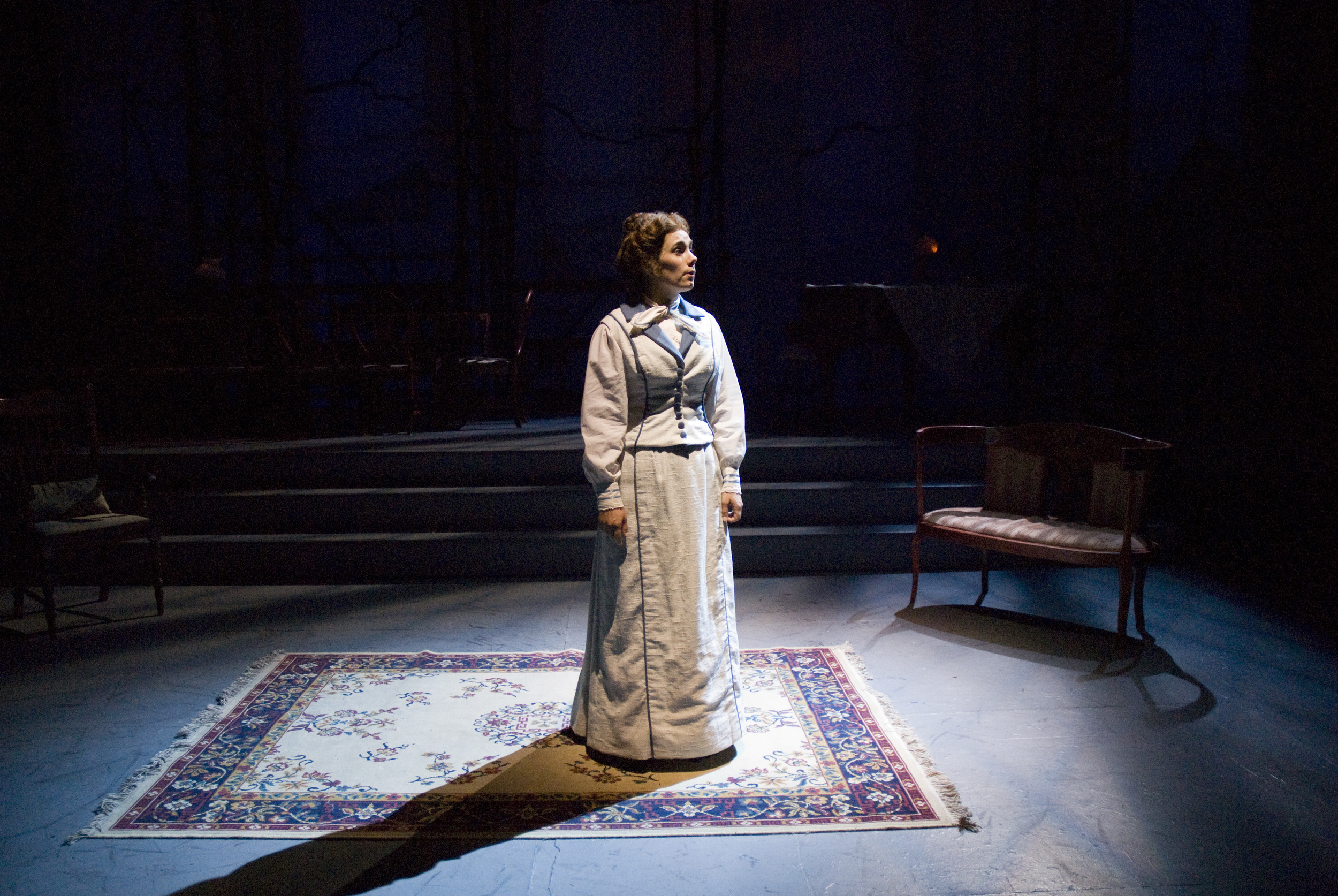
Real life.
You can see the identical angle and template coverage.
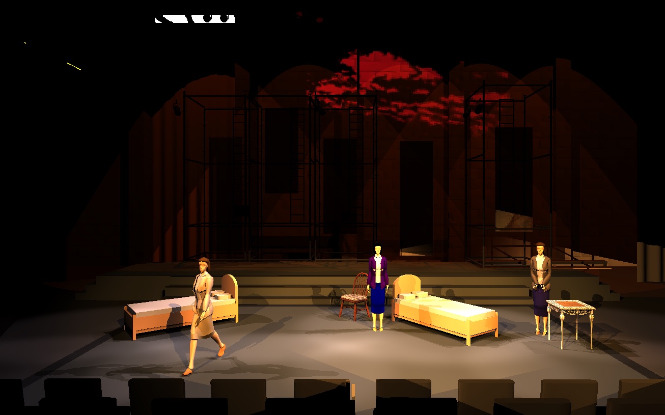
Act 3 was about relationship of the warm bubble of the interior and the ominous clouds of the fire on the back wall. We decided we wanted to use red as a visual indicator on the back wall, and keep the negative space the black screens created.
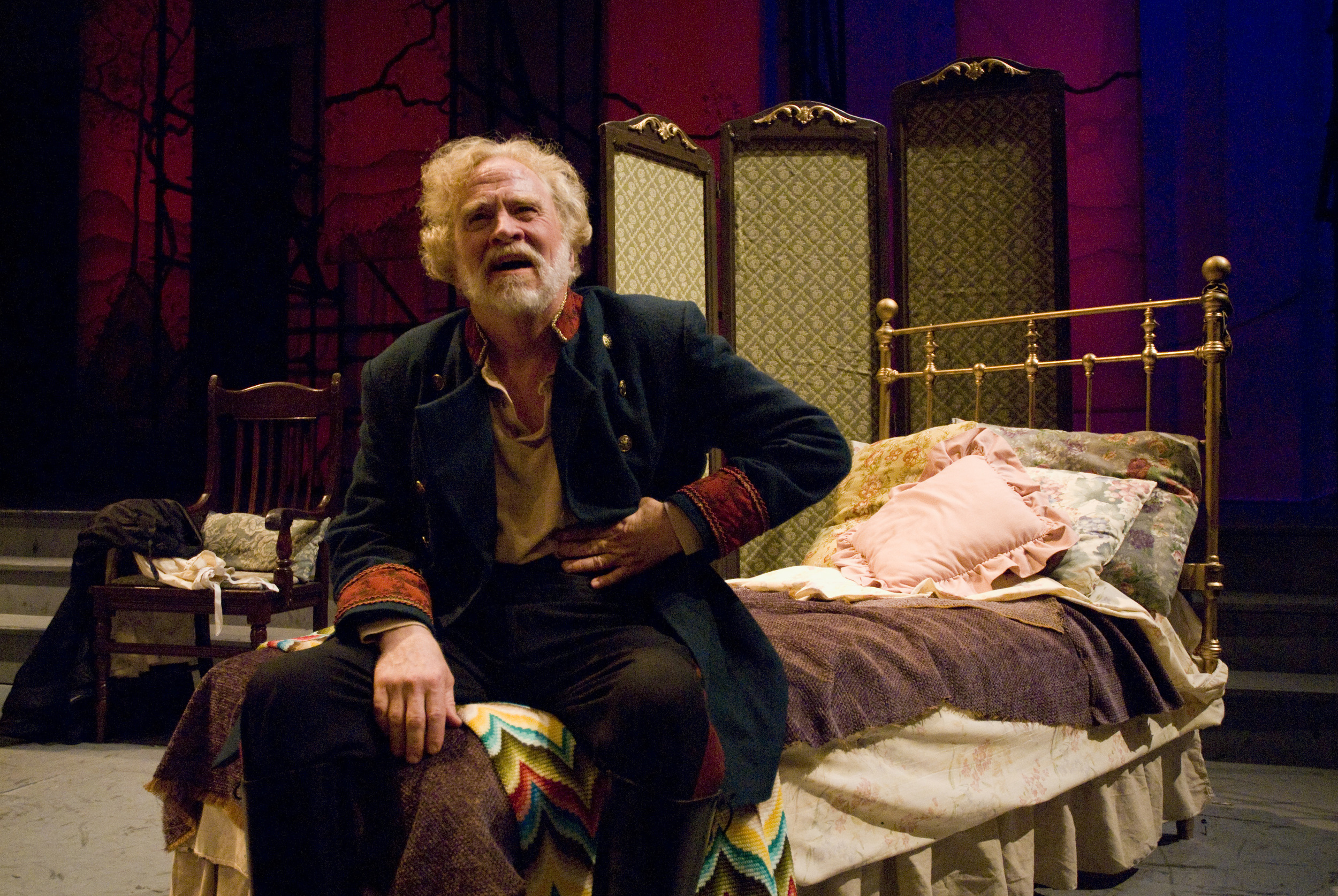
Real life.
The use of red as a foreboding color switched to the panels, and the blank back wall became the ominous black space.
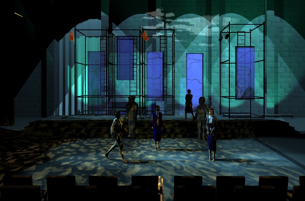
Top of Act 4. Not quite a recreation of the start of Act 1. We wanted the sisters to be in a world of dappled light, framed by the back wall and panels.
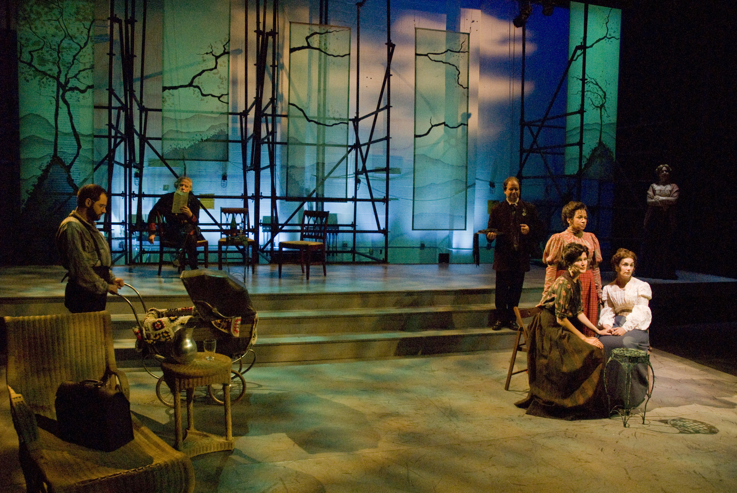
Real life.
The rest of the world is in the textured light, with the sisters (accented more than in the renderings) suspended against the sky.


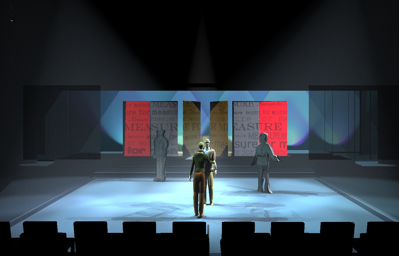
The other show in rep shared the space but different upstage arrangement. An RP plastic and scrim fly in downstage of the back wall (painted white so it now acts as a bounce for the RP. Six revolving panels (text on one side, mirrors on the other) each have their own color changing light.
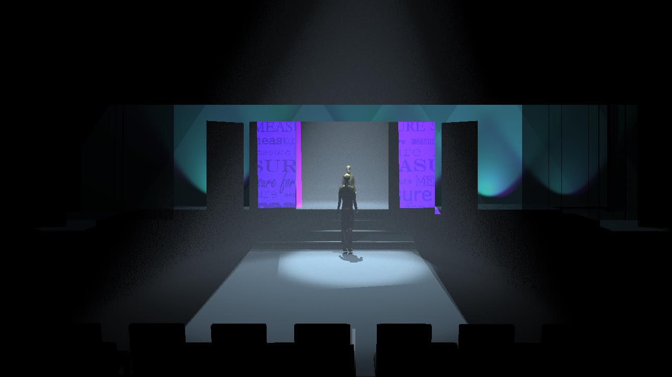
This is one of the first rough renderings. In this idea for the opening the Duke is introduced to us through his reflection in the mirror. The trick was to get the mirror texture on the panels to work like a real mirror. I got them to reflect images in them the right way, but ,alas, I never got them to reflect light back away from them.
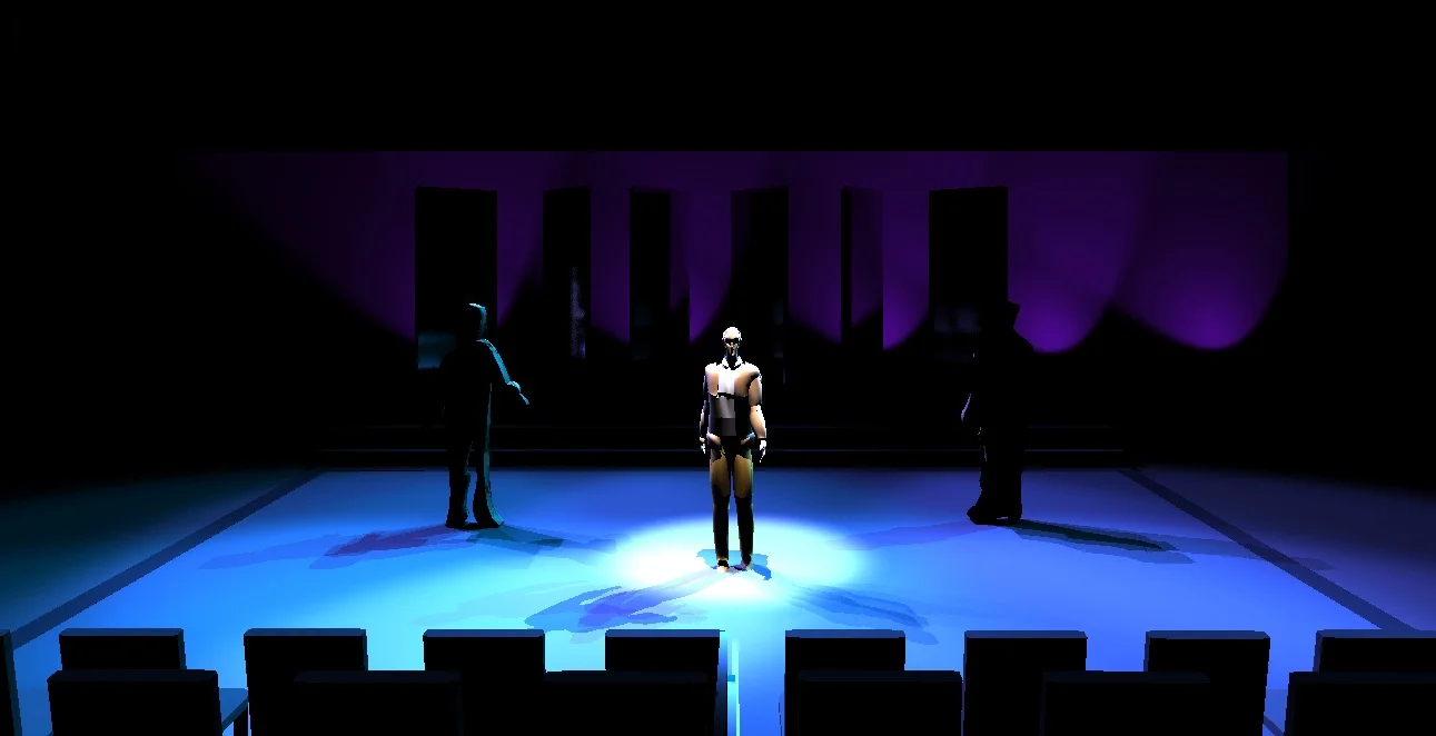
This was the opening that the director (Doug Wager) staged in rehearsal. AN isolated Duke with the panels turned to mirrors in a way to allow as much of the audience as possible to see the same thing. One of the initial tests was done in the virtual 3D environment.
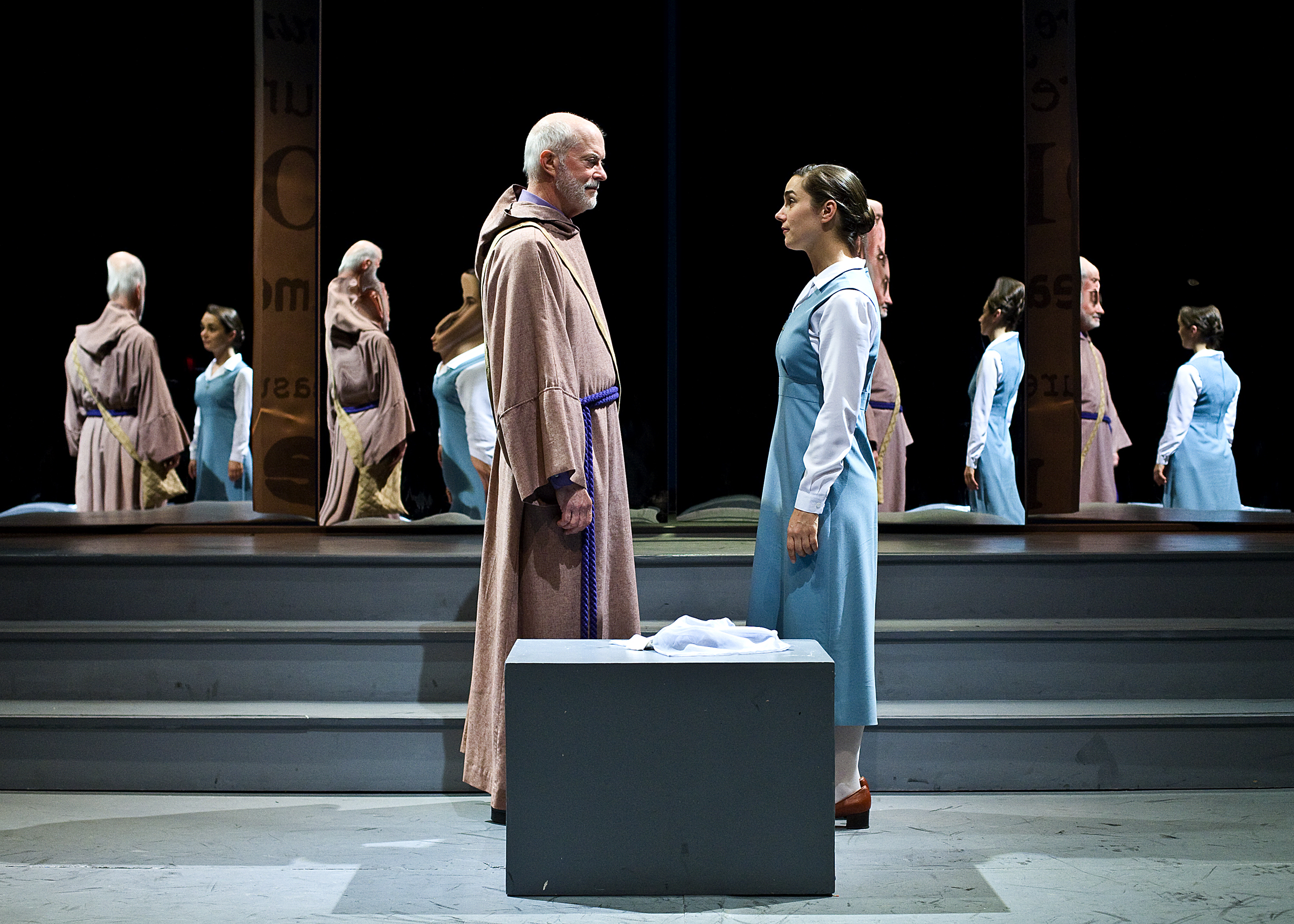
Real life
One of the tricks learned from the renderings was to keep the form lit so the mirrors could see it. It worked in real life, too.
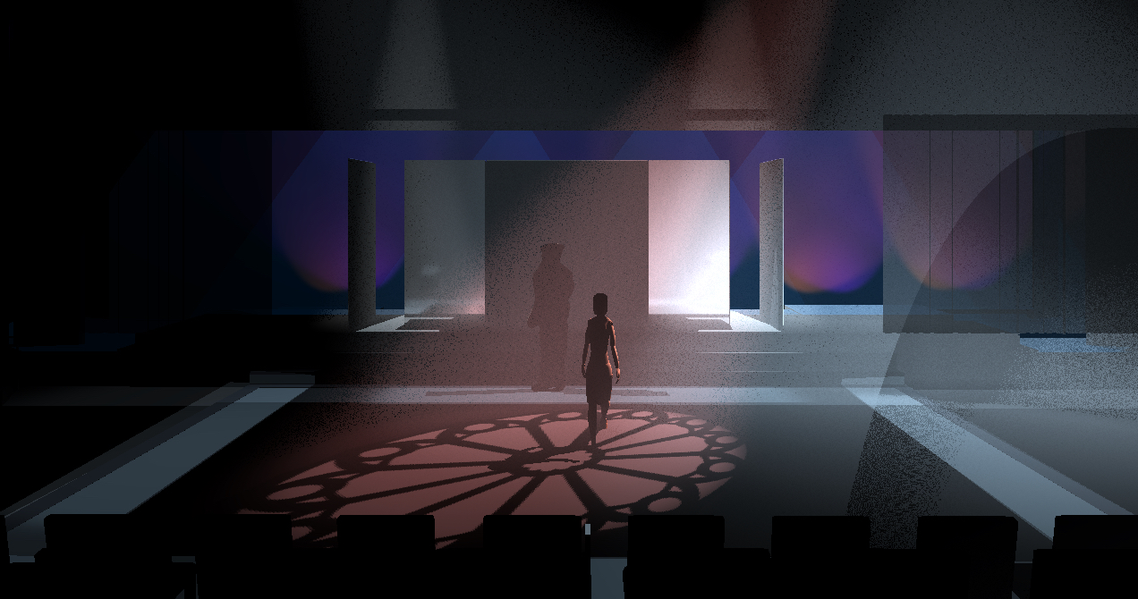
We fist meet Isabella in a soft, oversized window image.
I have a real life image, but there's a limit to how many times Genevieve Perrier can appear in an enticing diagonal backlight on one's web site.
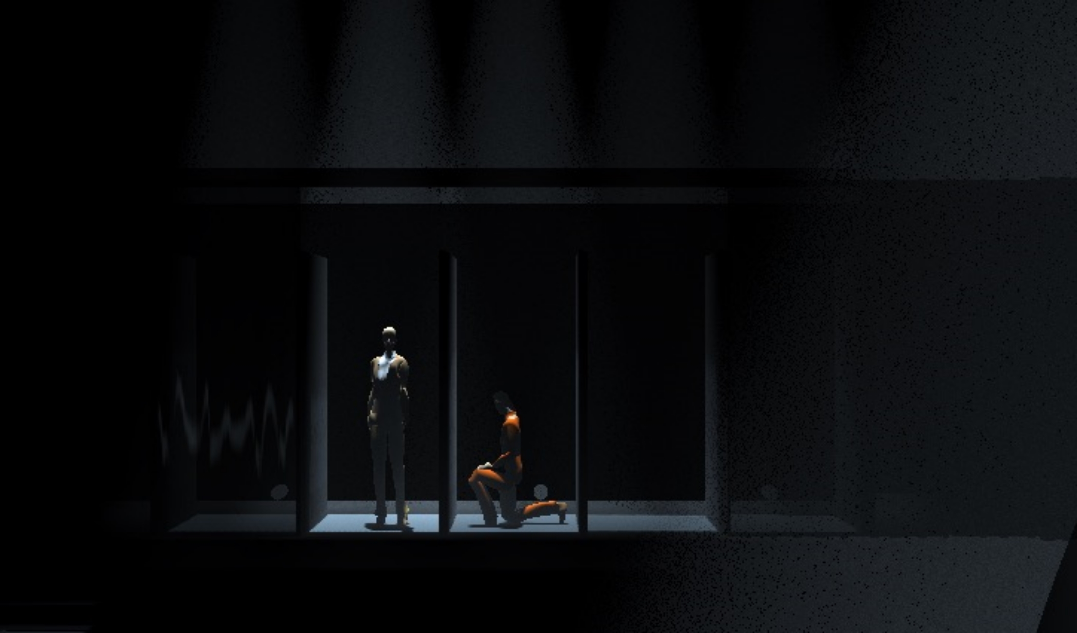
The jail scene. I used to 3D to see if I could really make tight, isolated shots. It solved several problems that wouldn't have been found out until after we got into the theater.
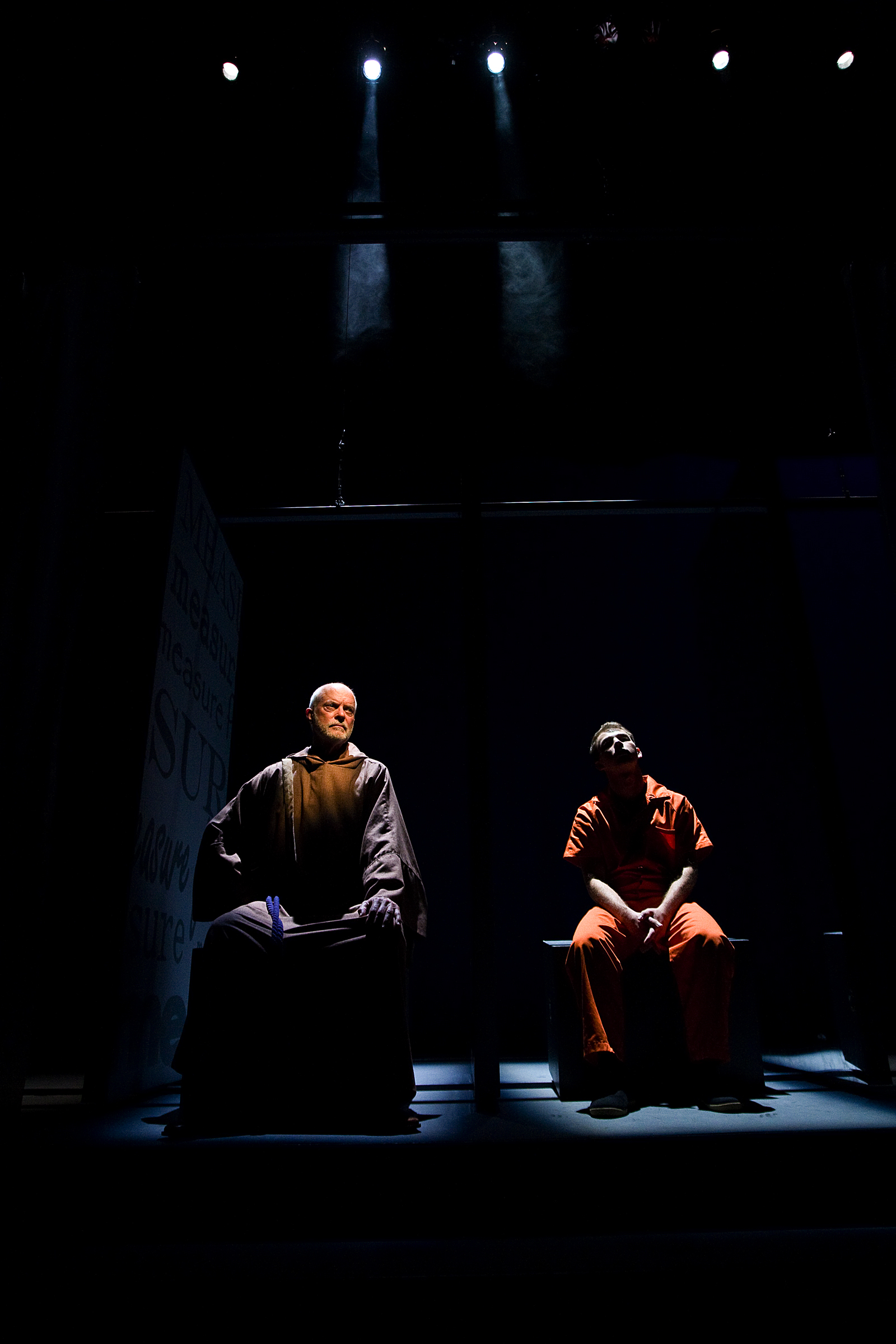
Real life.
Dan Kern doing it proper


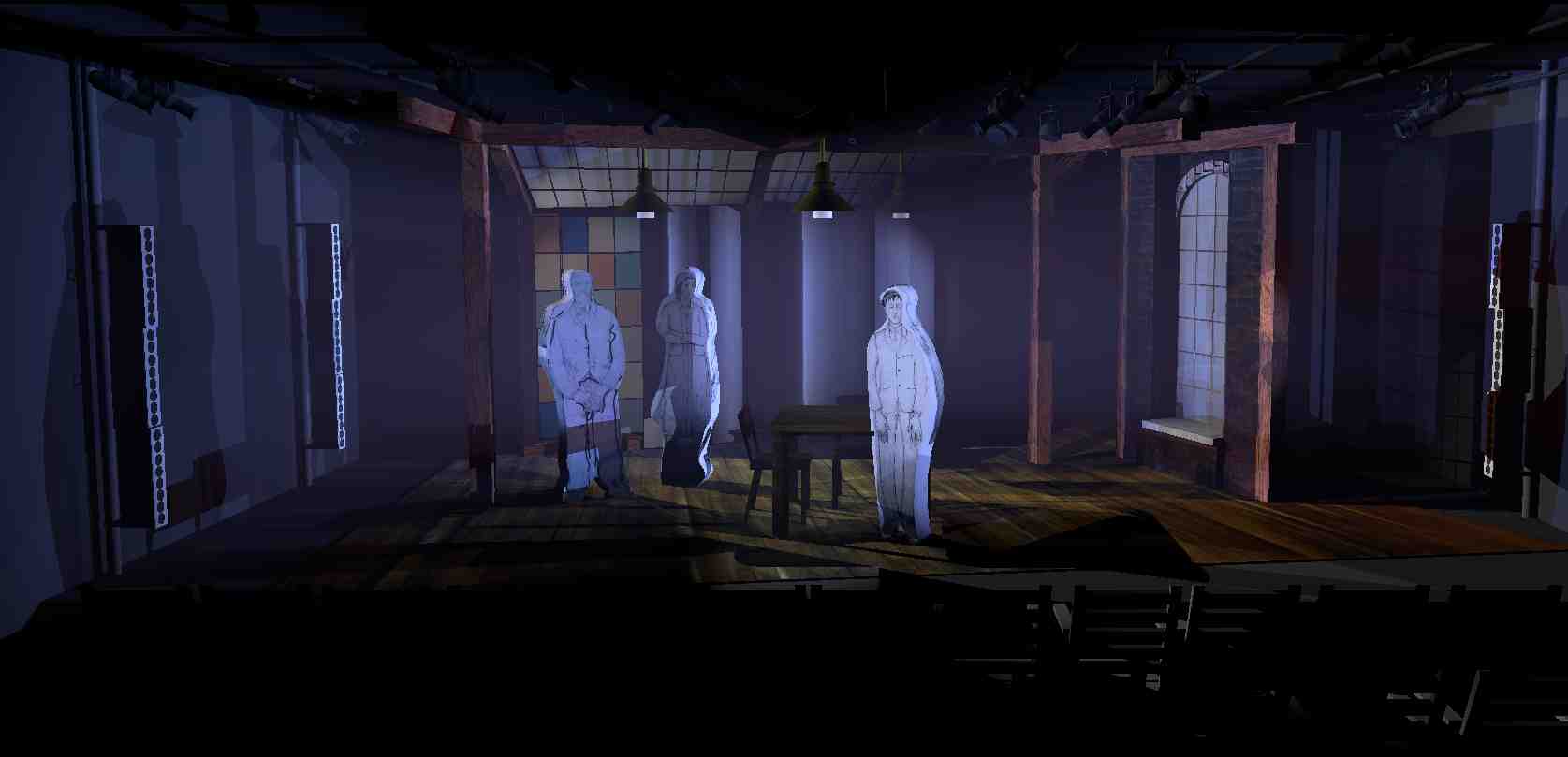
I created a fairly complex 3D set based on the set designer's (Dan Conway) drawings and paint elevations. The upstage part of the set is a window wall of individual window panes in the color to match the elevations. I had originally drafted it as one piece with a scan of all the windows on it. That was simple and easy, but didn't look right with how I knew I would light it. I ended up making each one individually. It took a lot of time, but the end result was much more truthful.
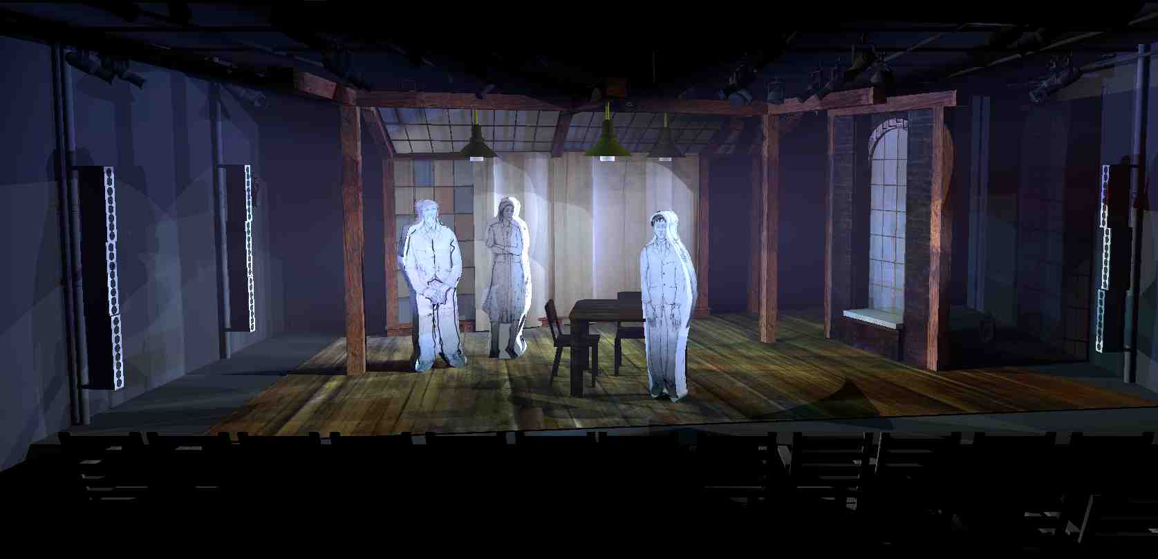
The vertical strip lights that are visible at the sides were cut in the theater. What was able to be examined in the renderings is the direction of light (which always seemed to feel best from the SL window) and the difference on the upstage windows when lit from the from of from behind. The overhead practical lamps...I made my own symbol that fit around the emitter so it would actually light up when the light was on. Some of the scenes were going to be shaped by what overhead lights were on.
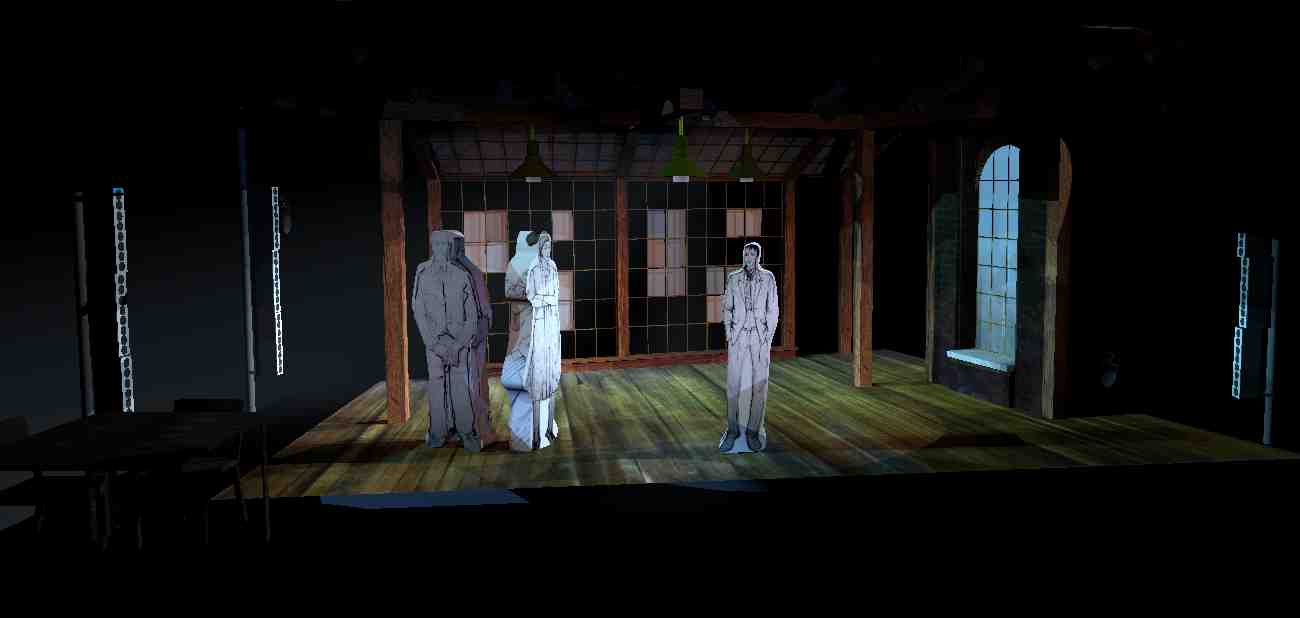
The director (Aaron Posner) wanted the window wall to resemble paintings on the wall for a gallery scene.
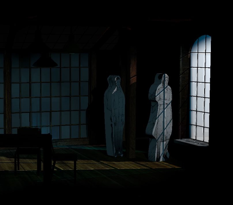
I worked very hard to find the best angle for the few lights coming through the window. Inventory and space were limited, but each light was for different moments. I could figure out the best placement well in advance.
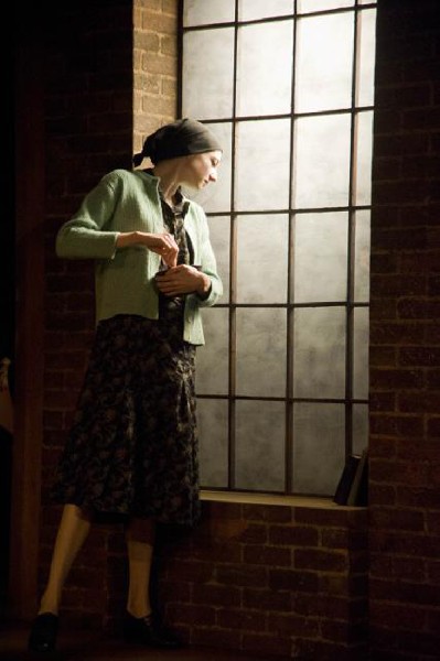
Much better in real life.
The angles of light across Riva's face for these moments were accurate to the renderings and became key lighting moments.
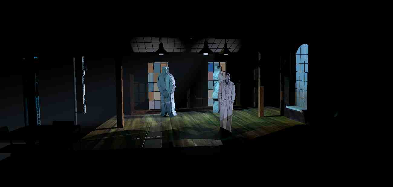
And then the shapes would resolve into a shape to frame two upstage characters as they see paintings of themselves that they weren't expecting, shall we say....
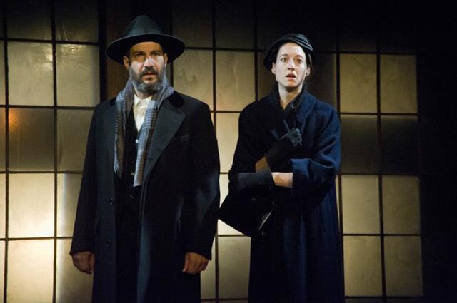
Real life.
Asher's parents at his gallery opening.


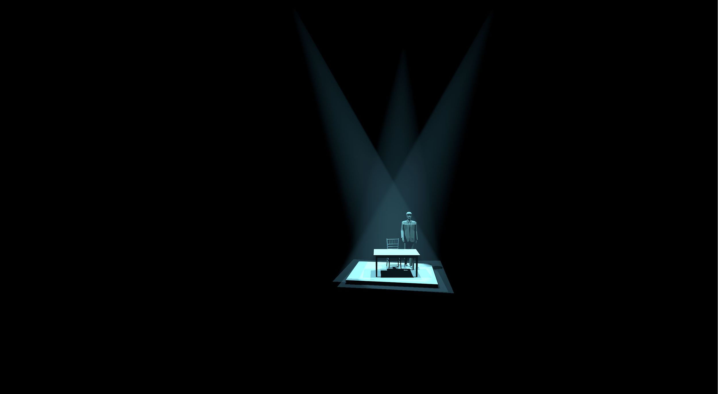
The director (Michael Garces) called our preliminary ideas "lighting strategies." I totally dug it. We had no idea what the story was going to be, but the design for most of the story is anchored on the platform in the middle of the stage. We came up with something that kept it contained and isolated and gave us flexibility of color.
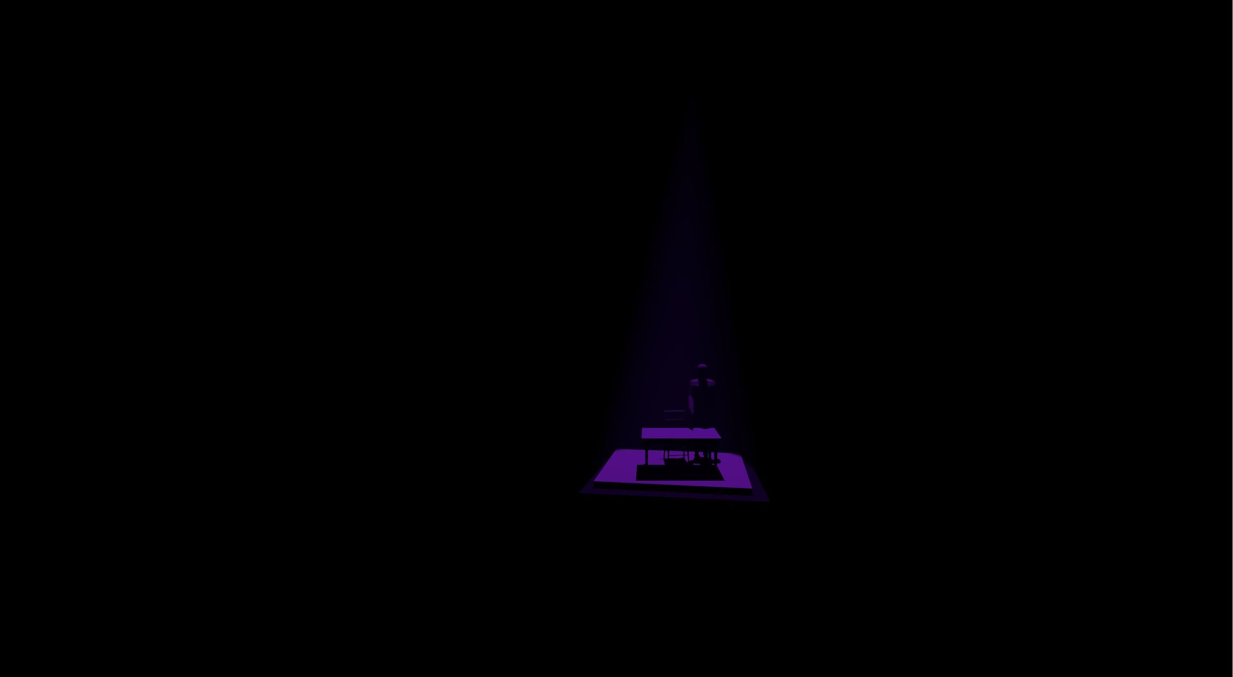
Should Prince come into the scene, I wanted to make sure we had lavender.

Squaresville
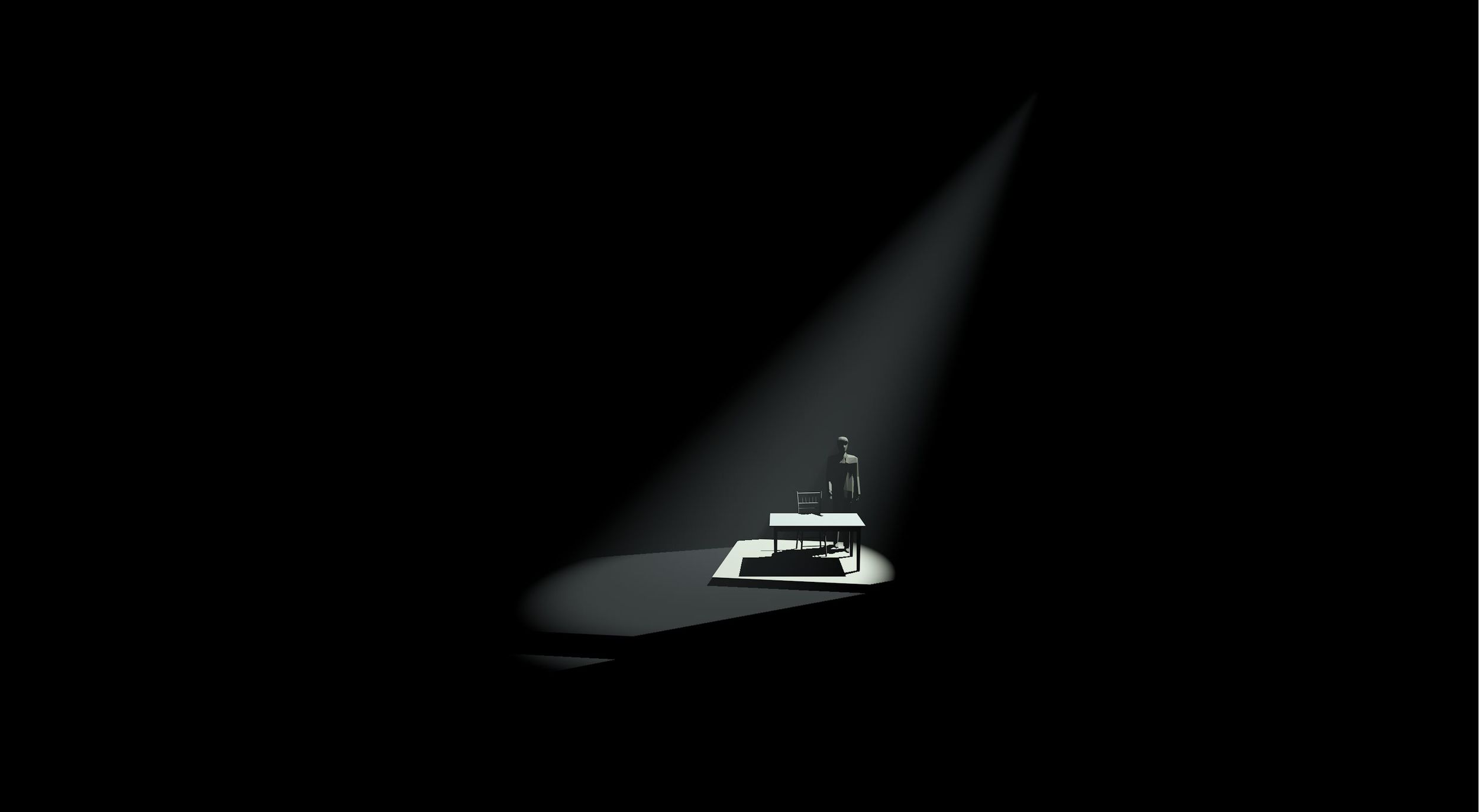
This light came in very handy in the show. A couple shutter cuts and a soft edge and it helped provide one of the strongest visual moments in the play.
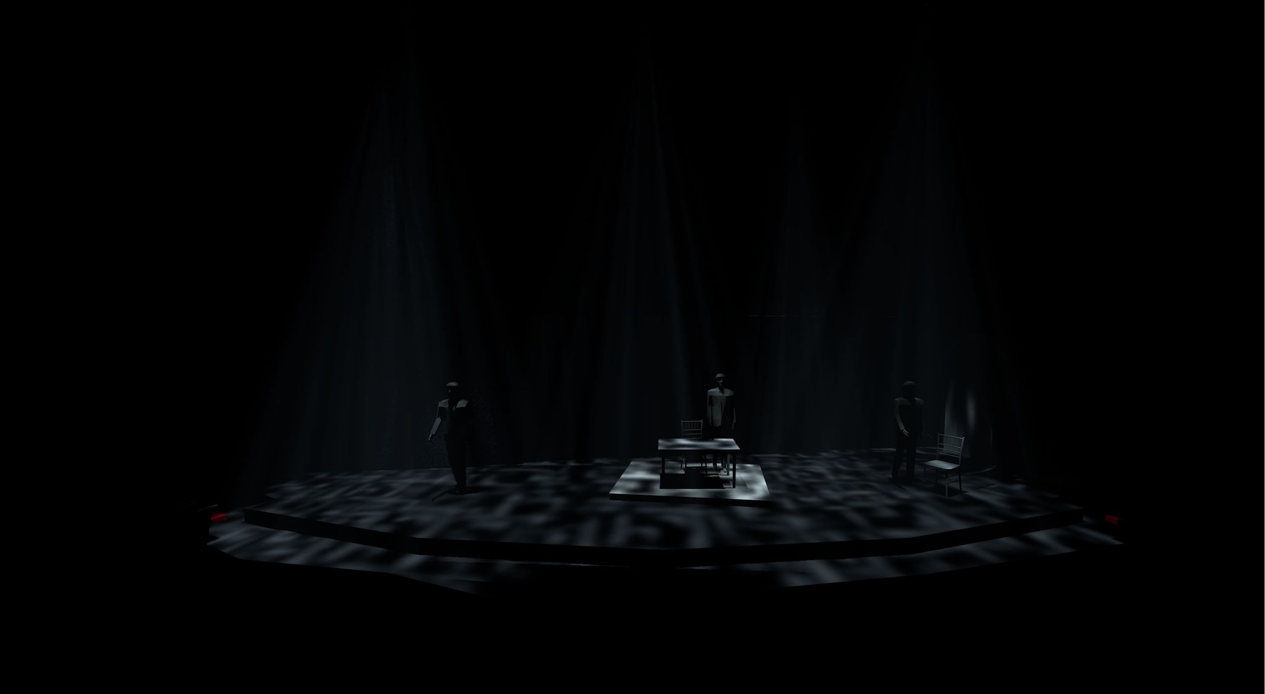
These templates were part of the language of reality/removal in the story. To create the appropriate edge (I knew I wanted a soft edge but Vectorworks really doesn't provide that option) I took an image of the template from the manufacturer's web site, photoshopped a softer edge, and imported the softer image as the template for the rendering. It was worth it.
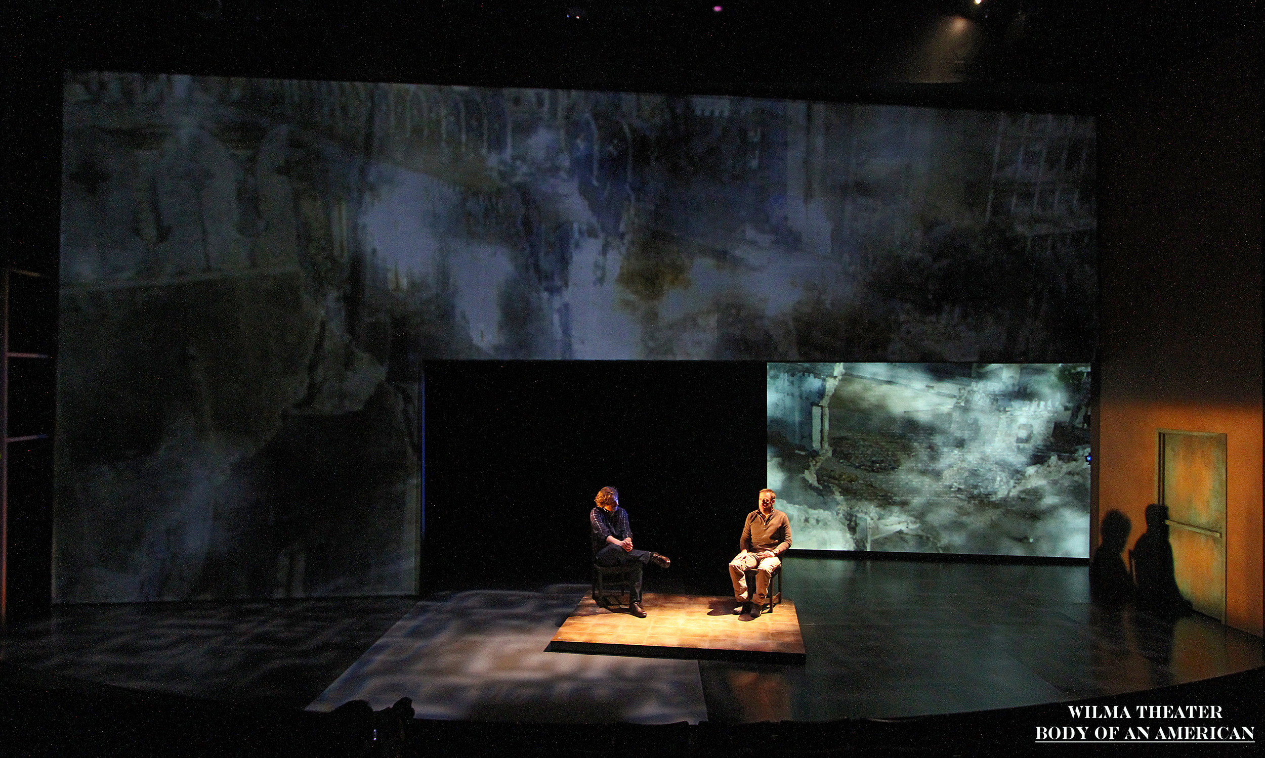
Diagonal backlight with the soft template. The projections (Jared Mezzocchi) kick ass.
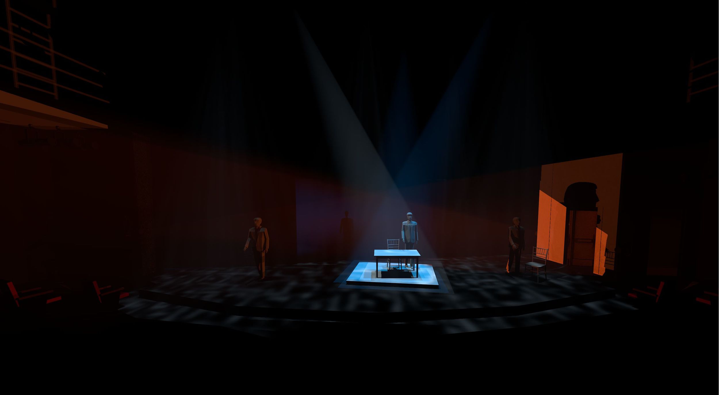
Just playing with the relationship between the island, lights that just light the bodies, and the negative space.
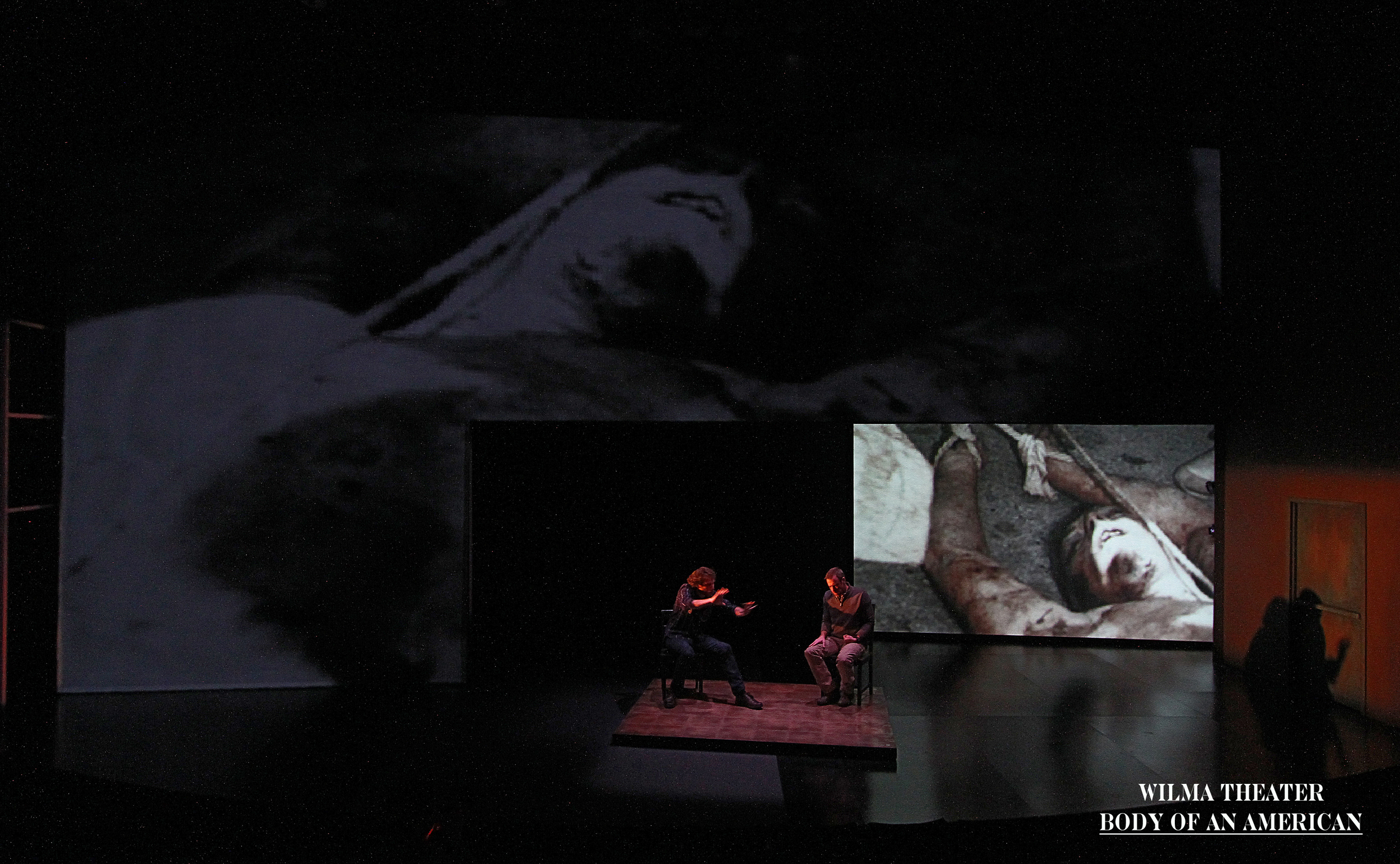
Same ideas....different colors.
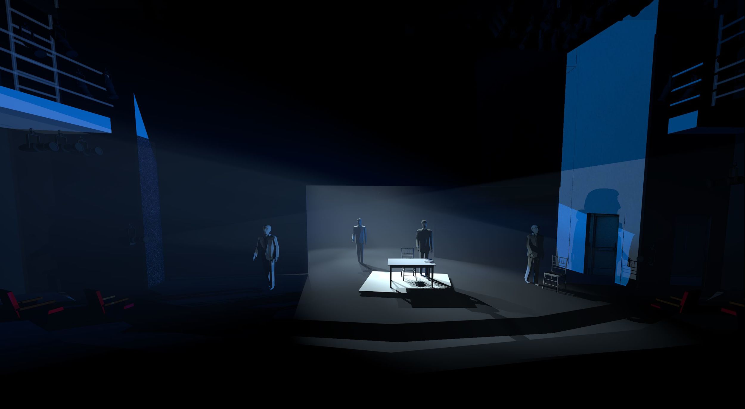
more playing
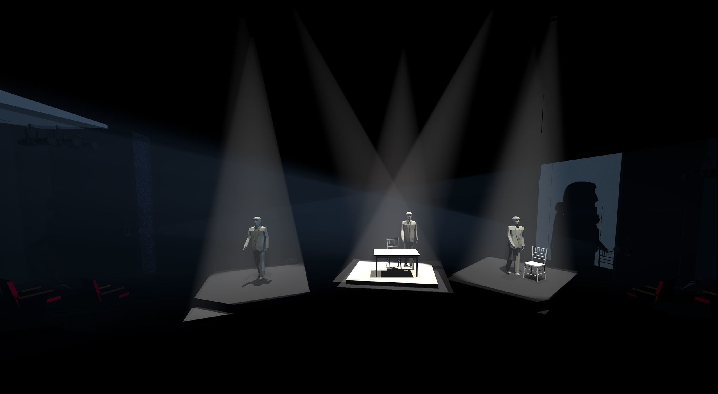
An idea that was used for one of the final scenes.
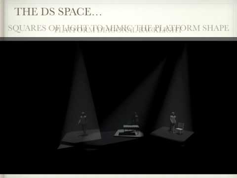
This is an animation of the keynote/powerpoint that I did for the director.


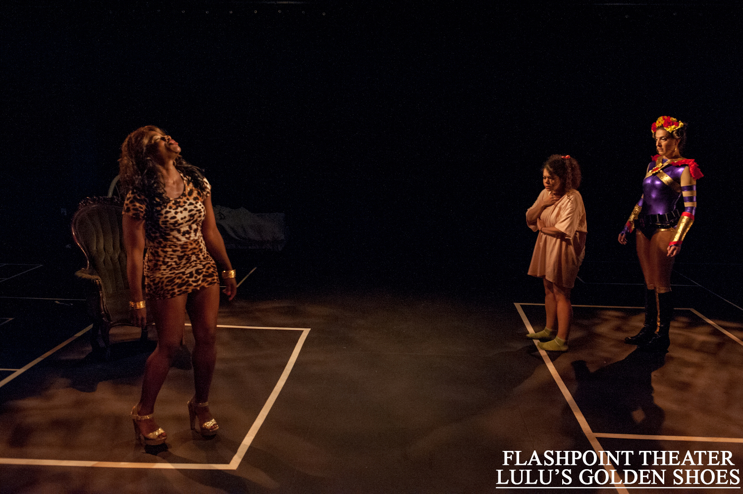
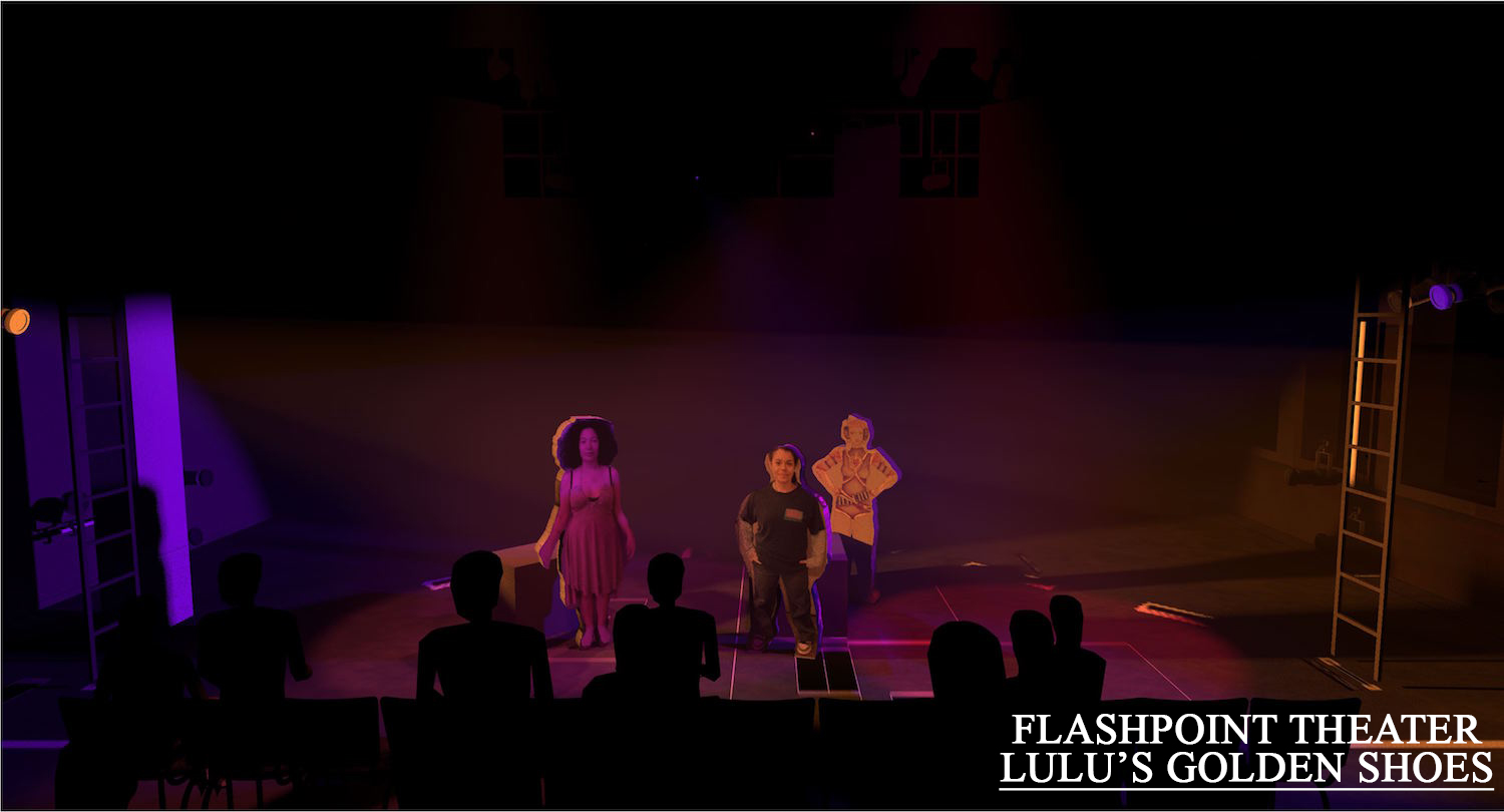
Low angle and very saturate for the magical world.
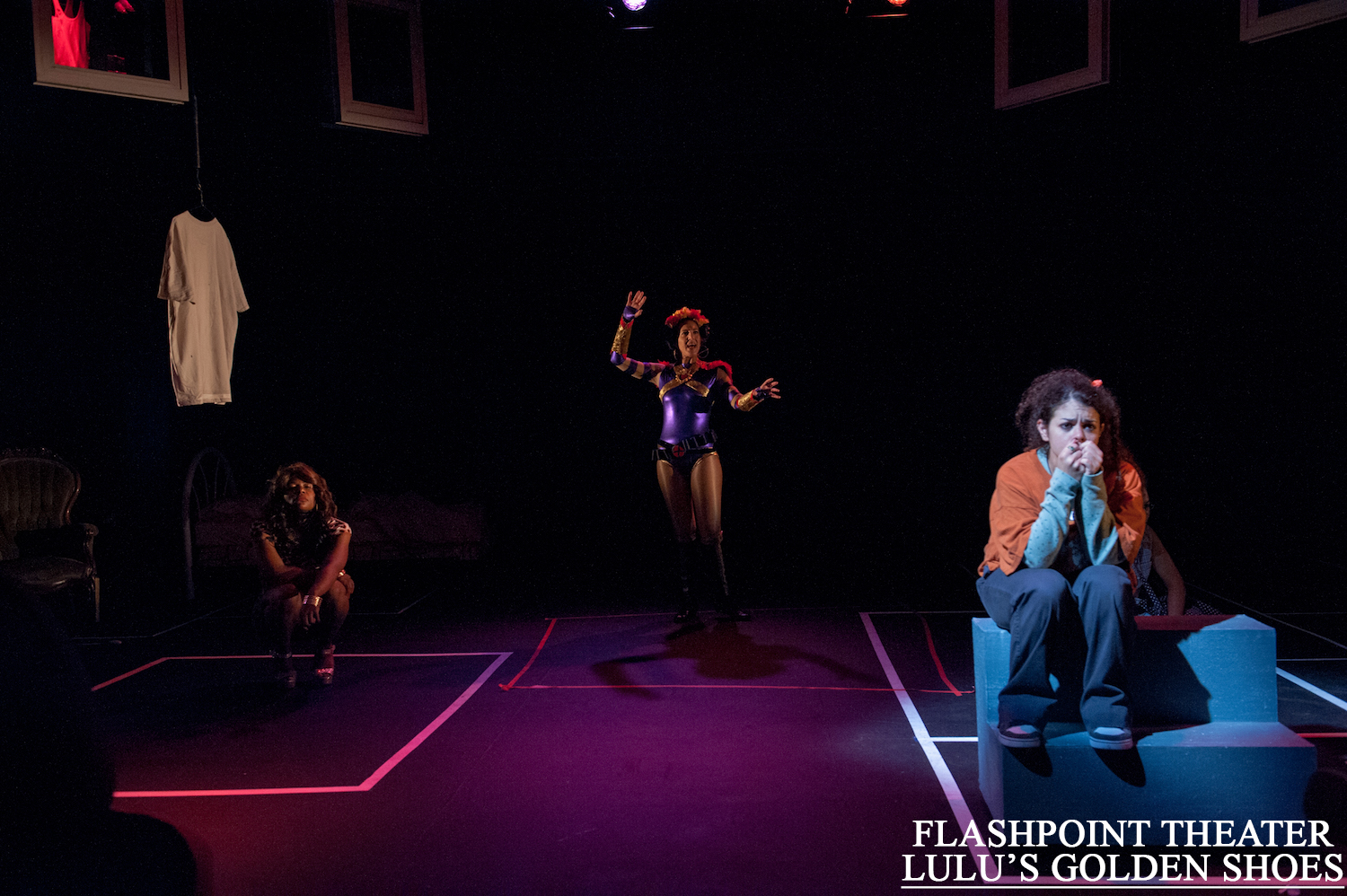
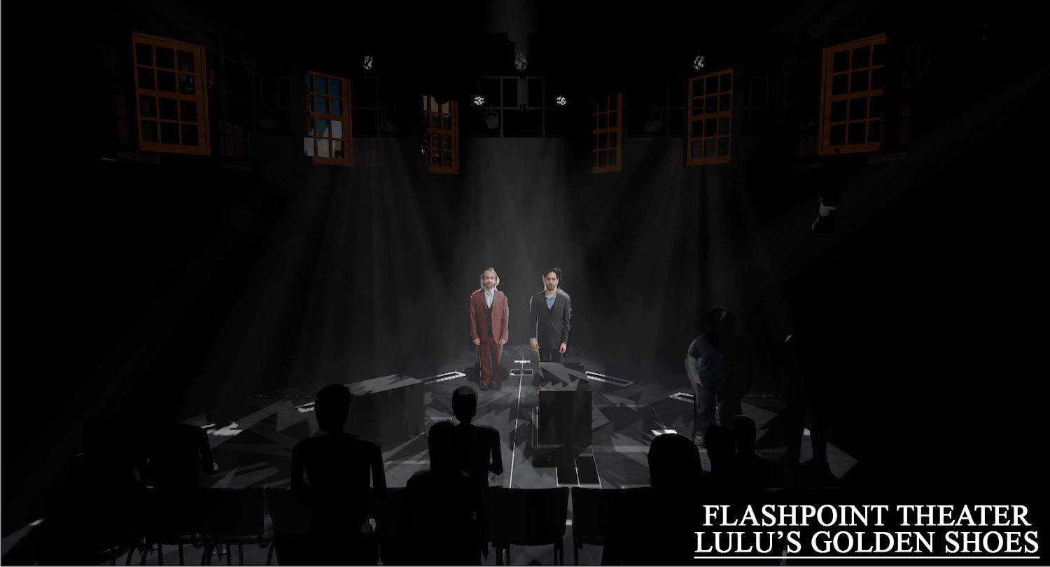
Sharp stark templates for the evil dudes.
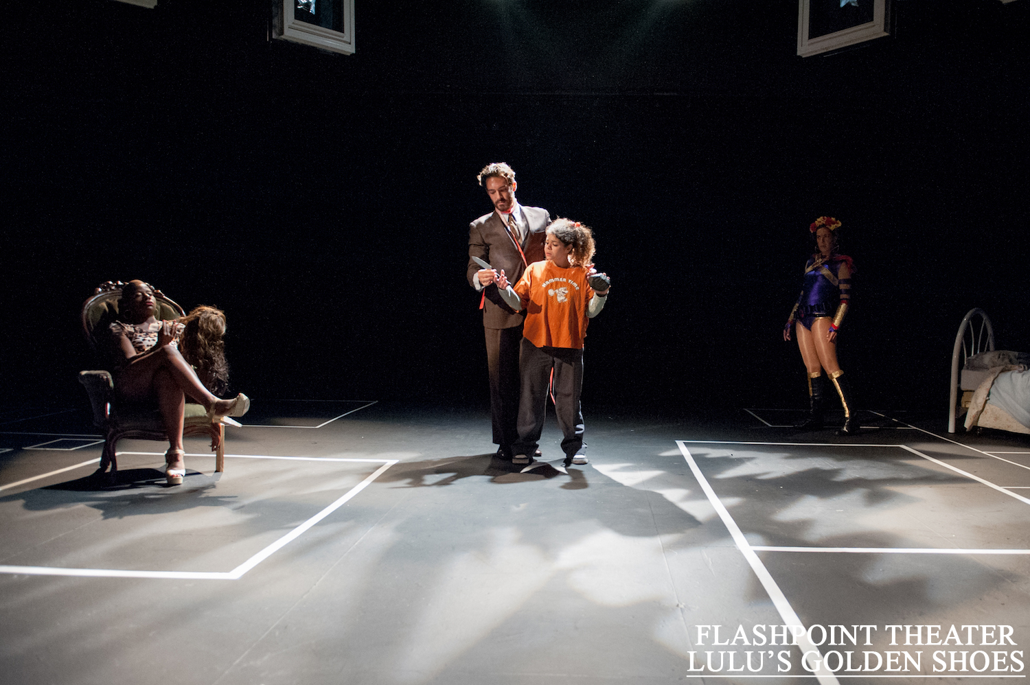
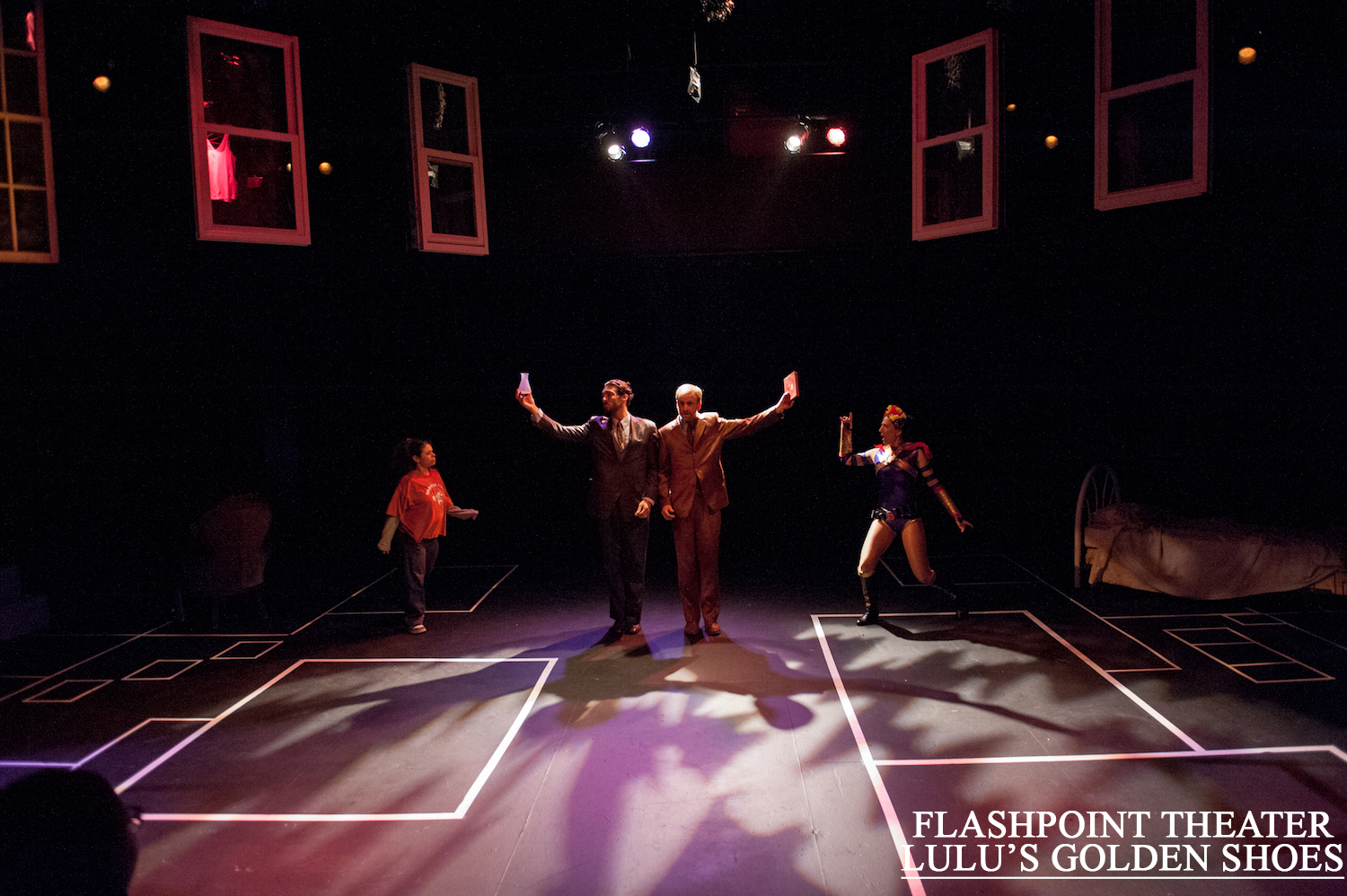
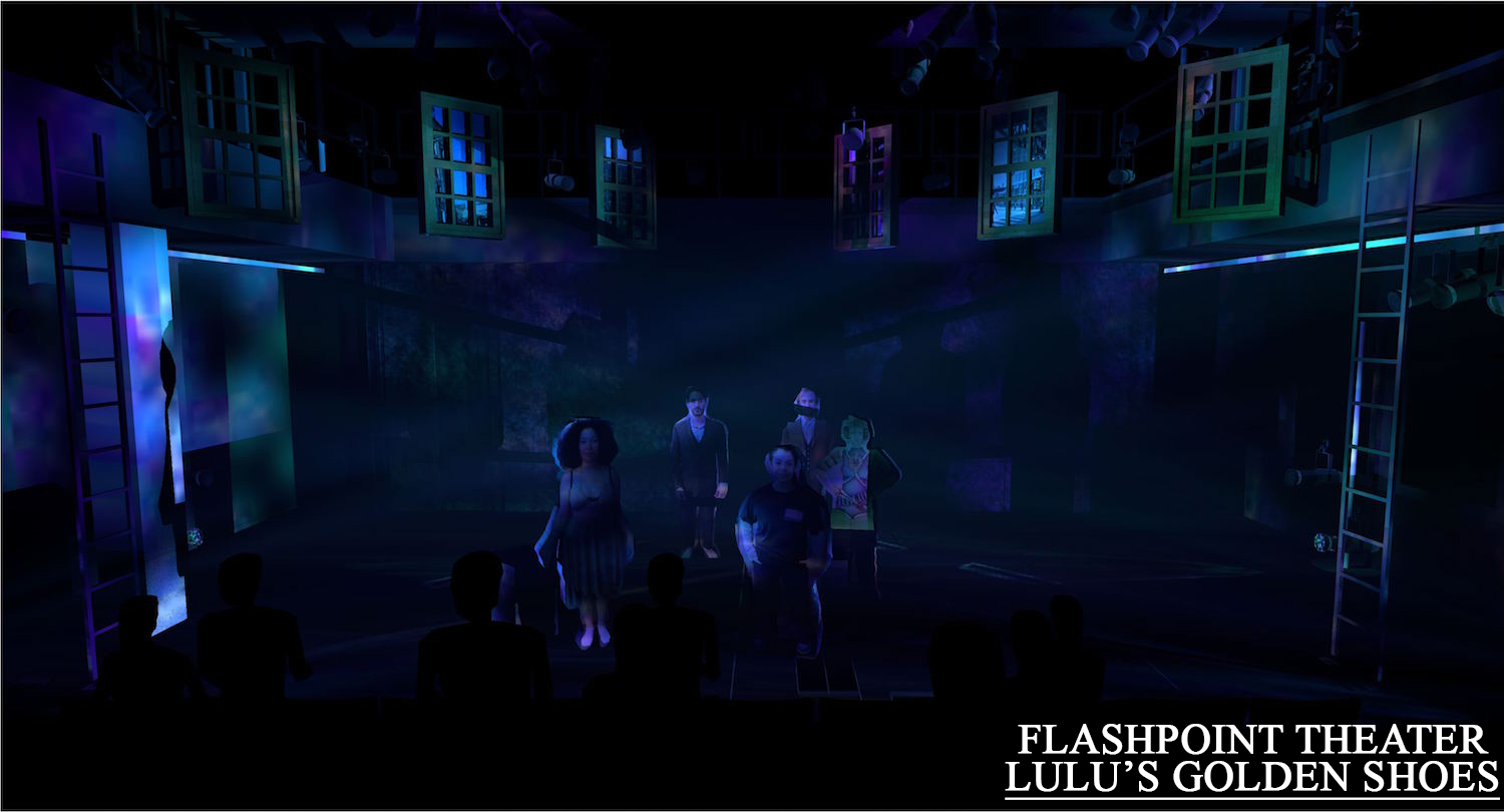
Low angle and unique colors for the river world.
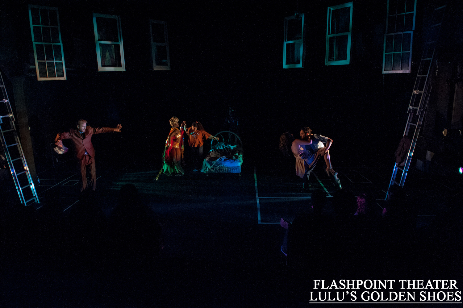
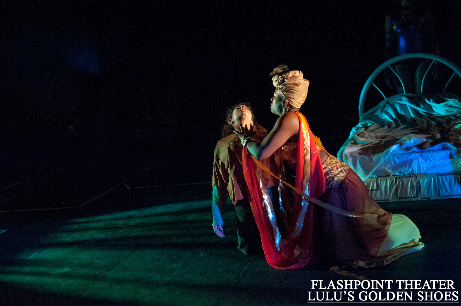
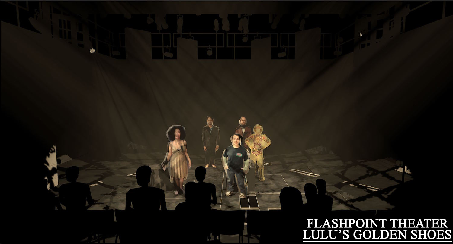
This is one of the first renderings I did for director Brenna Geffers. I took the costume designers renderings and costume pictures and created the little cutouts. Since the space was so even and minimal, I wanted to convey was how certain moments would be textured to help show different worlds. Set by Thom Weaver performed at University of the Arts.
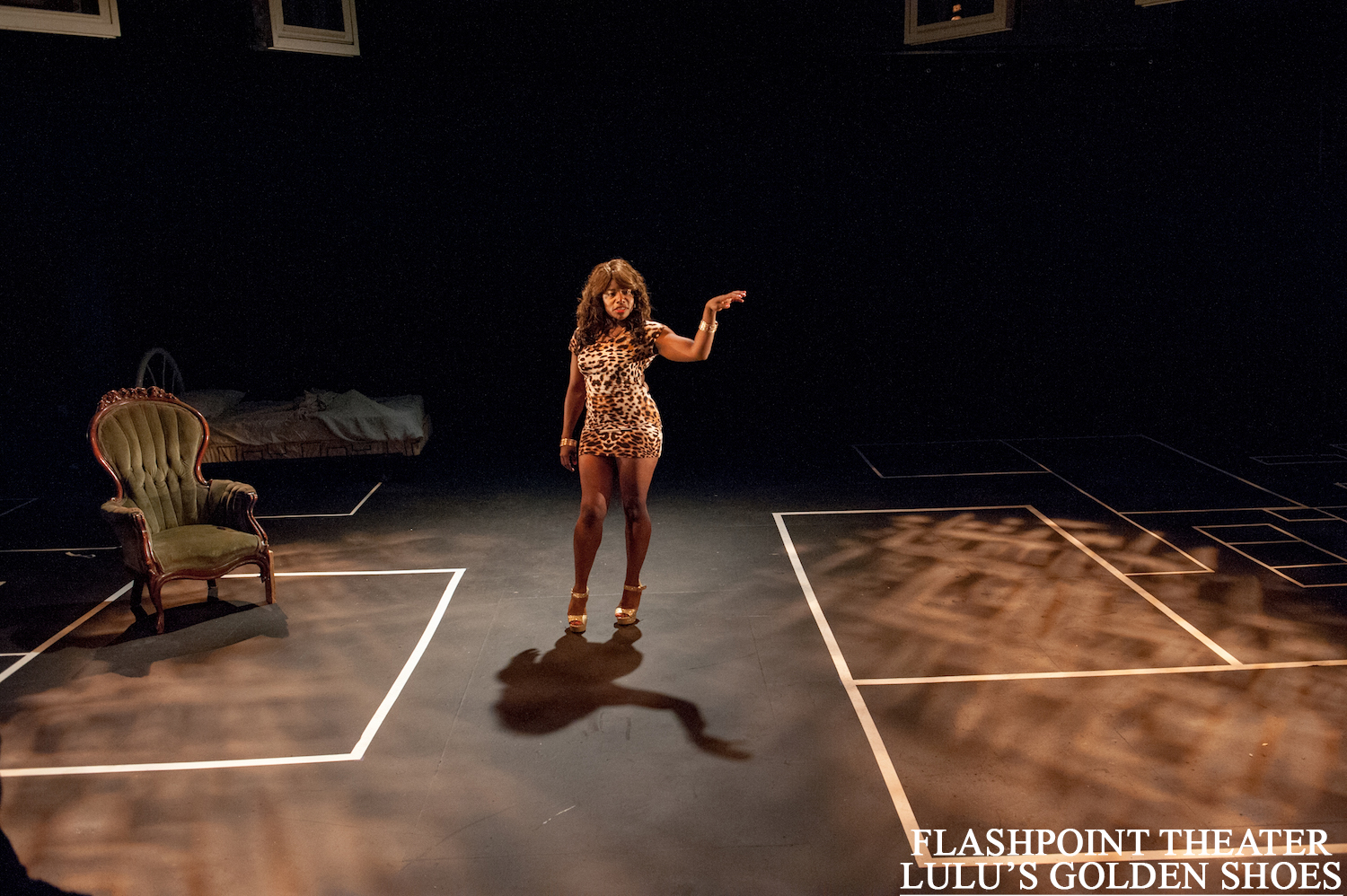
And in real life.


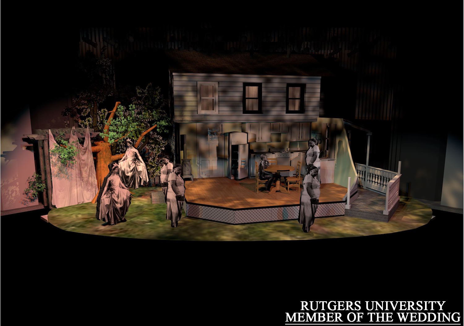
"Member of the Wedding" at Rutgers- Camden. Along with character cut outs from the movie, I started softening my template symbols to get a more accurate look. The rep plot used was limited to mostly front of house, but it allowed me to see what would work best after a series of comparisons.
Directed by Jesse Bernstein, sets by Jim Lamont.
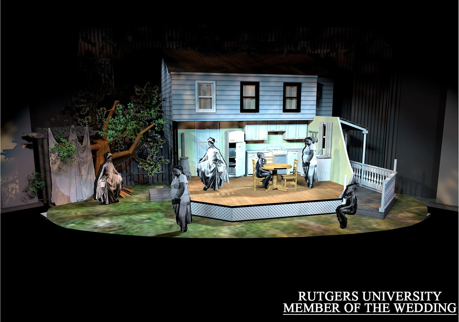
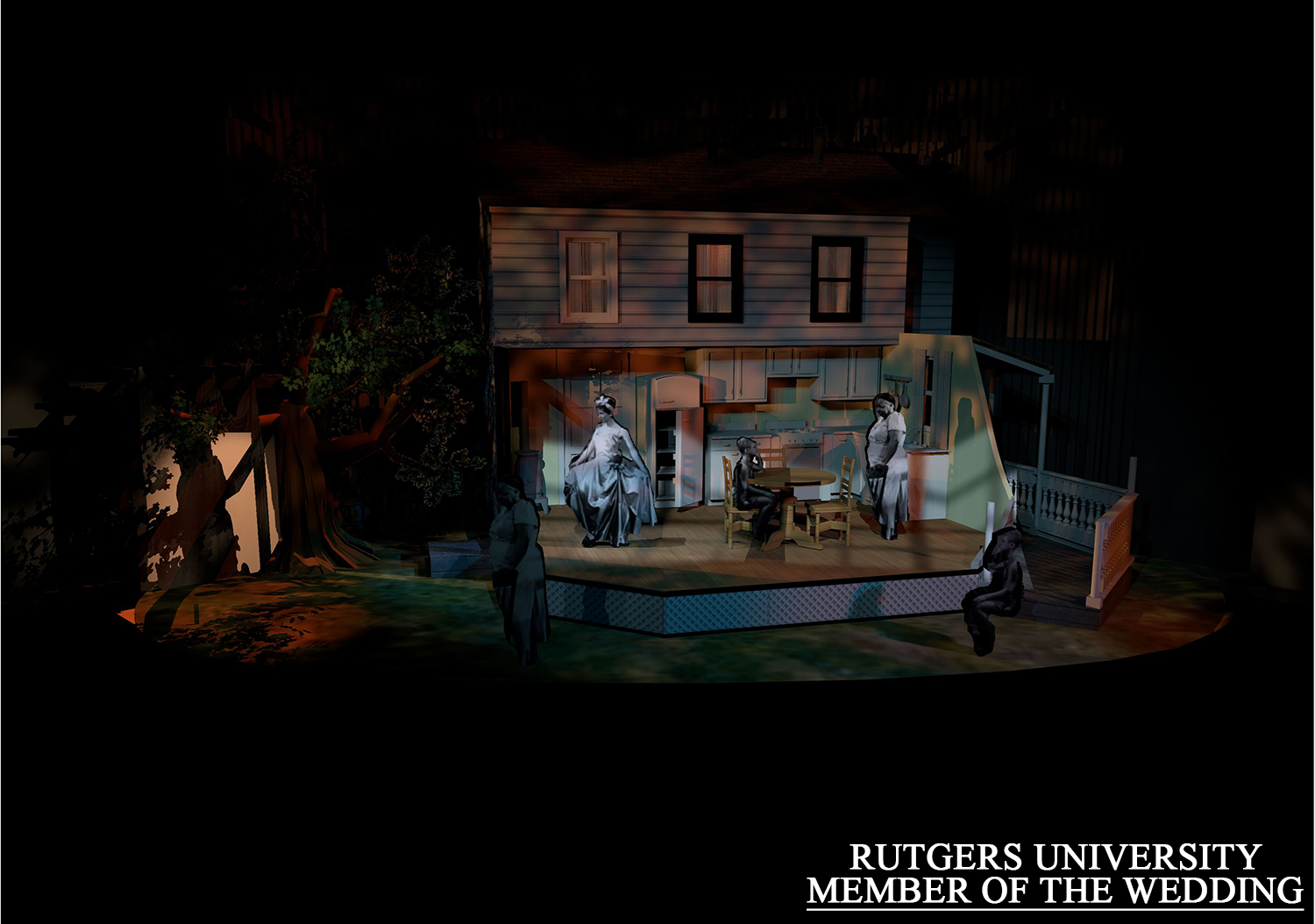
Part of the memory world were shadow projections SR in the garden.
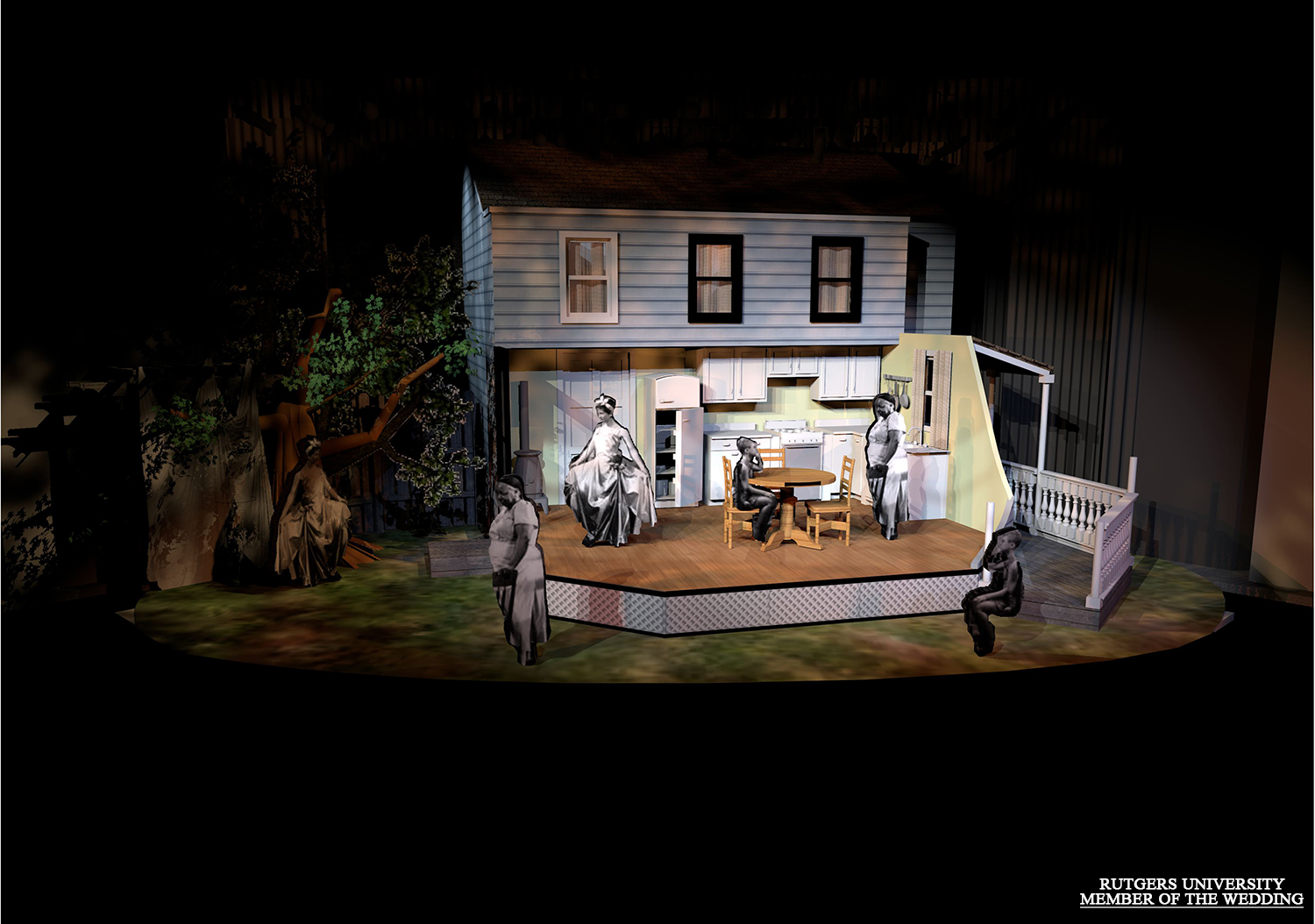
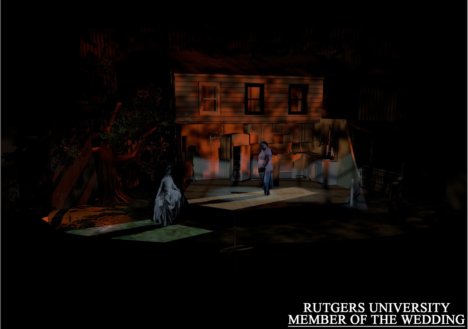
Final isolations on the two characters framed by the house.


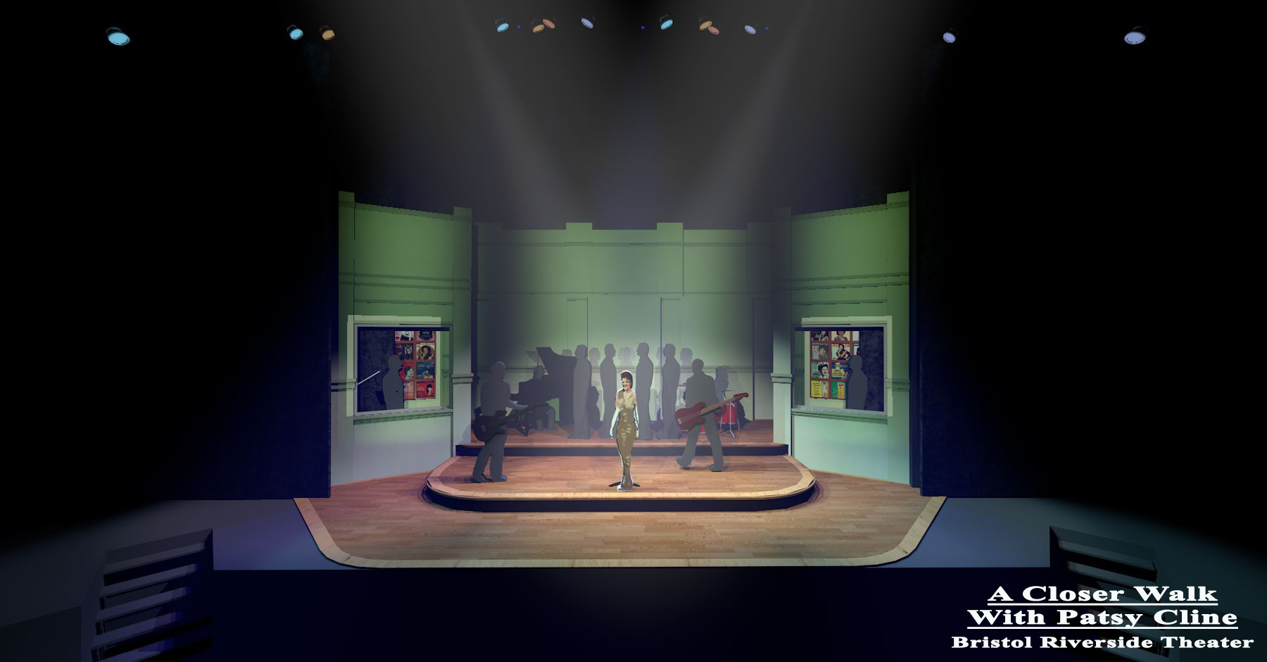

Three systems that then create a location.
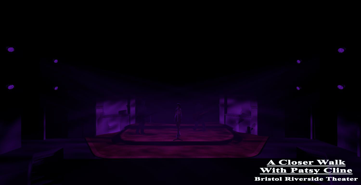
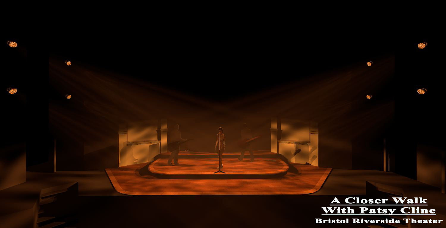
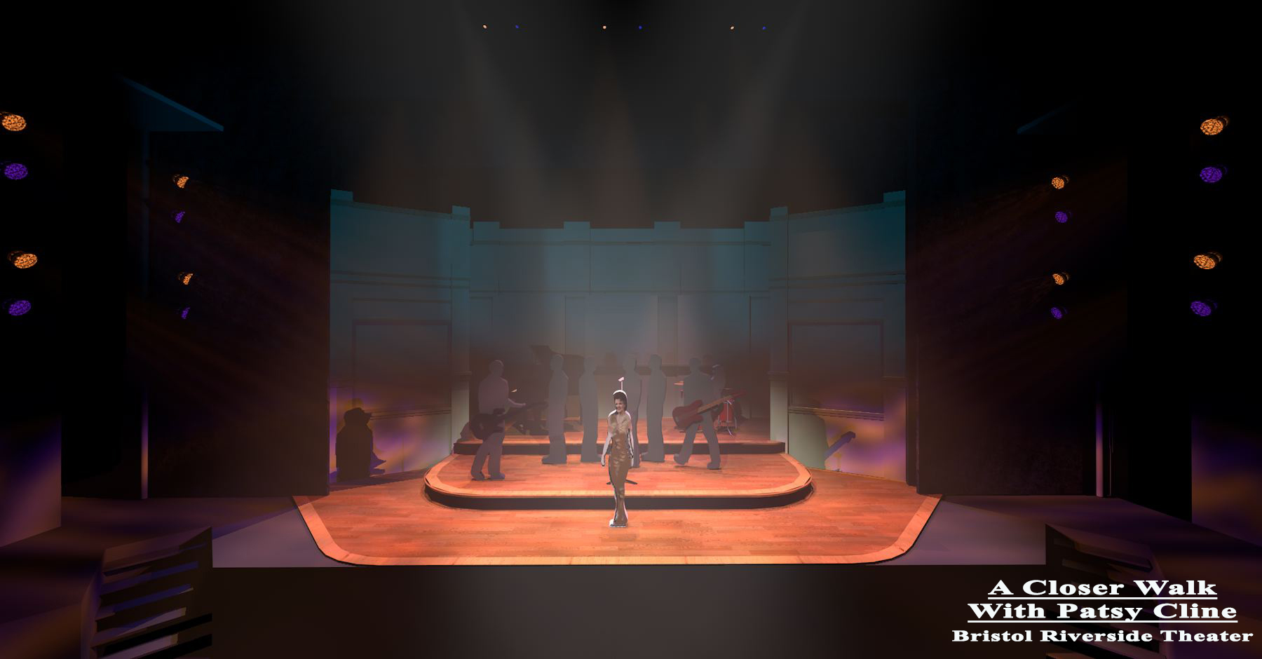
And all together they work like this.
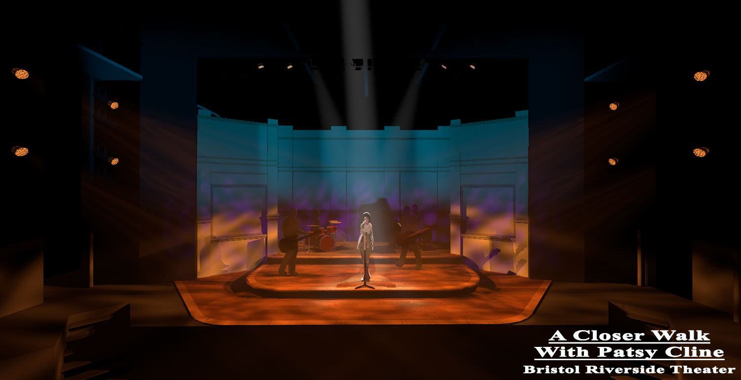
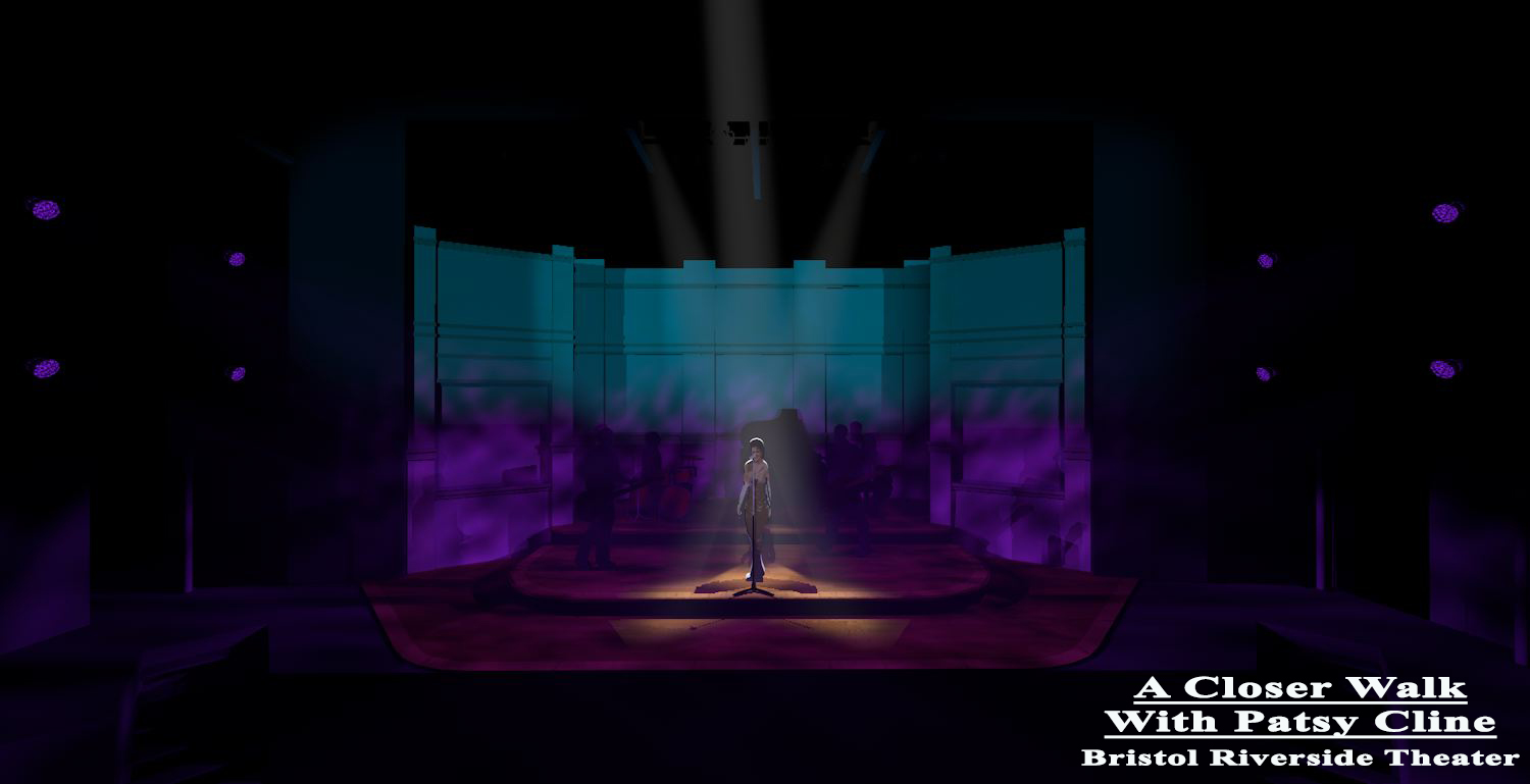
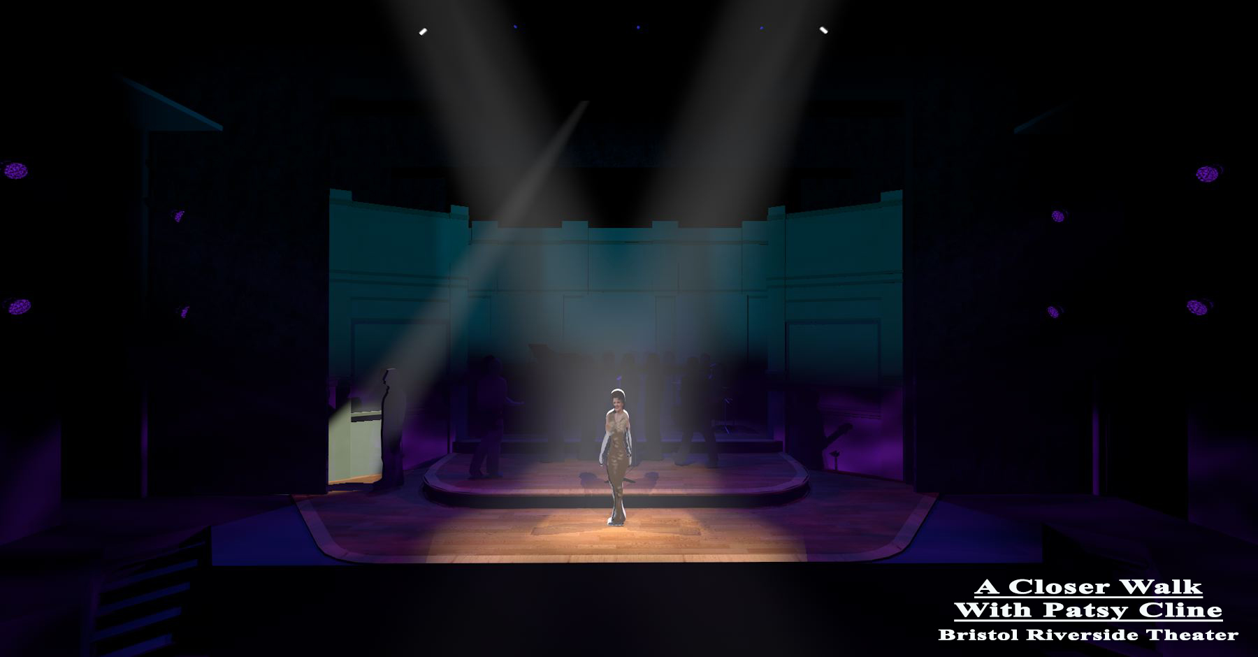
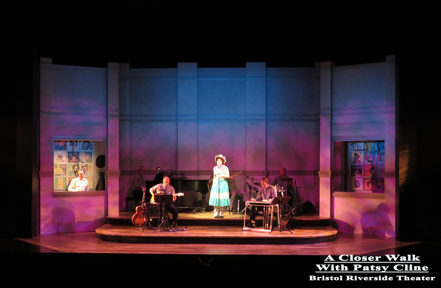
And in real life.
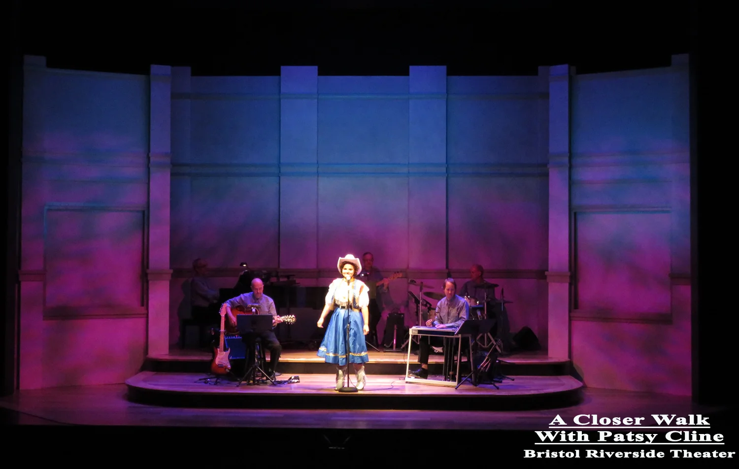
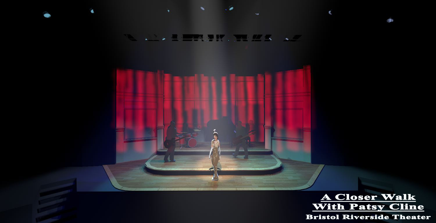
At the Grand Ol' Oprey. I wanted to suggest an abstracted red barn motif like the one used on the TV show for many tears.
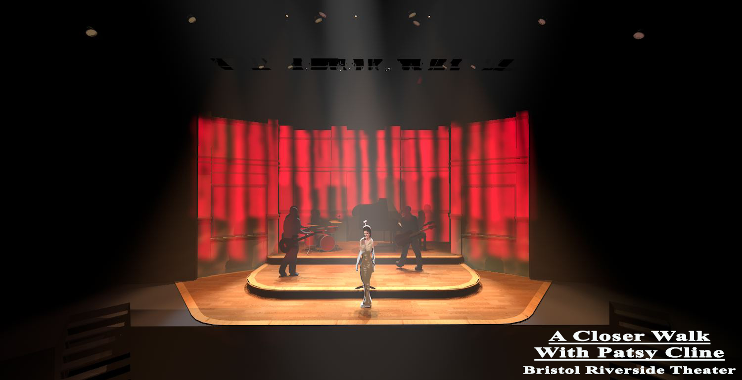
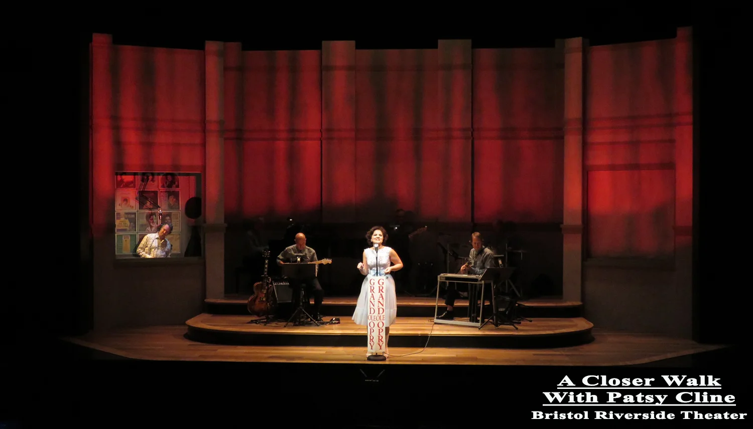
And in real life.
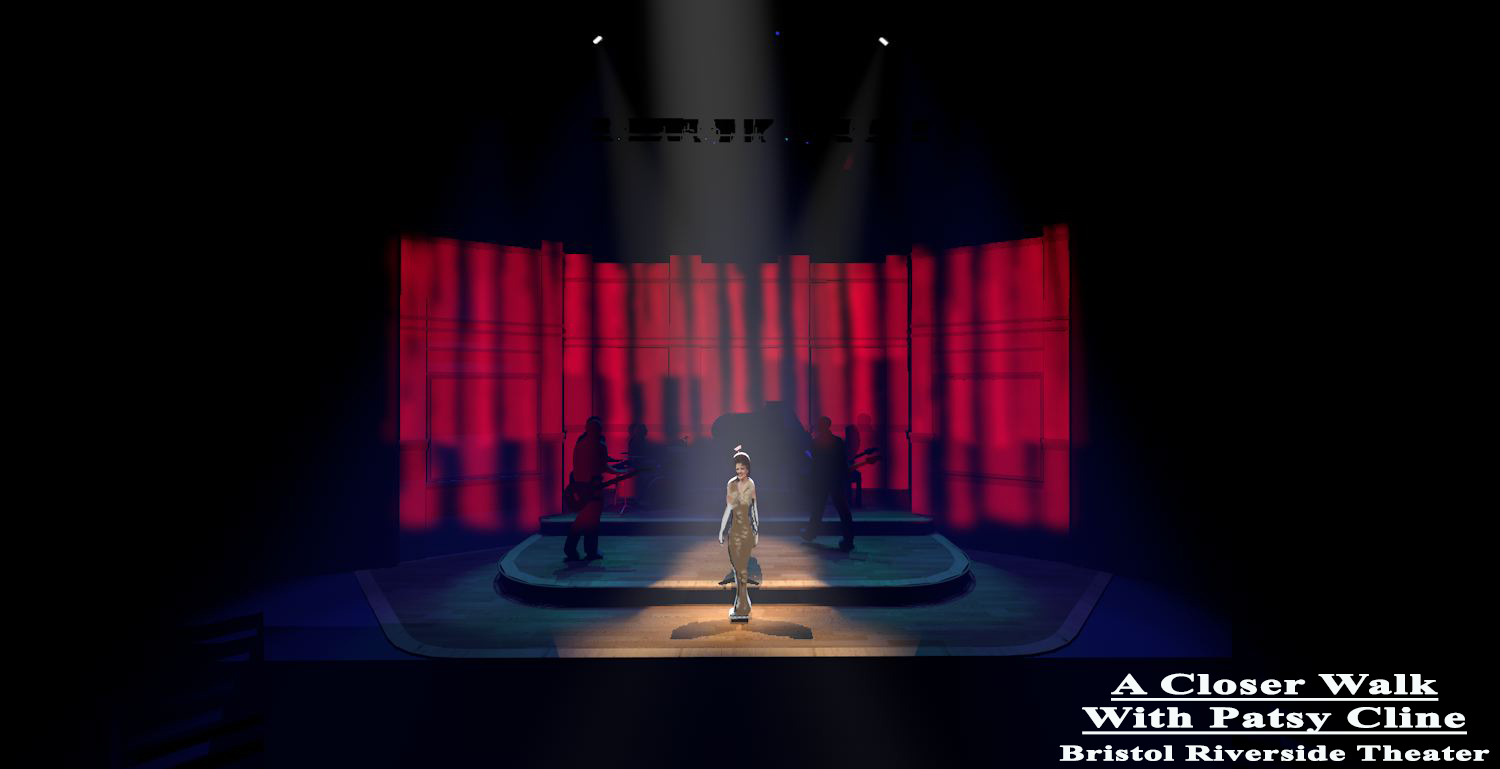
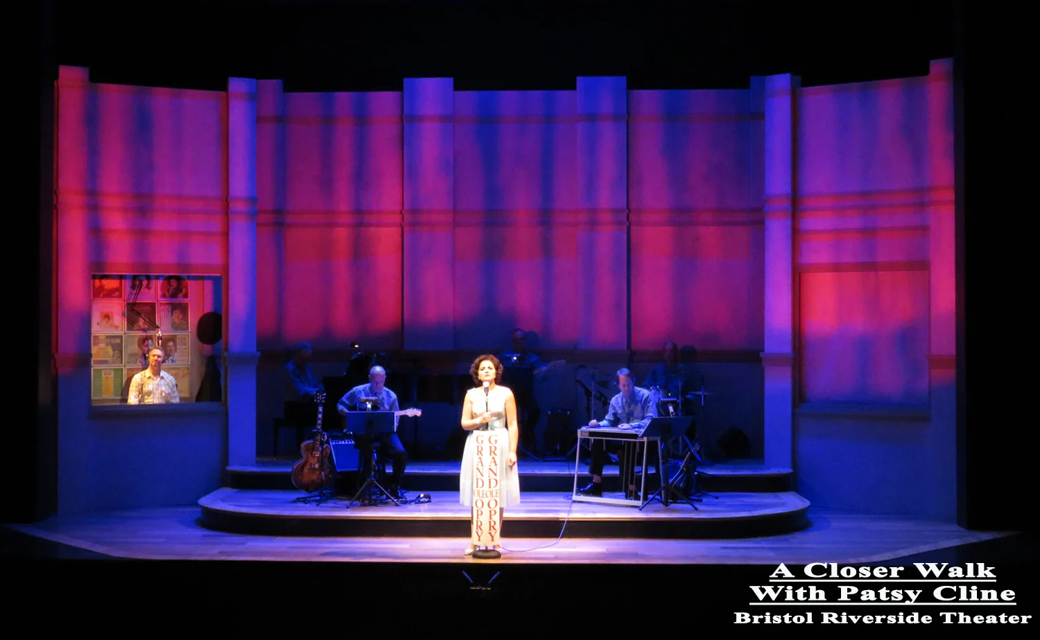
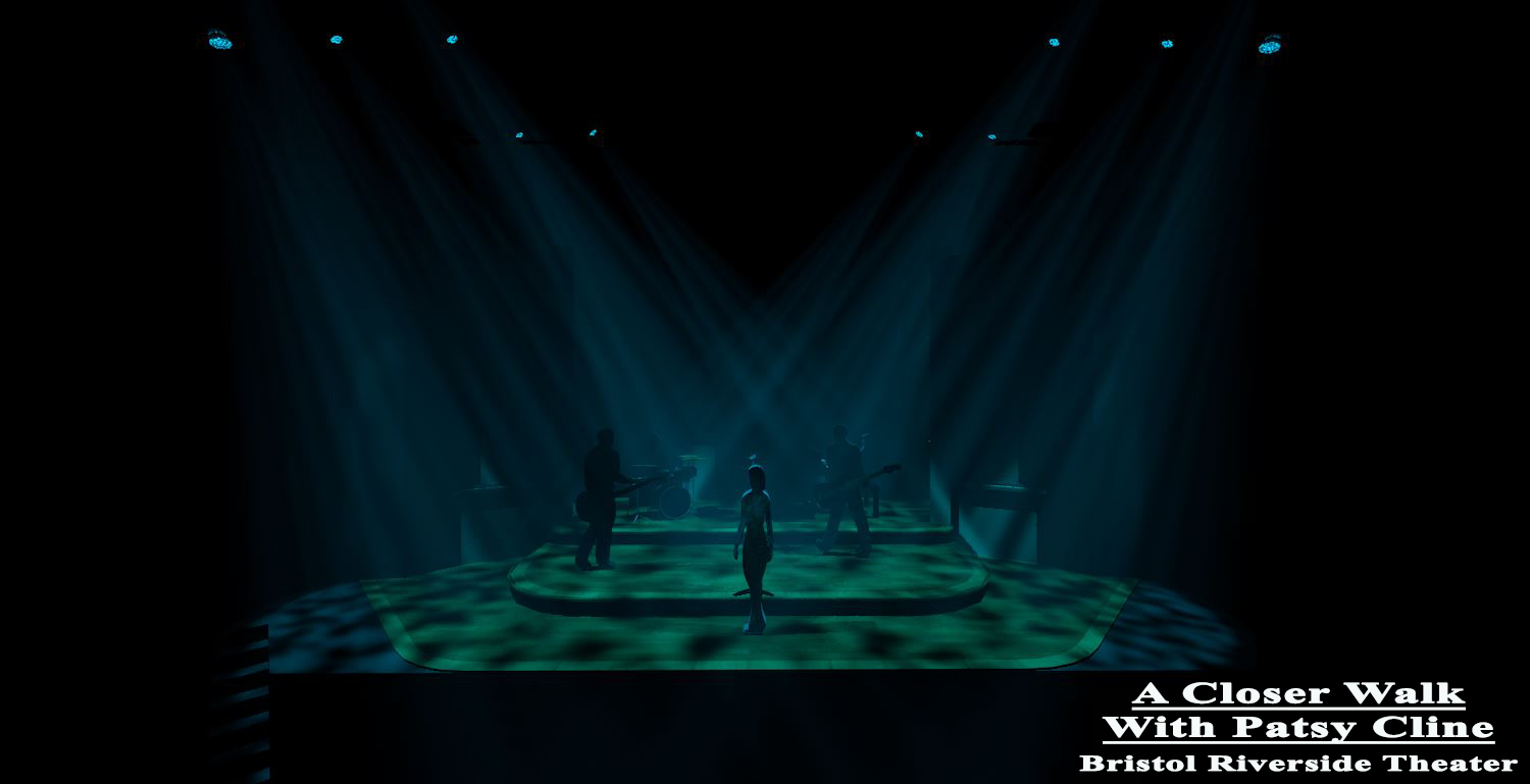
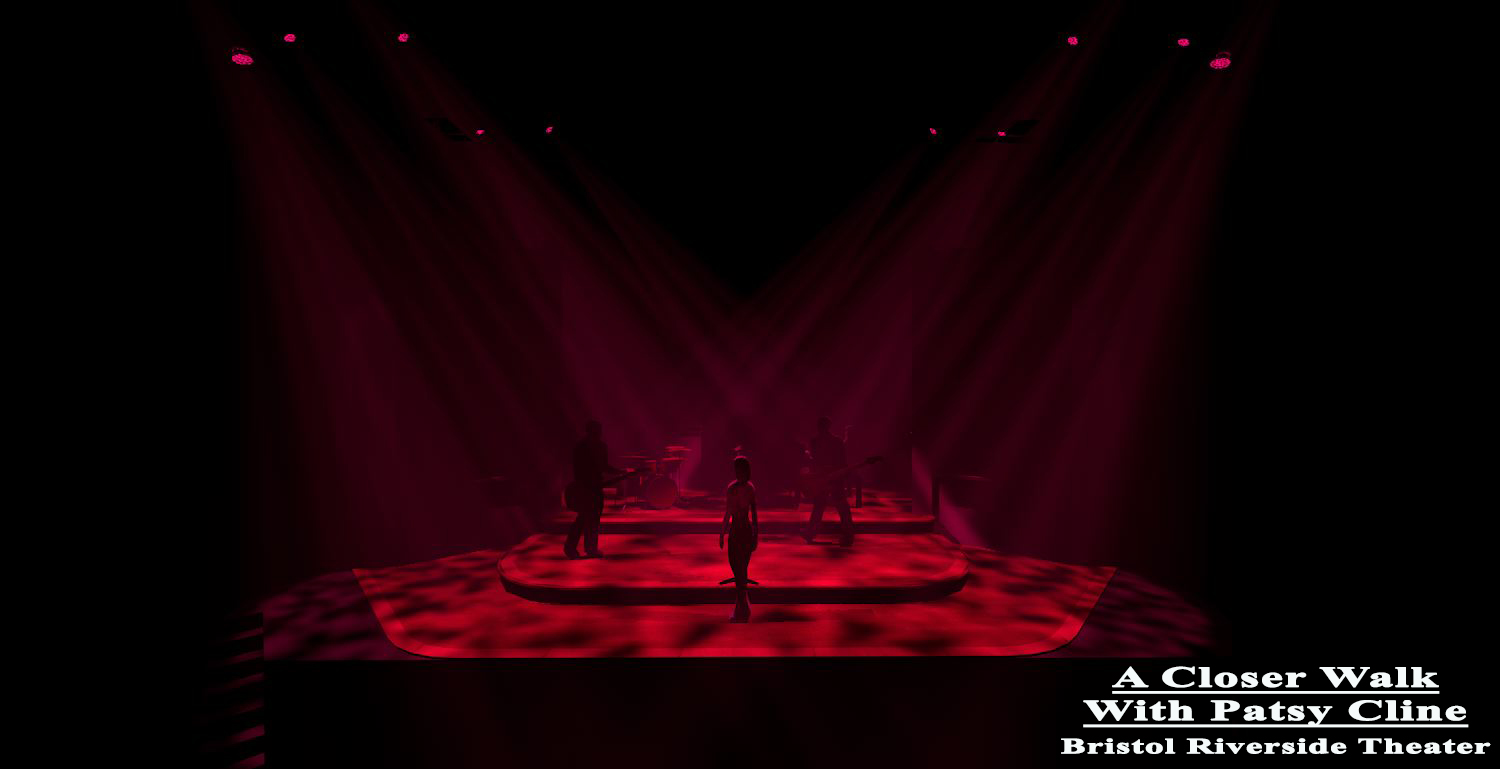
Three different systems for the Las Vegas location.

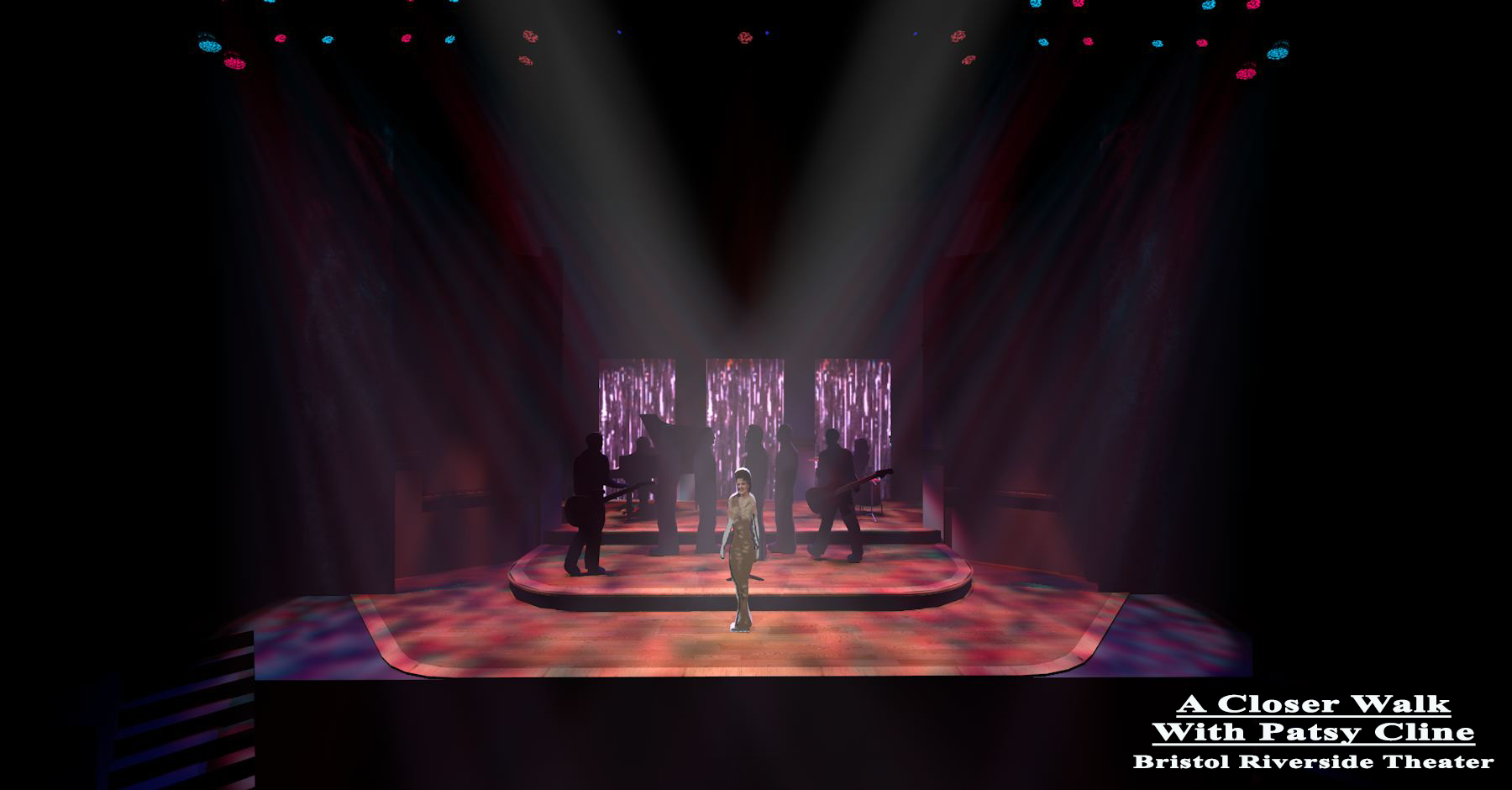
And a couple options on how they go together, complete with rain curtain US and LED tape under the steps of the set..
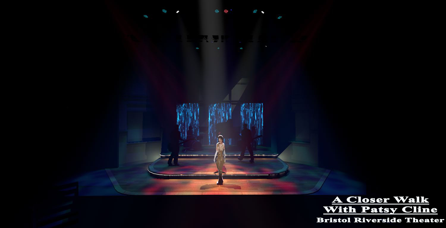
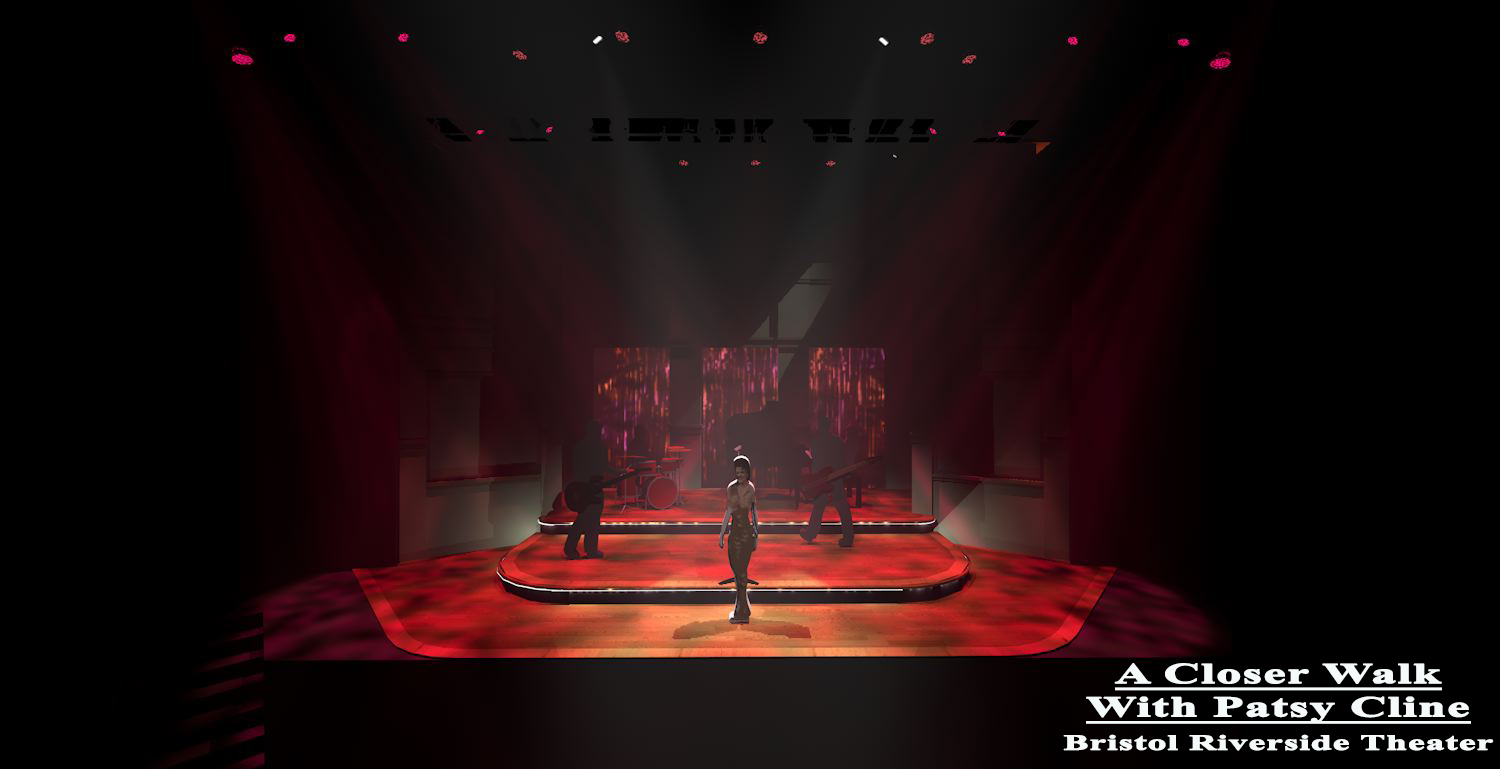
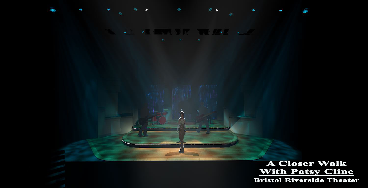
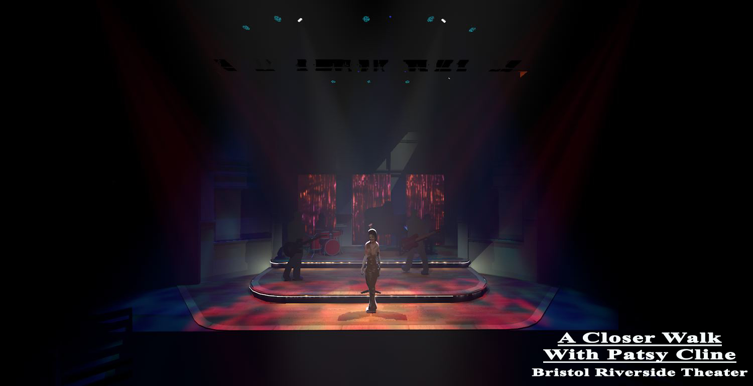
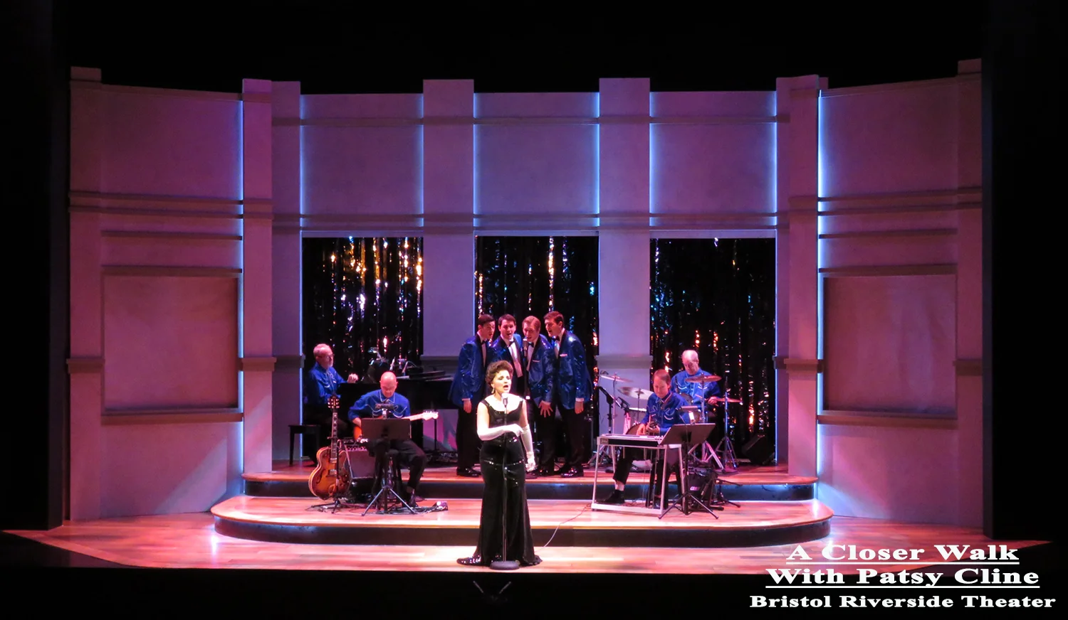
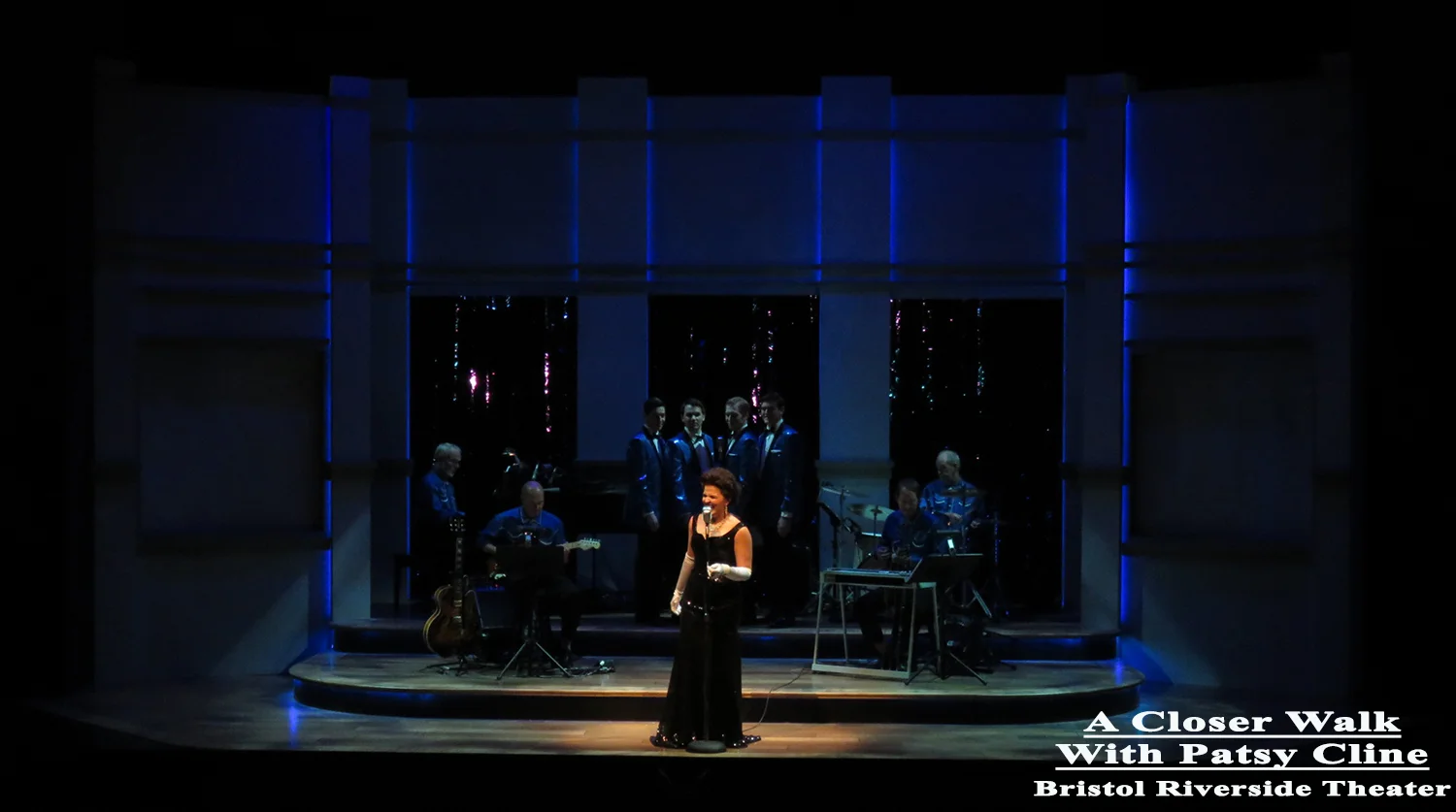
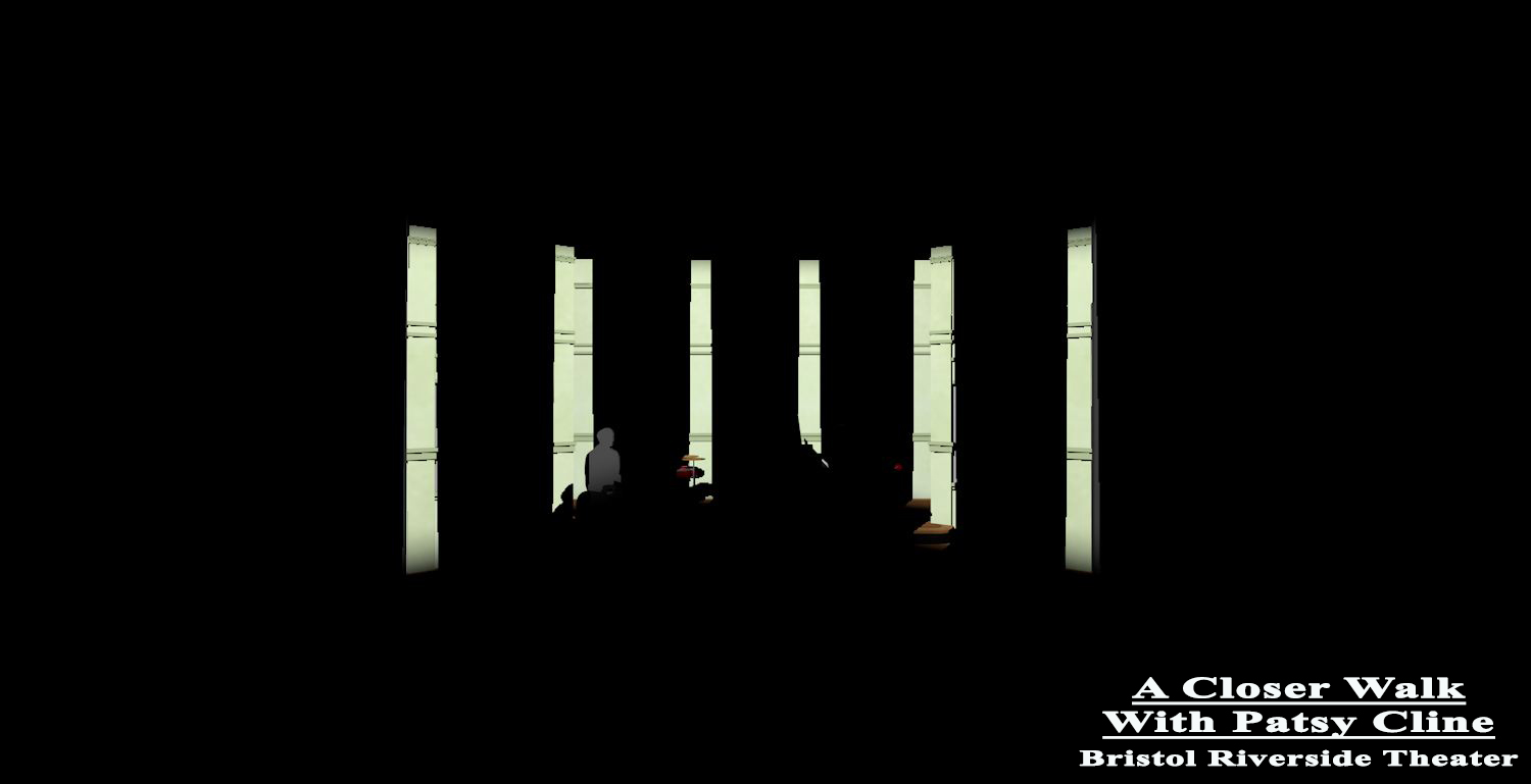
For Carnegie Hall I wanted to accentuate the columns of the set.
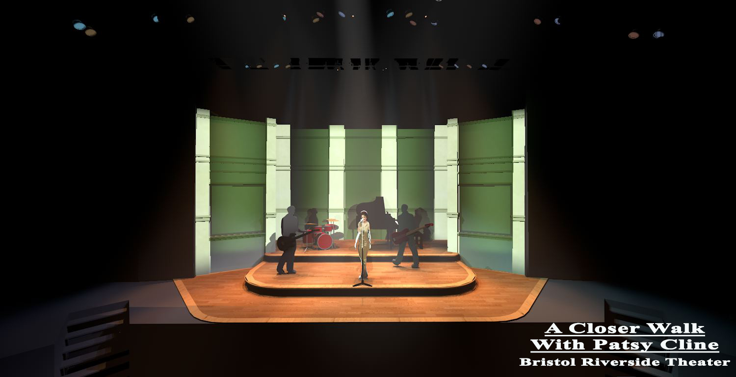
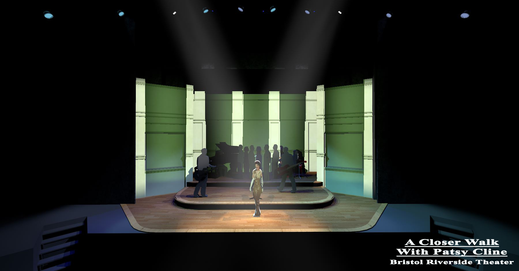
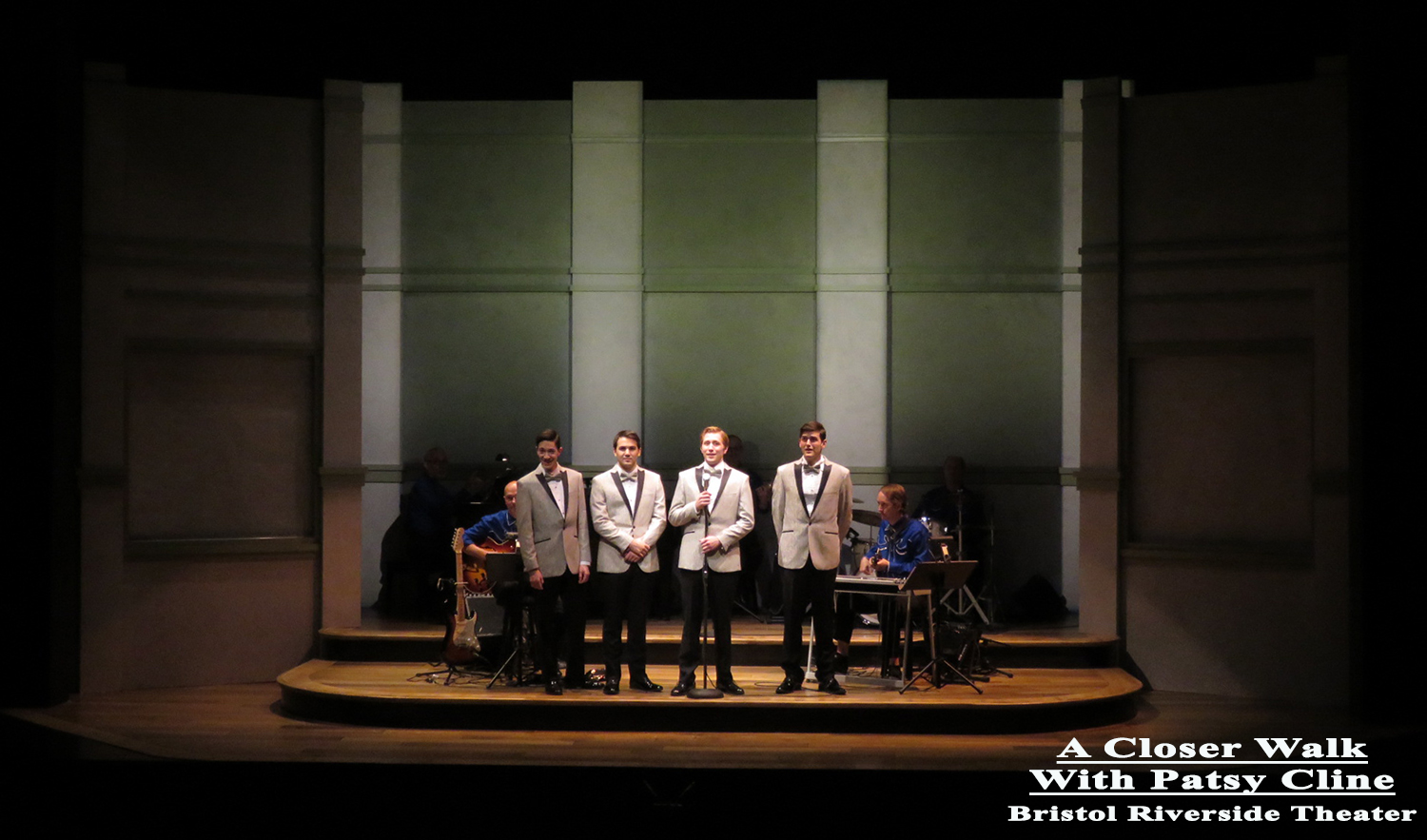
And in real life.
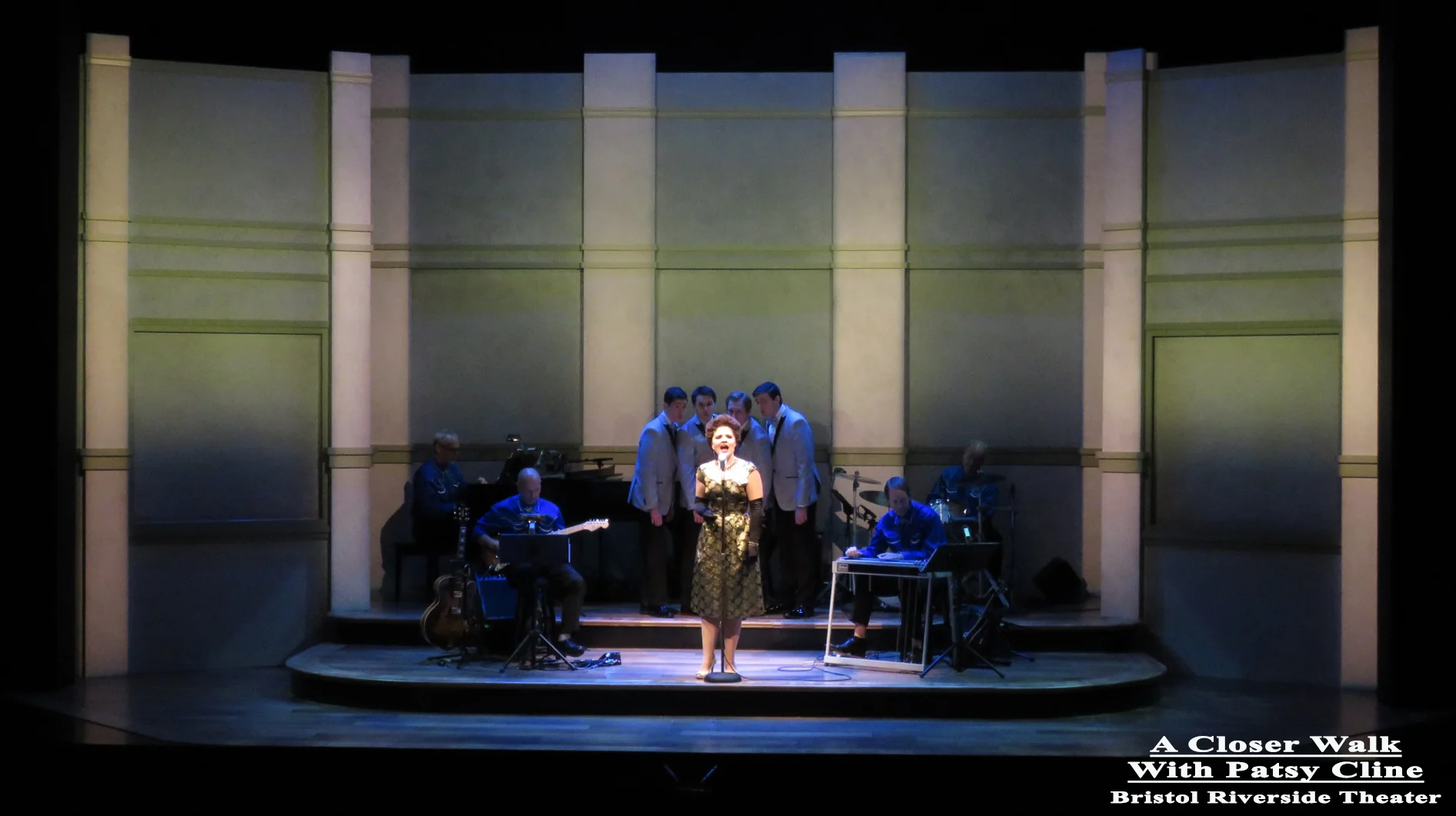
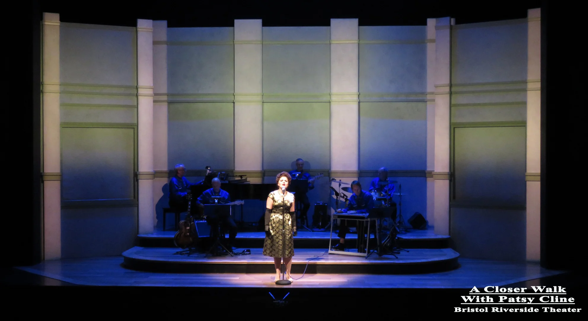
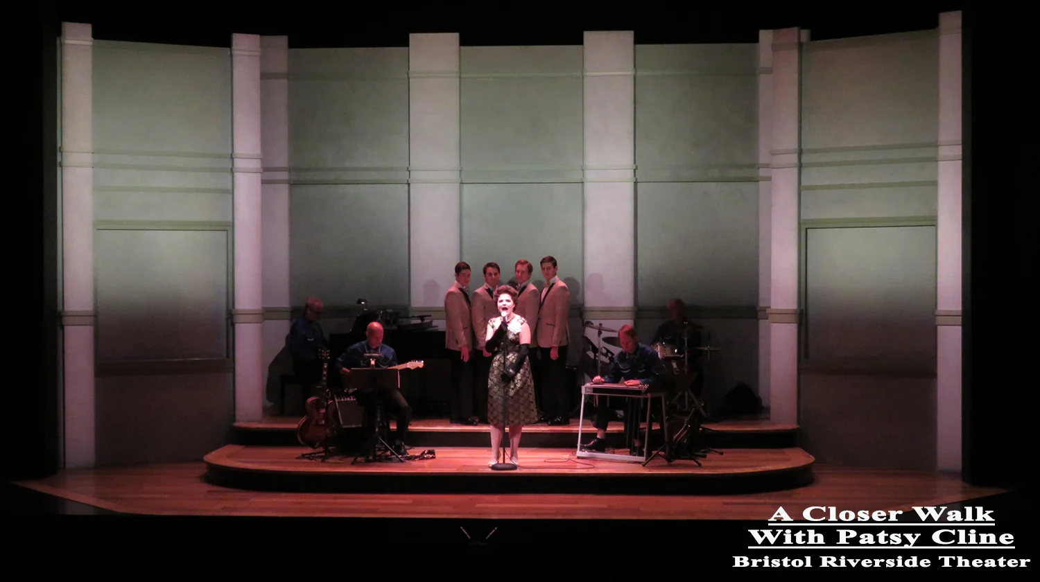
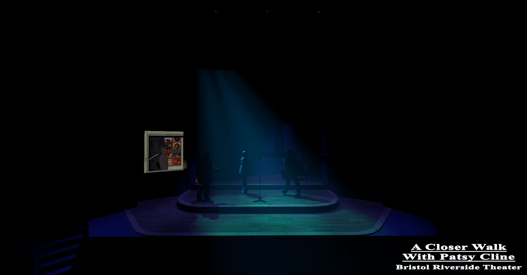
Who knew she died at the end?! My "Go into the light, Patsy Cline" light.
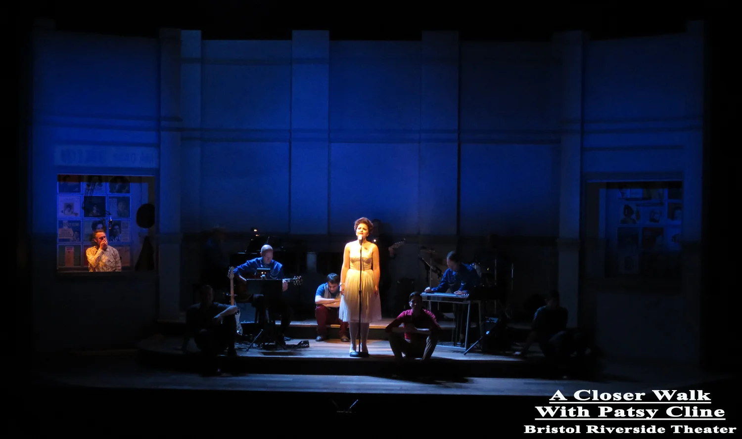
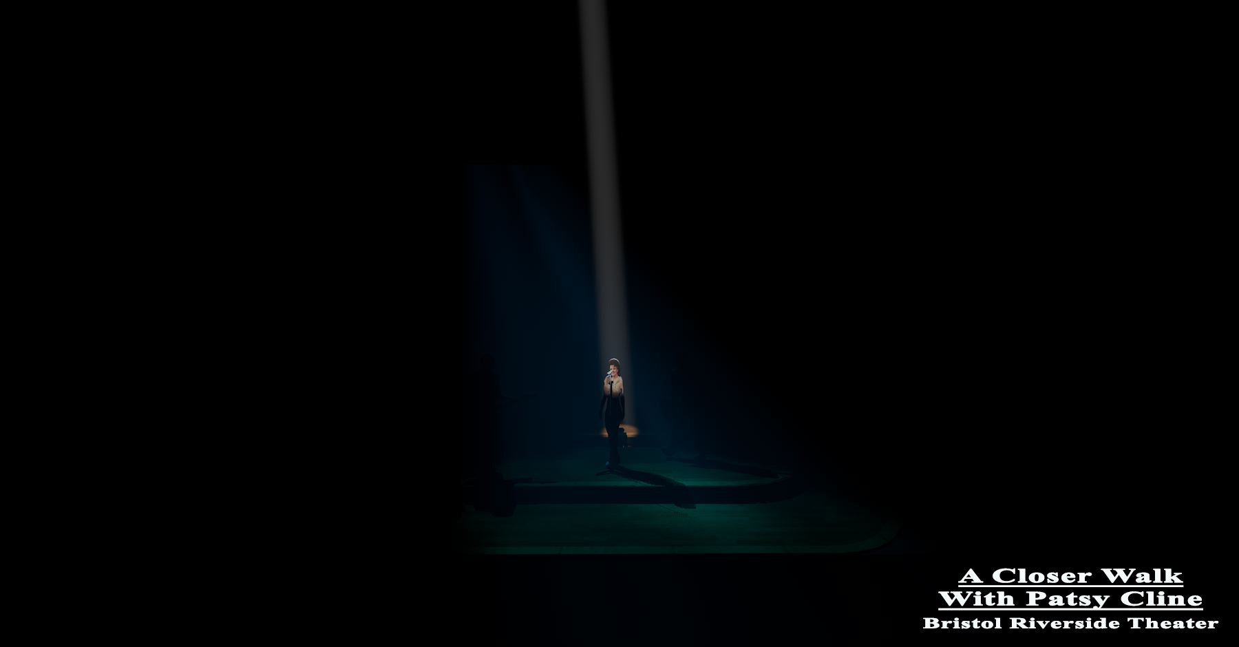
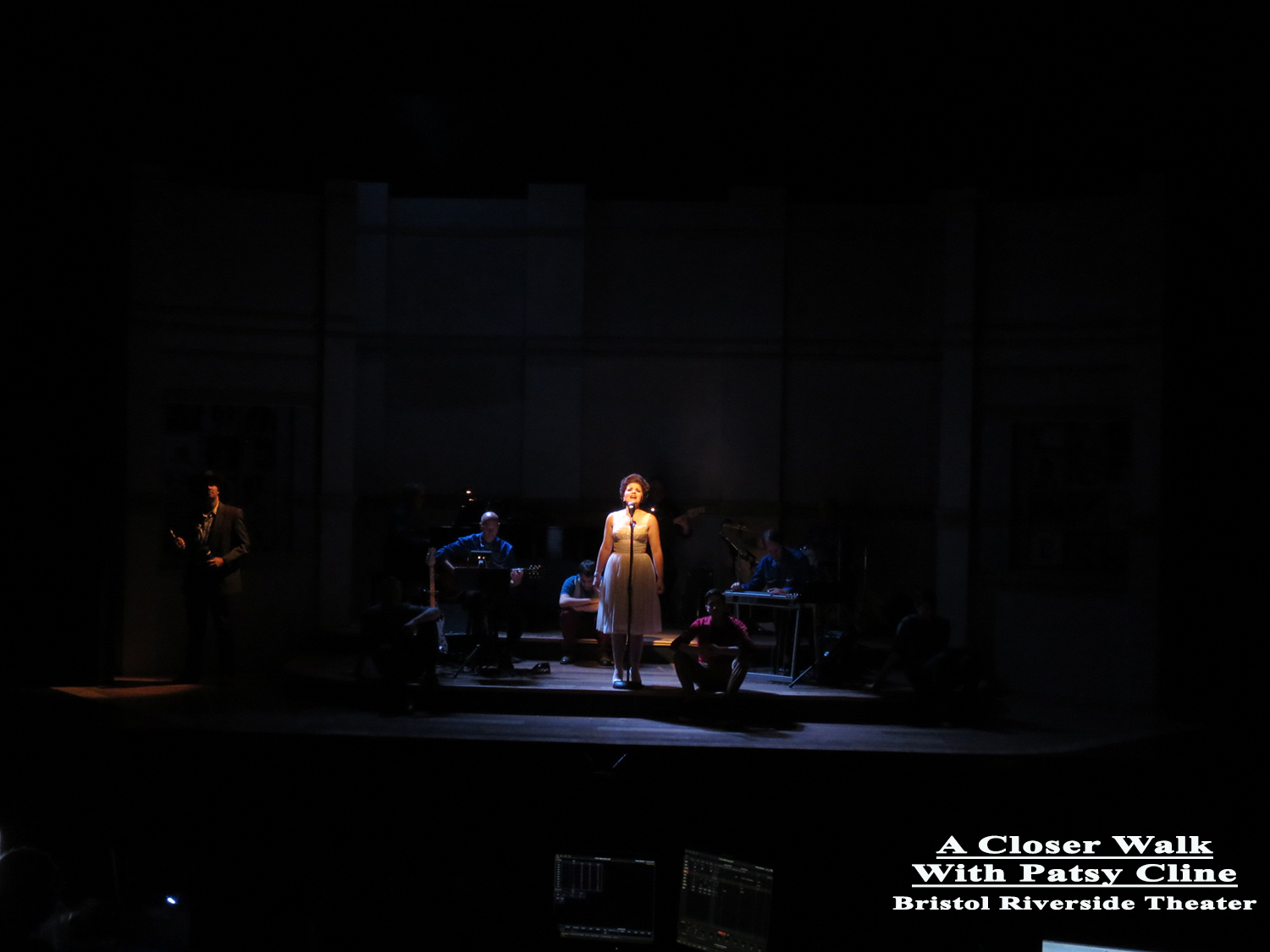
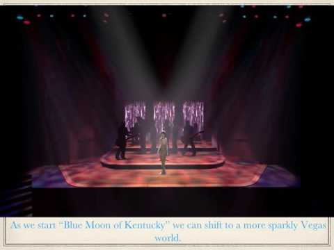
This is how all of this was presented to the director and production staff.
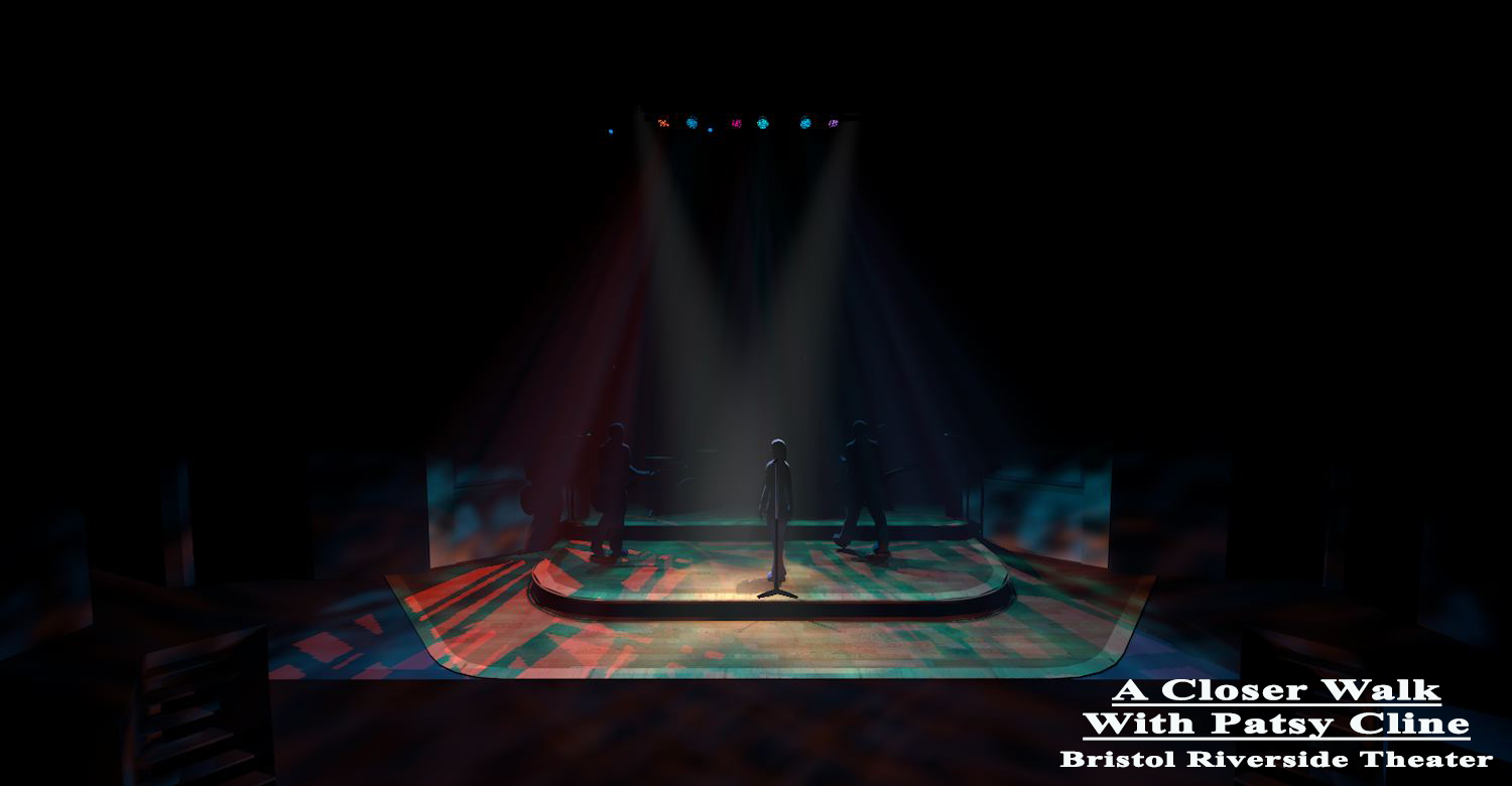
"A Closer Walk with Patsy Cline" at Bristol Riverside Theater. I literally brought the set into Vectorworks and turned some lights on from another show.
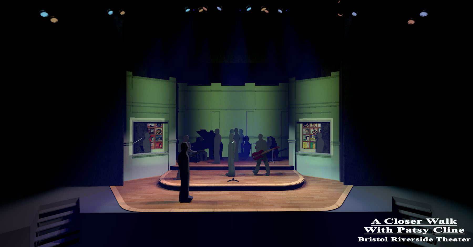
After showing the director (Susan Atkinson) what different systems would look like a month before we were in the theater, I "cued" nearly every scene into a PowerPoint storyboard that allowed her to look at the progression of the design and how different scenes fit into the overall arc.


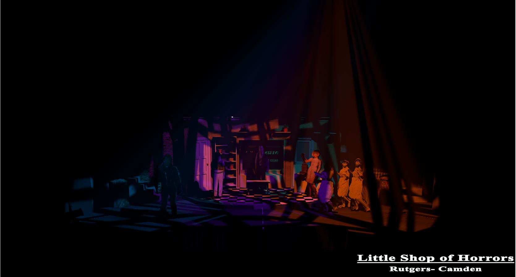
"Little Shop of Horrors" at Rutgers- Camden. With the rep plot again, I wanted to show the director (Ken Ludwig) what we could do.
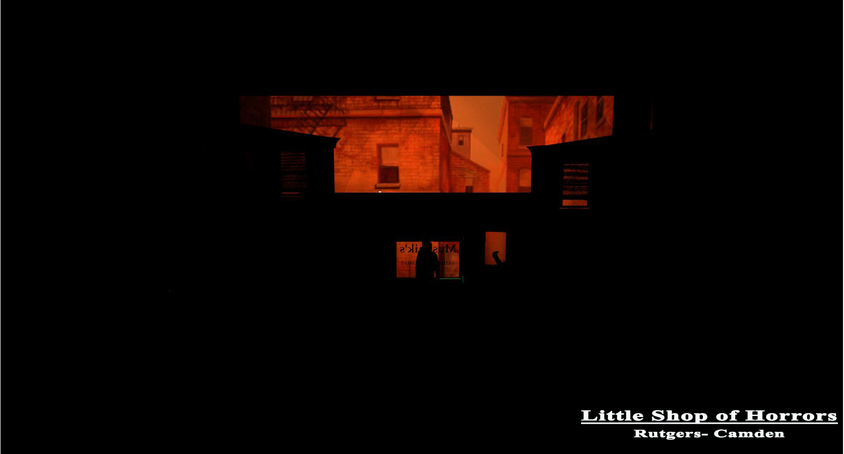
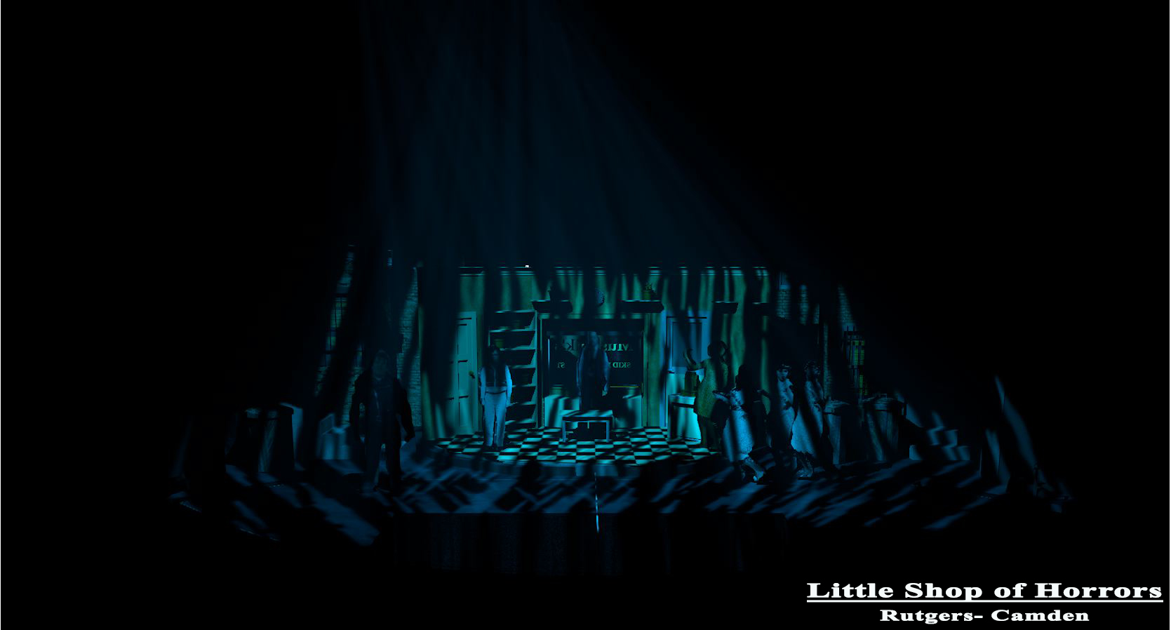
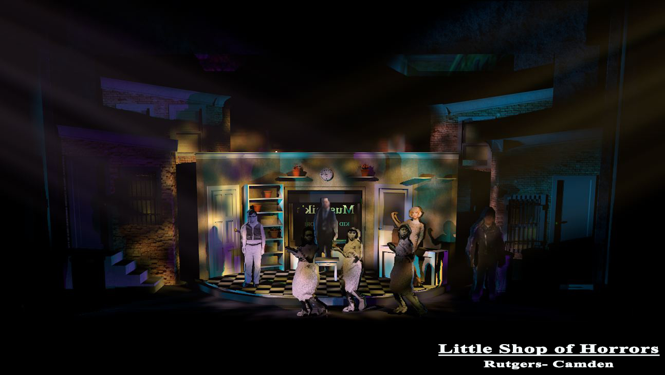
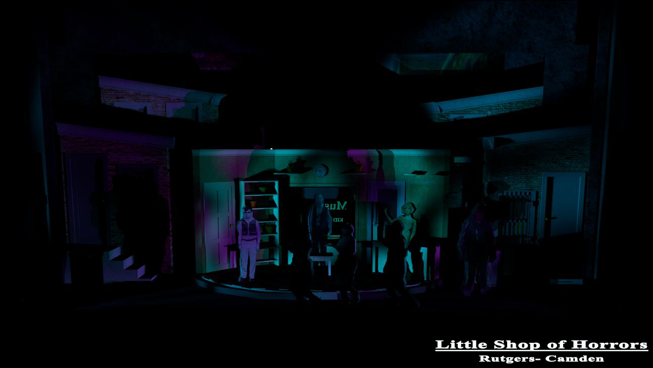
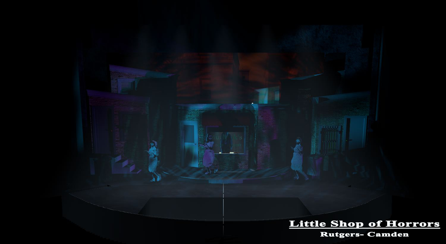
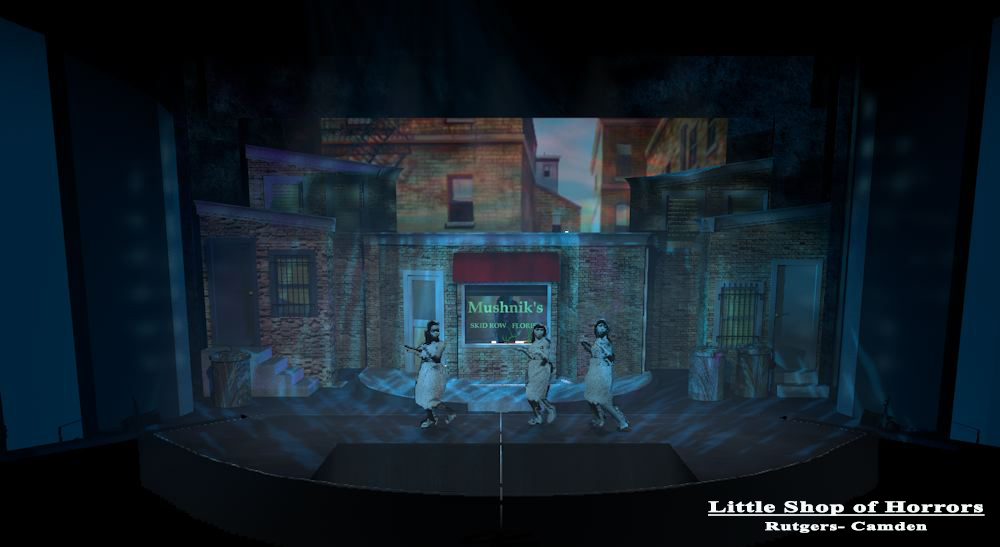
With just a couple more systems from the rep, I could storyboard the production weeks before we were in the theater.
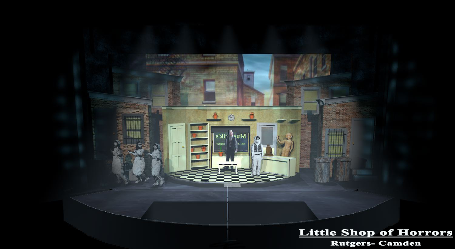
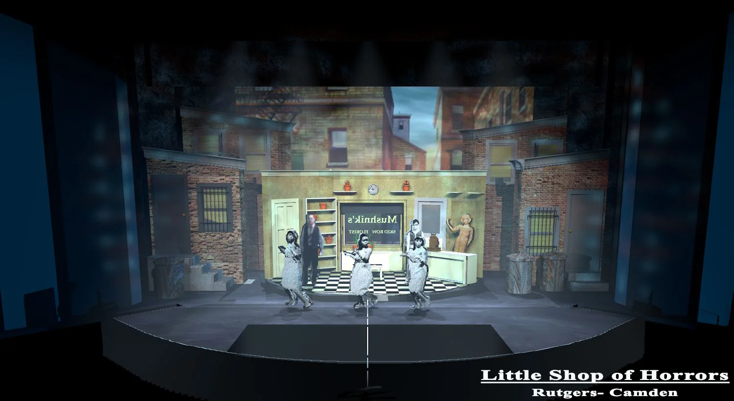
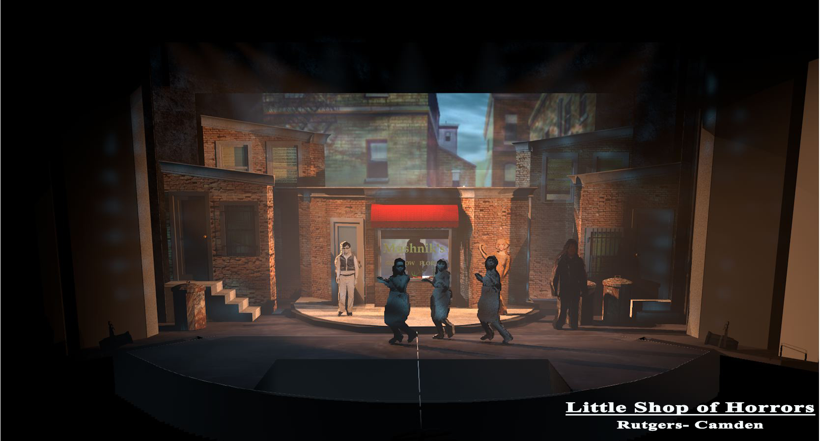
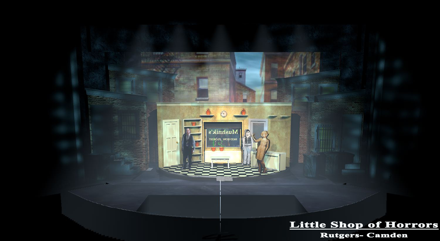
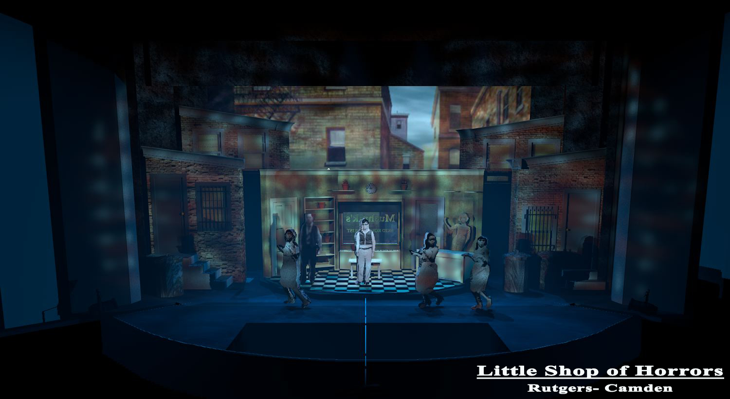
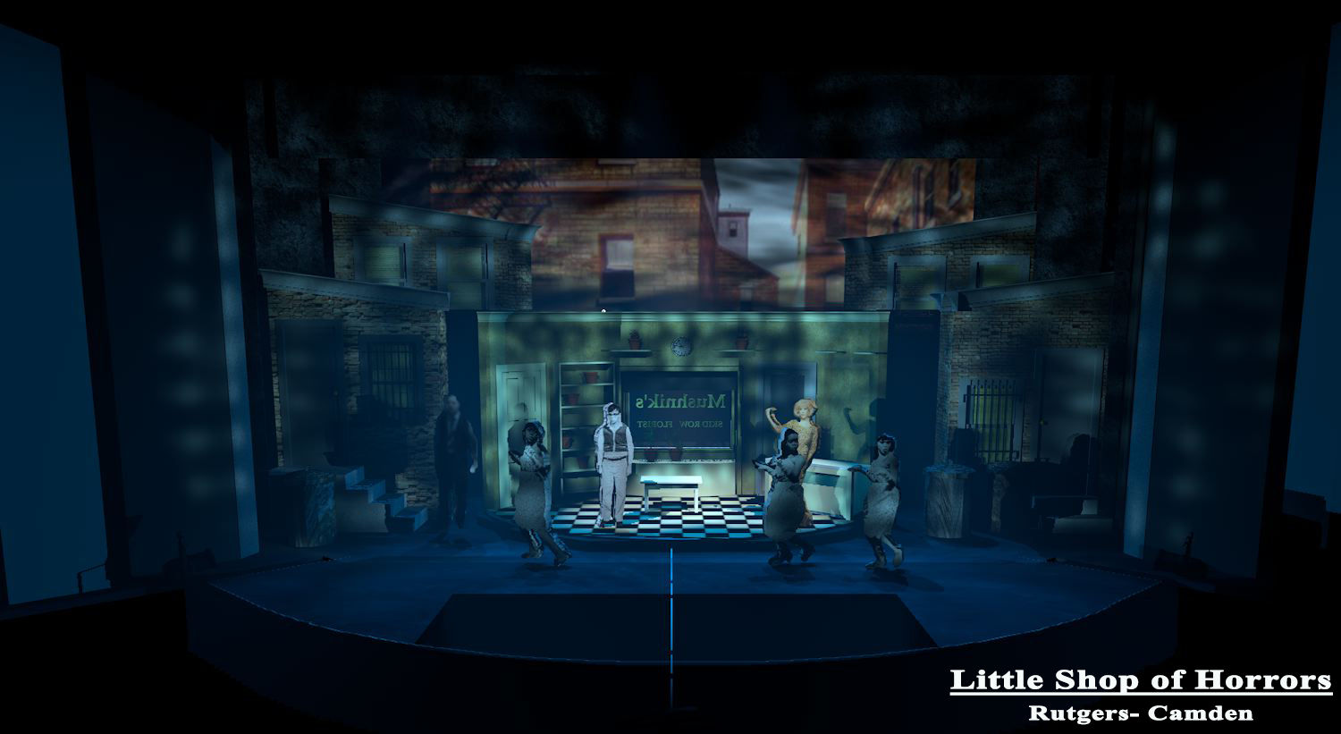
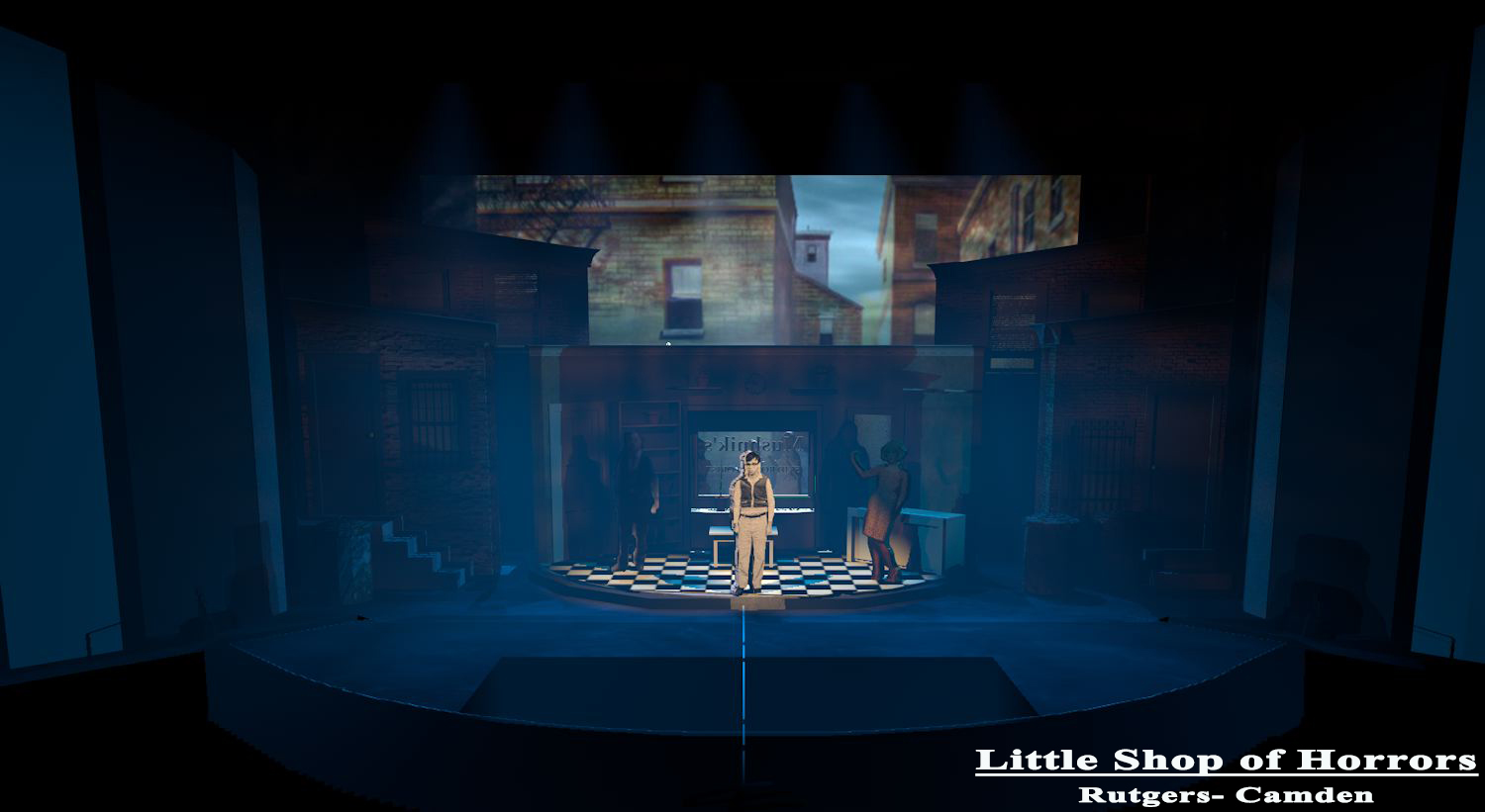
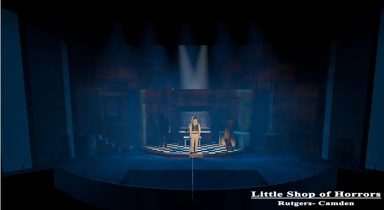
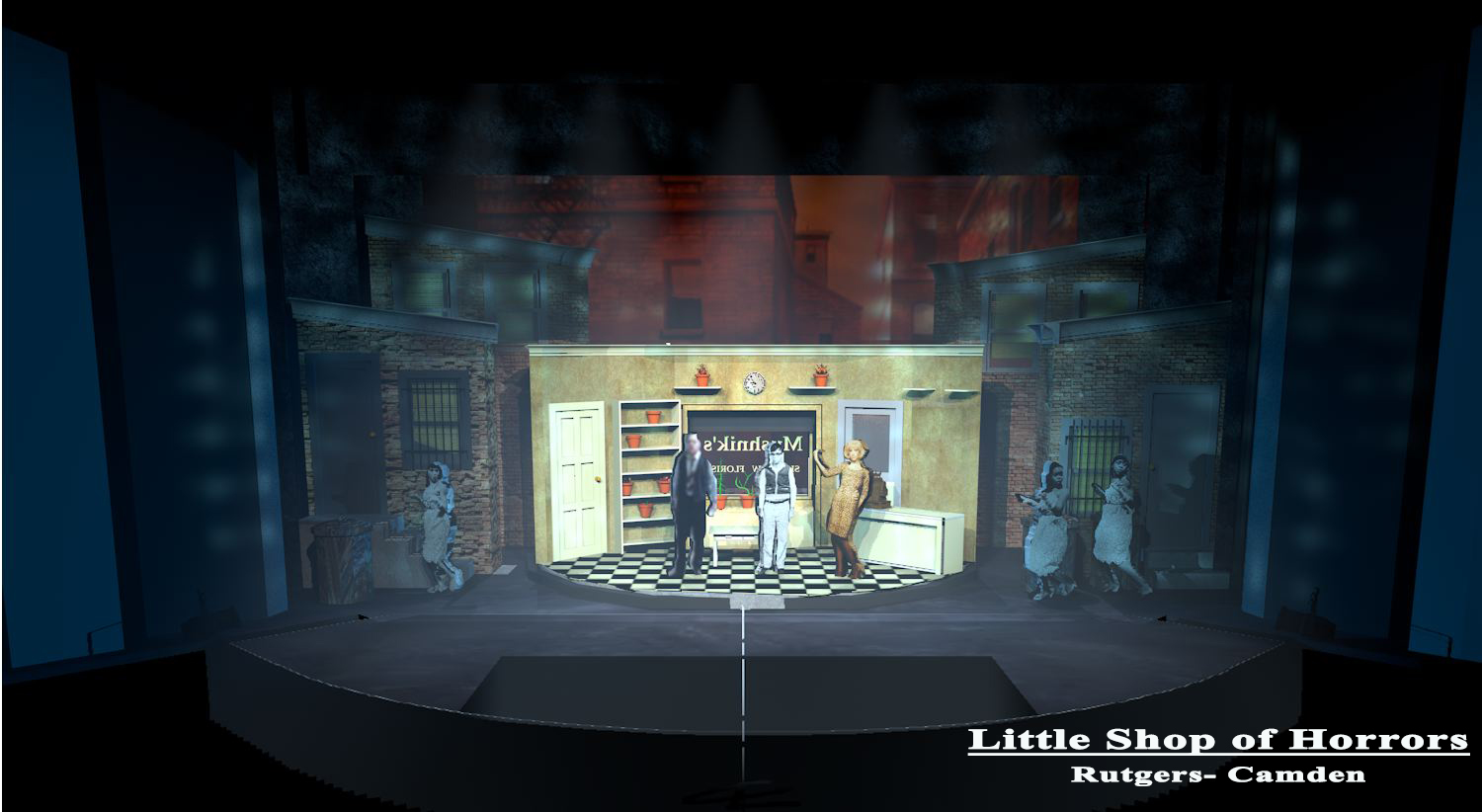
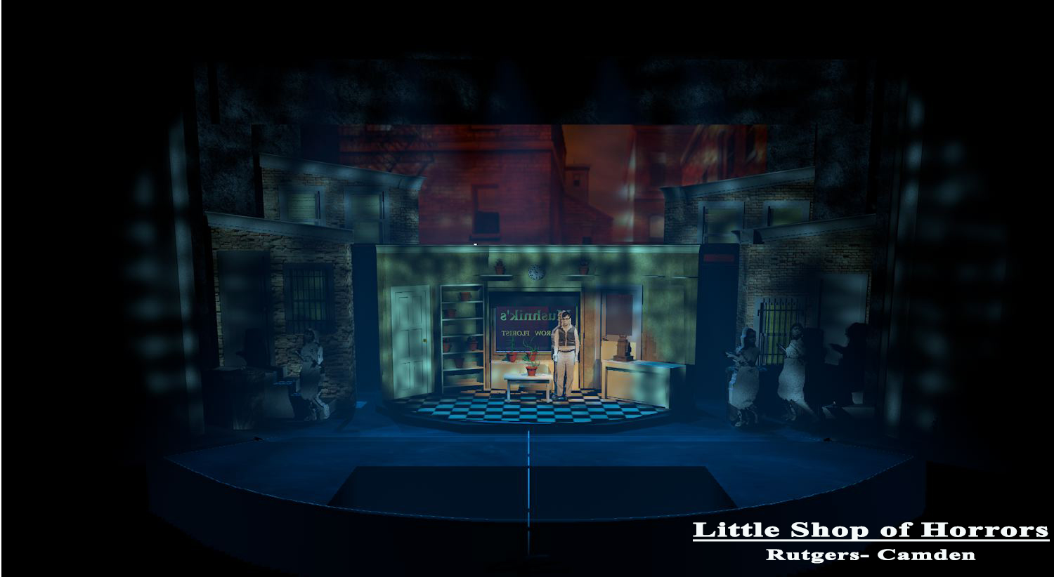
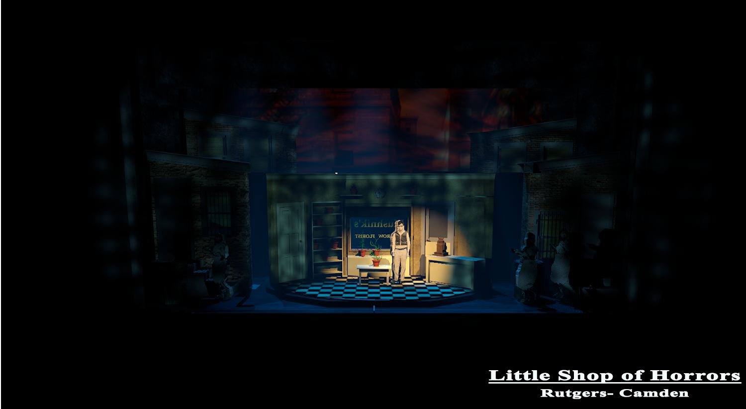
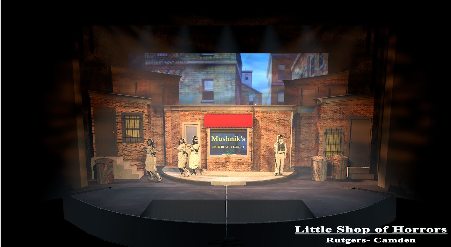
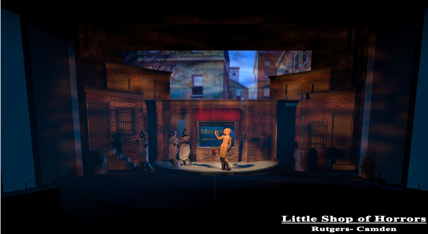
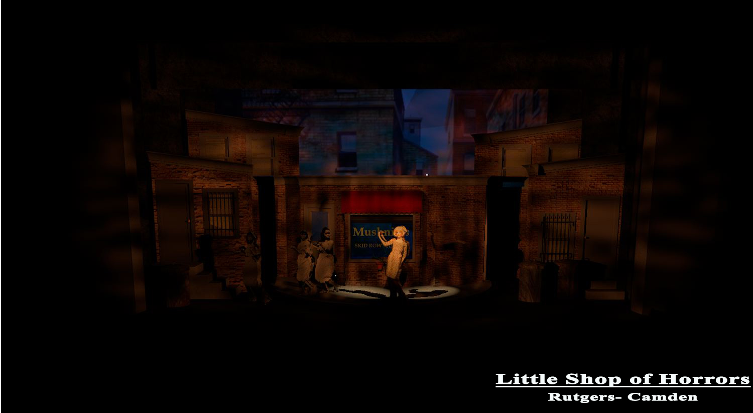
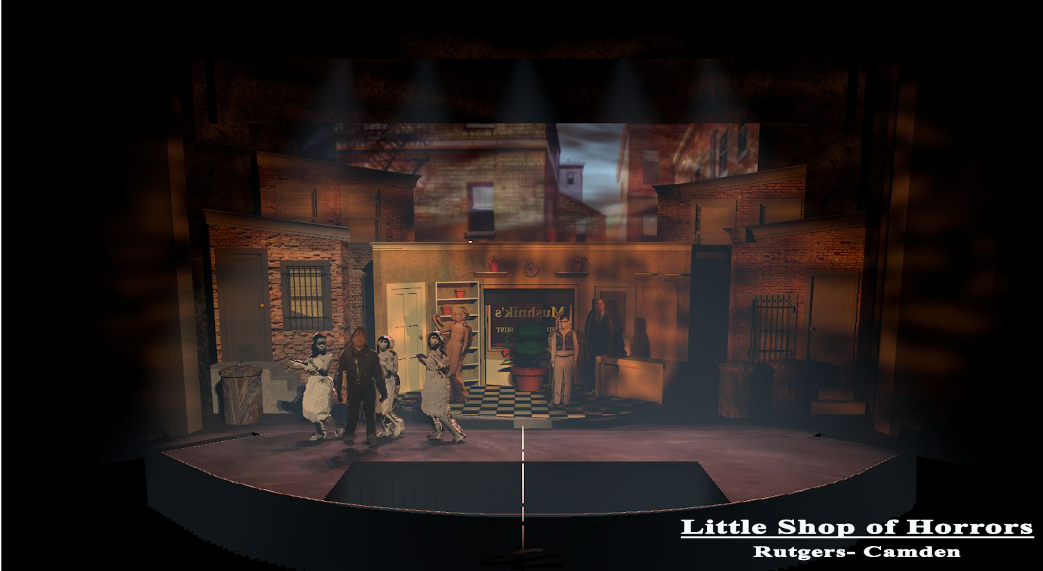
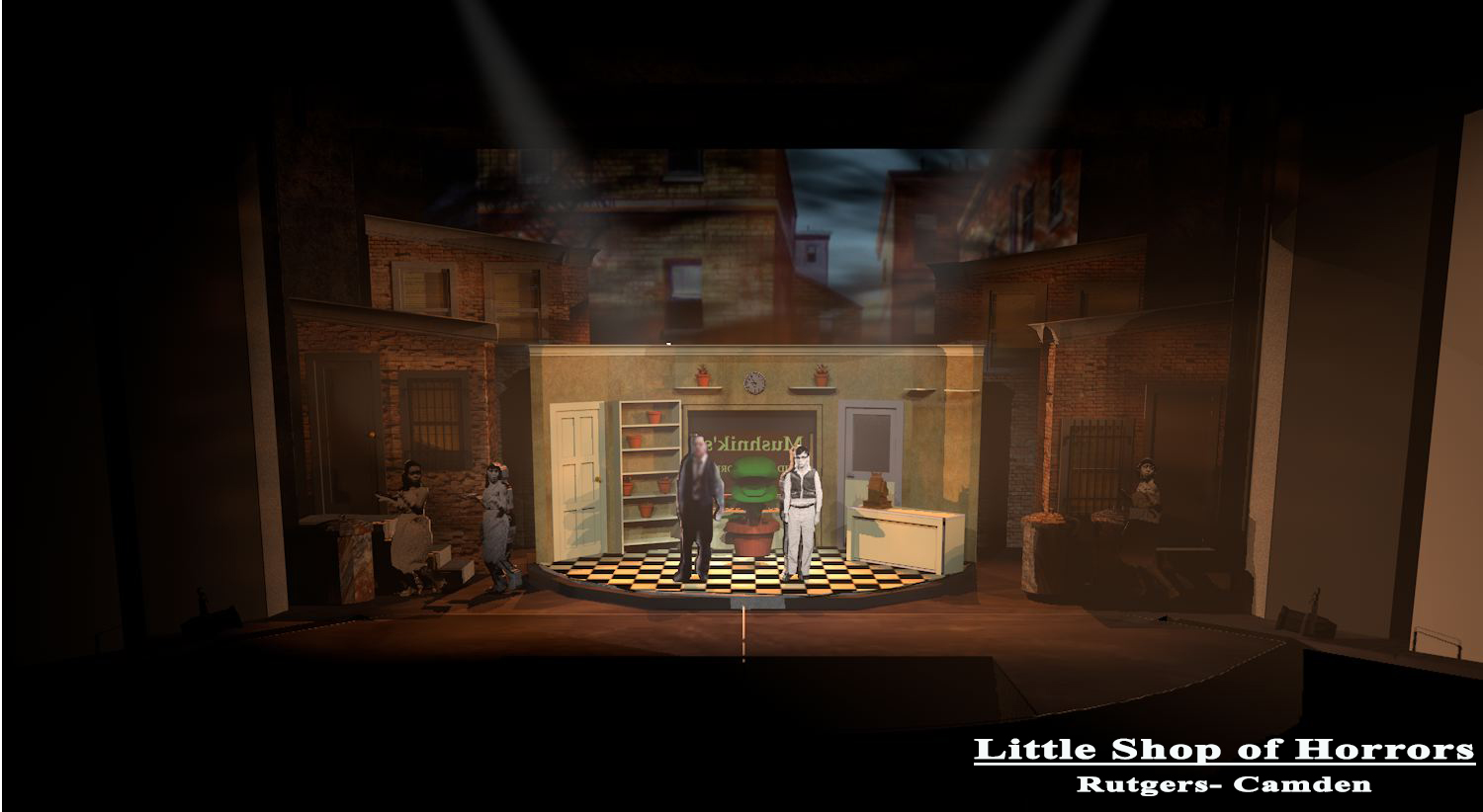
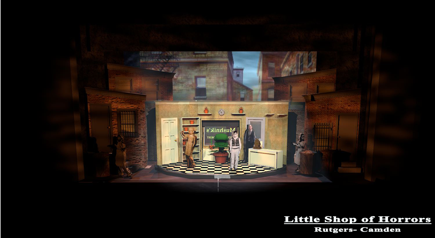
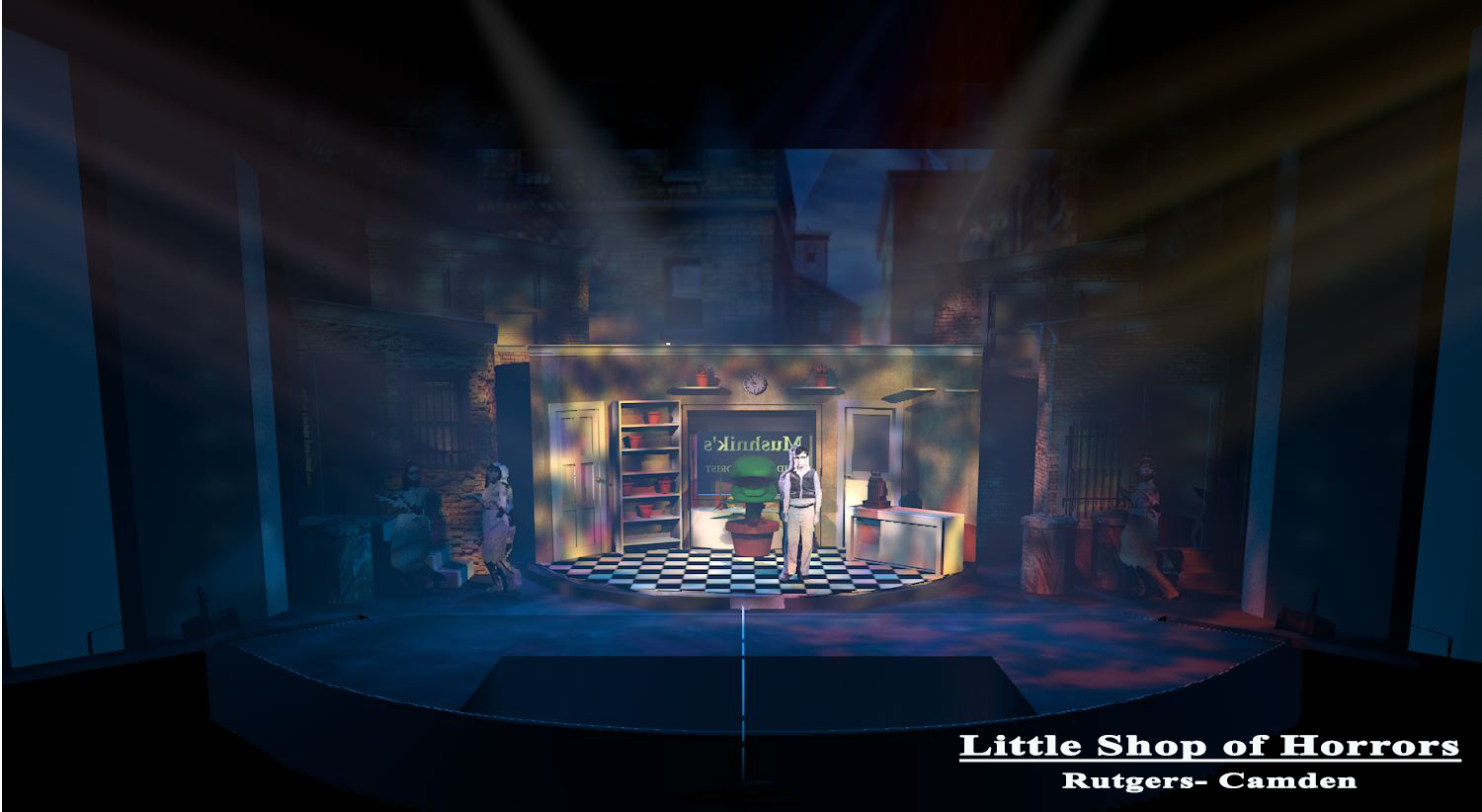
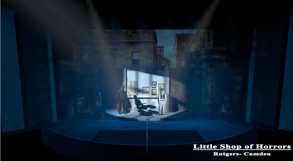
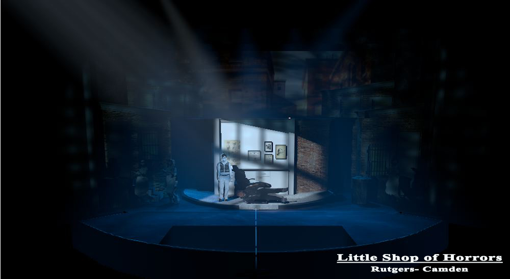
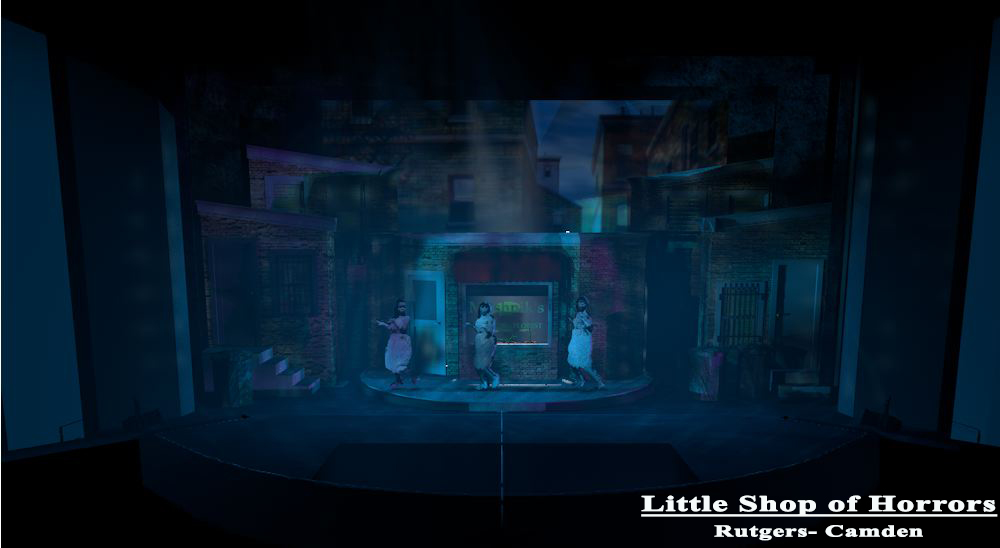
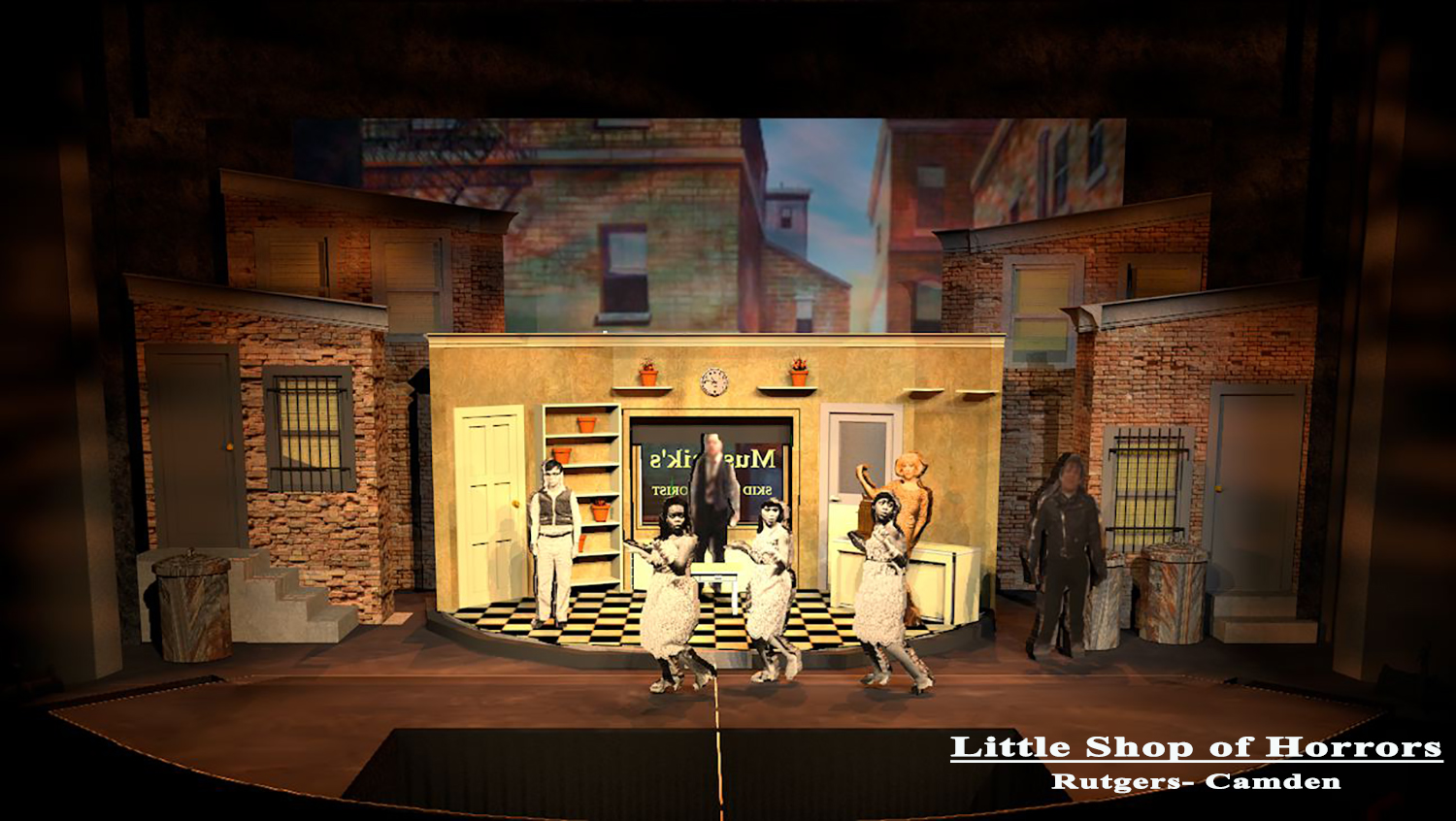
I got through the start of Act 2 and had build a good communication language with the director, so I storyboarded the rest of the cues with the light board.


For more current uses of this, please see some more detailed explanations of the process in the section Creative Work at American University in Cairo. This process is used for both sets and lights for University productions, as well as movies, TV and concerts.
Enjoy.


